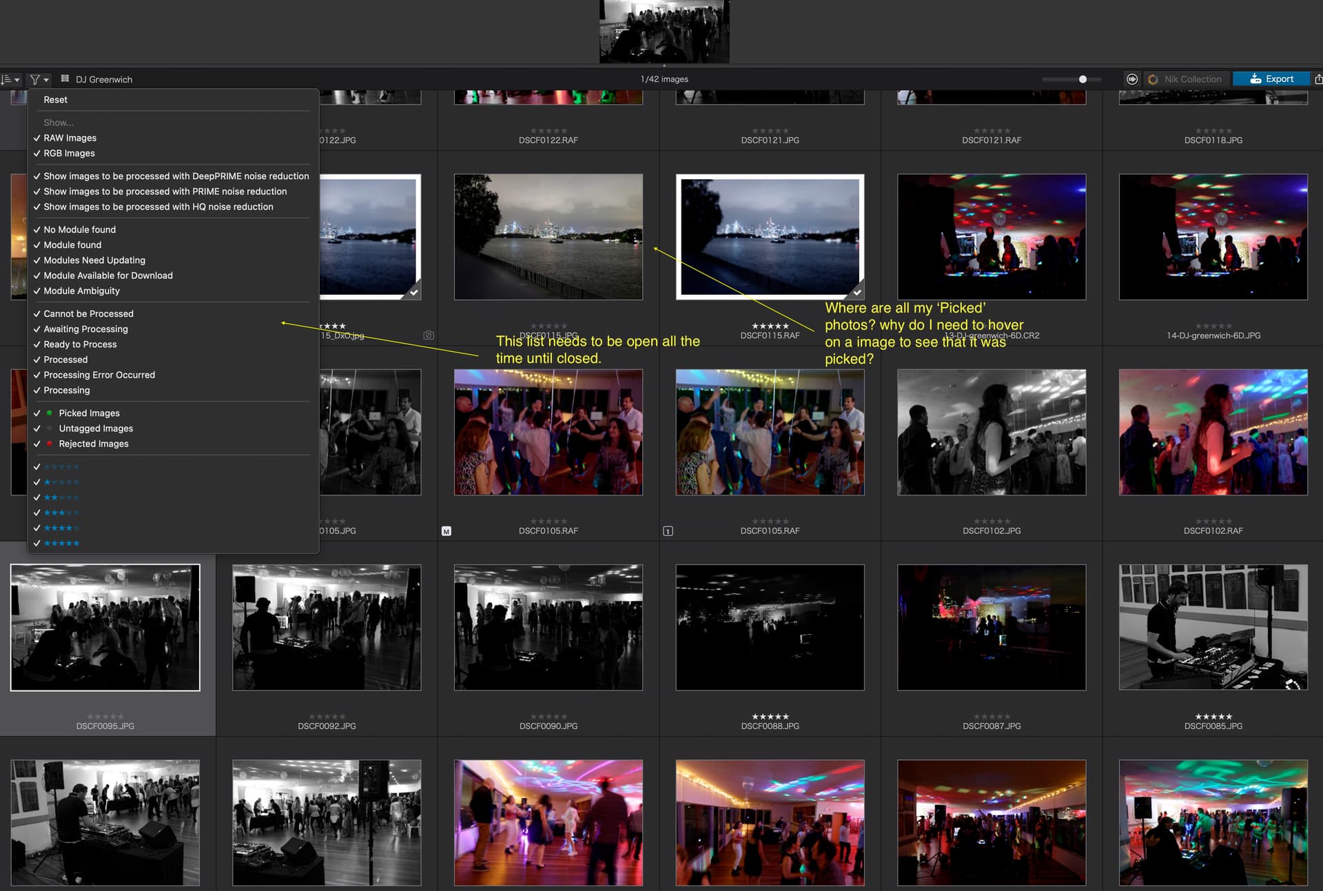
The filtering option (top left dropdown) to filter photos by attributes such as ratings and ‘picked’, ‘rejected’ needs some rework. Also, when picking images, why isn’t the green dot (or red) showing next to the thumbnail? When selecting, sorting, and preparing for export it’s quite frustrating to use the ‘filter’ option. Better if it was always open to making the selection quicker.
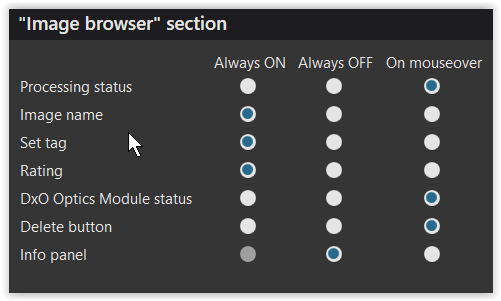
Check out the thumbnail settings.
Pick/Reject lights (and star ratings) are set to be shown on hover, unless the default setting is changed.
e.g.
Bummer. I feel so stupid. Thanks for the help. TIP, never drink Whiskey while post-processing photos. -)
If you feel stupid because of drinking whiskey, I’d try it with whisky. Doesn’t mean, I’m not stupid from time to time, but the drink doesn’t let me feel it 
Also, I fully support the “filters need some rework”, I miss the possibility to switch all ratings first off and then choose which I want to see. More clicks than needed, just to keep the user busy. 
Interestingly, more options to choose on the Windows side of things.
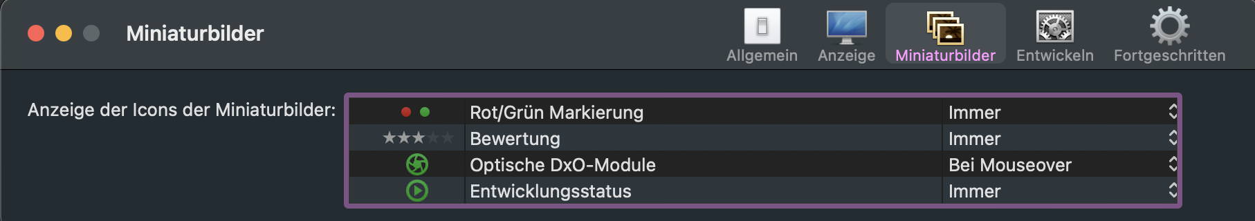
Now I understand some “issues” better. It’s the reduced Windows version I’m working with.
I love the “bei Mouseover”-Denglish, it always makes me think of the reader’s face. If it would have been translated with “bei Mausdrüber” 
ha ha @JoJu. I can confirm I had Glenmorangie Whisky (no e).
I am a product designer and have designed applications for over 20 years. Those ‘little’ nuances do add up. Features and price are not a big factor in this day and age in my opinion.