Would you not create a couple of temporary virtual copies and compare those?
True, but the first image in aperture mode and shot a “normal” exposed in the middle by watching histogram, not ETTR, the scene i used for first video would be more spread. higlights where possibly still nearclippingpoint due snow. but the gras and shadows where darker more near black.
a wider histogram to begin with. i think, i wasn’t there.
That one was compressed by exposing ETTR. (which everyone would do by the way if you stood there to capture the top and bottom as good as possible, but in this case the “lower anker got drifted”)
Smartlighting does two things:
compress DR in highdynamic scene’s to get rid of clipping warnings. (contrast is low.)
expand DR in low dynamic scene’s to gain some nuance , to be seen in histogram as getting wider more spread.
I suspect it uses the algoritm of selective tone sliders in automatic mode together with contrast and gamma level.
By using two or more boxes to give away which objects ,part of the Dynamicrange, you want to effect you can control the effects better.
And even only effect a part of the histogram.
1 Like
In some ways, the title I gave this thread could be construed as suggesting that the histogram should always be full - something which is certainly not the case.
Or is it? Take the example of this image…
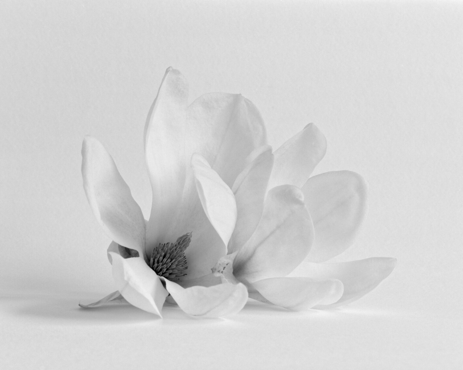
… and its histogram…
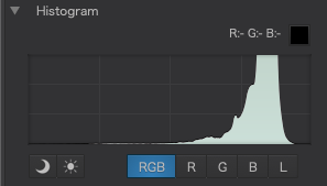
This was made, quite deliberately, as a high-key image so, understandably, there are very few tones in the first half of the histogram and the image appears as we would expect.
However, if I turn on the over and under exposure warnings, I only have to move the ends of the tone curve sideways by a couple of points…
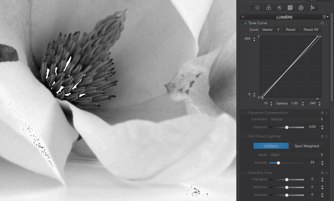
… and both the under and over exposure warnings start to flash.
Especially surprising for the shadows end but, if you look at this section of the flower…
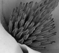
… in more detail, you find that there are indeed tones that are virtually black, despite the apparent absence of such tones in the histogram. It’s all about the scale of the histogram, where there are simply not enough levels to show such small quantities of a particular tone.
In fact, despite its appearance, I have completely filled this histogram 
2 Likes
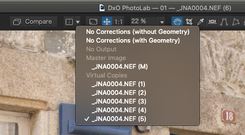
Virtual Copies are very useful when you want to preserve a particular “state” before moving on to more detailed corrections … BUT, I find them to be next to useless for comparison of subtle differences - because the time it takes to (re)render ALL corrections when switching between VCs exceeds my mental picture of the previous result !
John M
Hmmm. I don’t get any lag on my Mac. For comparison, I choose one of the virtual copies, then I set the comparison drop-down to another and simply hit the Compare button.
3 Likes
That’s really interesting, Joanna - I’ve only ever thought to switch between VCs via the Image Browser - not via the Compare; and I’m most surprised (indeed, curious) to find that the latter is much faster … tho, still not fast enough for me to make a satisfactory mental comparison.
Which suggests that either your Mac is much faster than my PC - - or my mental picture dissolves too quickly 
John
Thanks again for the second useful tip today  Works like a charm and you pass by the lag when completely switching. I mostly only compare to the original, (pressing “D”), but knowing this now is a game changer. Will use it for sure more in future.
1 Like
And, thanks for this reminder, KD … I had forgotten.
It’s a bit fiddly to set-up a VC as the reference image (and not at all obvious, on the Win version, that it’s even possible to do so !), but it’s certainly faster to compare VCs this way than it is by switching between them via the Image Browser (PL is obviously caching them).
All the same, I’d still prefer that the SM intensity values were “sticky” !
John
never realised that i had this feature.
Thanks.
1 Like
When I raised this as a concern last year, DxO explained that the lag disappears once the images have been cached. Sometimes I have to switch between two images several times before they’re both cached and can be displayed just about instantaneously. Especially if they’re from a RAW file. So maybe it would help to raise the size of your cache in your PhotoLab preferences and make sure you have enough free system RAM. I suspect using a fast SSD also helps with this.
2 Likes
Just tried your suggestion and raised the memory from 1000MB to 10000MB. But it makes no difference. Cleared the cache before and opened then 6 editet images. This raised the used memory up to around 6MB. The lag, because of rendering the preview, when switching in the image browser stays the same like before.
You tried switching back and forth between two images several times, and the lag never went away?
Yes I did and the lag keeps. It always starts to render the preview again. On Mac btw.
… and when working with Local Adjustments (LA active), just hit compare and the previous version (without LA) is already selected – like it!
1 Like
Hi Greg - - Yes, I did this multiple times (switching between the master version and a couple of VCs, via the Image Browser) and the lag on my system is consistently ~3 secs … and this is not due to insufficient cache size nor memory on my system.
… 
The Compare method, as shown above by Joanna, is much faster - pretty much instantaneous, in fact … but, it’s tedious to set-up when all you want to do is simply compare the results of two different correction settings … which is normally easy to do, simply by switching that particular correction ON/OFF … but not so for Smart Lighting (when comparing results of Uniform vs Spot-Weighted) because the Intensity settings are not “sticky”.
John
A couple of my notes on tonal adjustments in PhotoLab 4:
-
Increasing global contrast by using the Selective Tone tool does not cause a great increase of saturation. Conversely, when using the Contrast and (especially) Tone Curve tools to increase contrast we also increase saturation quite significantly. It seems to me that Selective Tone and Smart Lighting do not work by simply multiplying RGB values, but must be based on something like the HSV, Lab or YUV colour models.
-
Selective Tone has a built-in local contrast enhancement (sort of like Clarity, but it affects lower frequencies than e.g. the Microcontrast slider), so if you use it excessively e.g. for portraiture, it can cause unwanted build-up of local contrast which accentuates smaller details.
-
A less obvious way of manipulating global tonality is by using the Color Rendering tool. The first Intensity slider can serve as a simple global contrast tool (I typically switch off the “Protect saturated colors” Intensity slider as I find it undersaturates my photos). It’s worth remembering that Photolab’s underlying colour profile is the “Neutral color, neutral tonality” profile – note that if you go from the Intensity value of 200 to 0, neither the colour nor the contrast changes when you select this as your base profile. I typically use the “Neutral color, neutral tonality v2” as my base profile and can modify the Intensity slider to modify global contrast slightly. This affects the saturation slightly, but not excessively. If you switch off the Color Rendering tool, the Camera Default rendering is always applied on top of the neutral color base rendering.
-
You could also go the route of baking your favourite type of tone curve into a custom DCP profile, but that’s pretty esoteric for most users and not very flexible.
-
You can also affect tonality locally, by e.g. using the HSL tool (the luminosity of each colour can be changed independently) or by dodging and burning with Local Adjustments.
4 Likes
I suggest not relying on the Shadow clipping indicator in PhotoLab too much since it’s a display gamut warning and not a working space gamut warning. It simply informs you that your (presumably) calibrated monitor cannot correctly show you those colours in the preview the program creates. See also this post with my examples.
2 Likes
Fascinating - and enlightening 
John M
1 Like
Just catching up. What a great and enlightening thread! Thanks, all
1 Like