Ok sorry, got it now. Seems to be some kind of sunday morning brain lag 
You mean you only get that on Sundays? 
1 Like
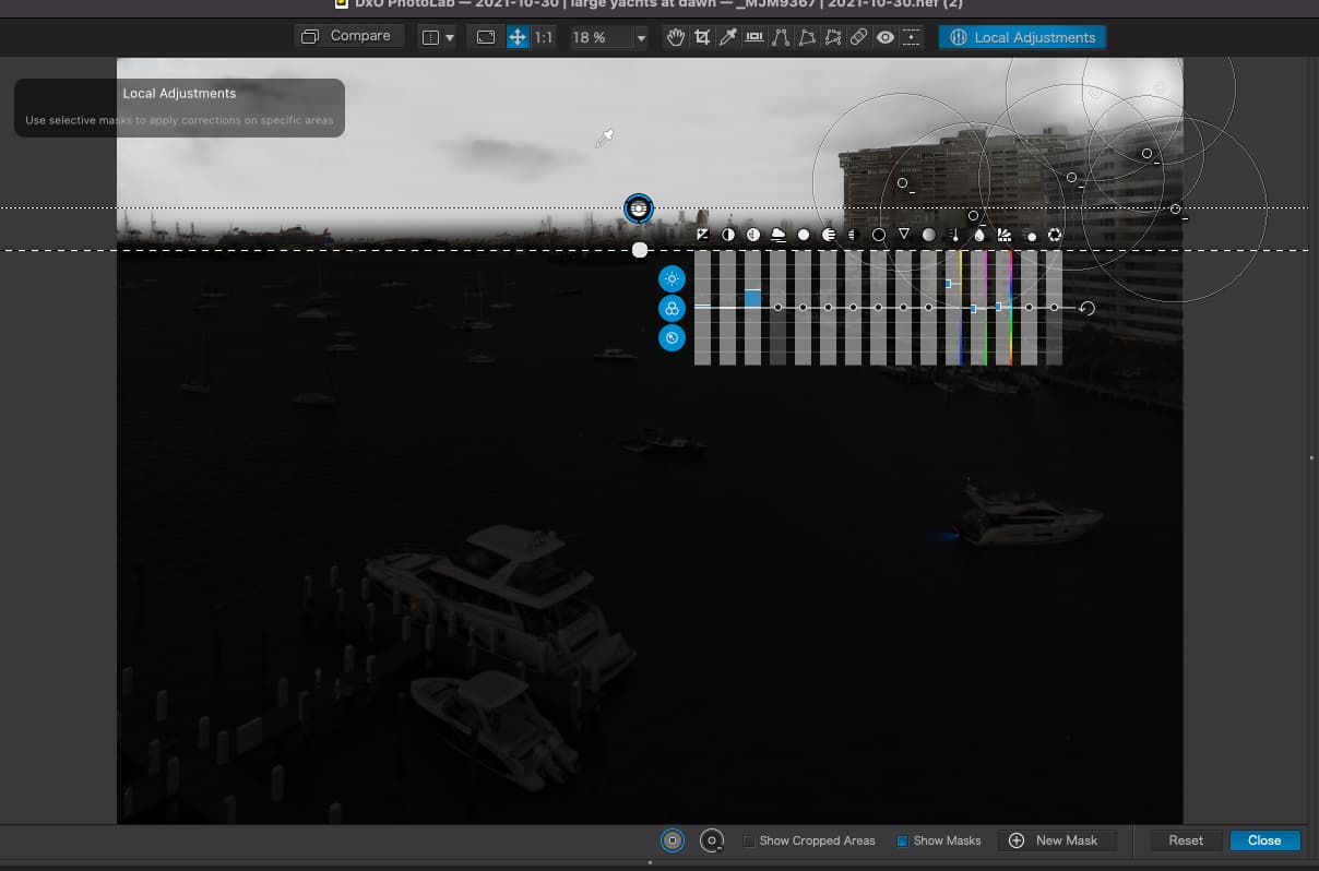
@KameraD – as @Joanna explained, it’s the list of the (partly) renamed Local adjustments,
using the ‘english’ version for this forum 

the ‘german’ version, now with LA active and the last entry in the list Control line - wall darker
mask view of 2 control lines – at the bottom LHS and additionally at 3/4 up towards the right
2 Likes
I’ve only just got around to looking at what you did with this image. I am impressed!
Peter, I like your sense of humor.
Well seriously, let’s see if the author will jump in and do some homework.
@Joanna, thanks for the compliment.
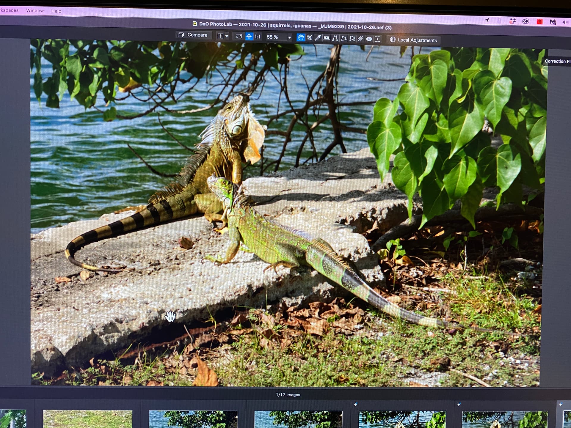
I thought to invest time being an interesting subject.-- It’s a pity he didn’t have the right lens, to see (better) what’s going on and to separate / isolate the animals from the branches.
1 Like
Yesterday was very frustrating - I added the control line much as you did, but at that moment I didn’t realize I could use negative control POINTS to select areas which would not be modified by the control LINE. Now that I see what you’ve done, it’s obvious:
The color of sky/water now seems very natural - in fact, the entire image looks ver natural. Nobody would guess at how much effort went into it. And thinking about this, had I used a view camera, and lowered the front lens, I would have achieved the same result I got by using PL5 to keep parallel lines parallel, so maybe the photojournalist in my can now justify what I did. All the things we’re doing to this image reminds me of how Ansel Adams worked, and he is the person I would most like to emulate - and you are teaching me the how to use the tools I’ve got access to, to achieve what I hope is a similar result.
Understood - use “fine contrast”, not “micro contrast”.
I’m fascinated by your tone curve - I never thought of it the way you’ve shown.
On the same Tone Curve, I see you left my settings of “253” and “3” alone. I did that because PL5 thought I was clipping the highlights and shadows - not very much, but changing those numbers eliminated the problem. Hopefully that was an acceptable “fix”?
Something else I need to consider - if I’ve done something with a dozen adjustments, could I achieve the same result in fewer adjustments? I need to think about this for a long while. I have noticed that when I think I’ve messed up editing an image, and I start all over again at the beginning, it’s easier for me to get to the same end result with fewer adjustments - by starting with the most important adjustments first. By the time I do those, some of my minor adjustments no longer seem necessary.
I don’t know why, but the vertical bar “|” that I use in my file names isn’t there in your file names.
File name on my computer is _MJM9239 | 2021-10-26.nef.dop
Your file name is the same, but there is no vertical bar before the " 2021…"
OK, as you suggested I will save a new virtual copy, and before I do anything else, I want to study your settings.
Thanks!
Wolfgang, I thought I did what you suggested, and now have
“M” for 9239, non cropped
“1” for 9239, my crop, tone curve is straight line
“2” for 9239, my crop, tone curve is straight line
“3” for 9239, your crop, tone curve is straight line.
None of them have any local adjustments. So, I will try to do what you did, speculating on what to do - I must be really messed up, because looking at the “3” VC, I don’t see the need to do anything more!
Added later - like I said, I’m a slow learner. I found all your adjustments listed under “Local Adjustments” at the bottom of the right panel. Now I need to figure out how to make them active again, or are they already active?
Yes, they are - so I’m looking at your finished image. I didn’t know this until just now. So, I can now try to figure out what you did, and why…
Added even later - how did you manage to “auto mask” the two iguanas??? I guess I need to look up “auto mask”.
You certainly are very brilliant at PhotoLab !!!
When I click on the “Compare” tool, I am amazed at the difference!
Trying to understand what you did.
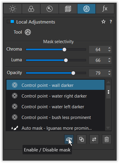
1 - Control point - wall darker:

2 - Control point - water right darker
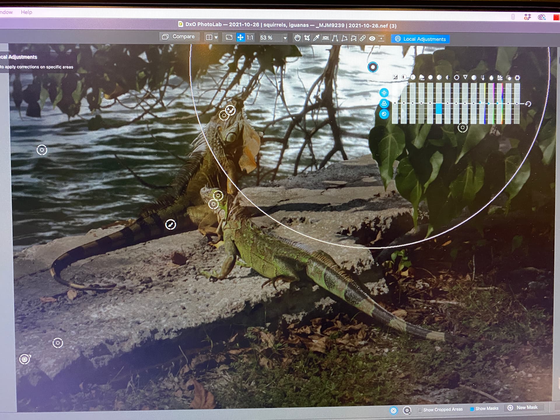
3 - Control point - water left darker
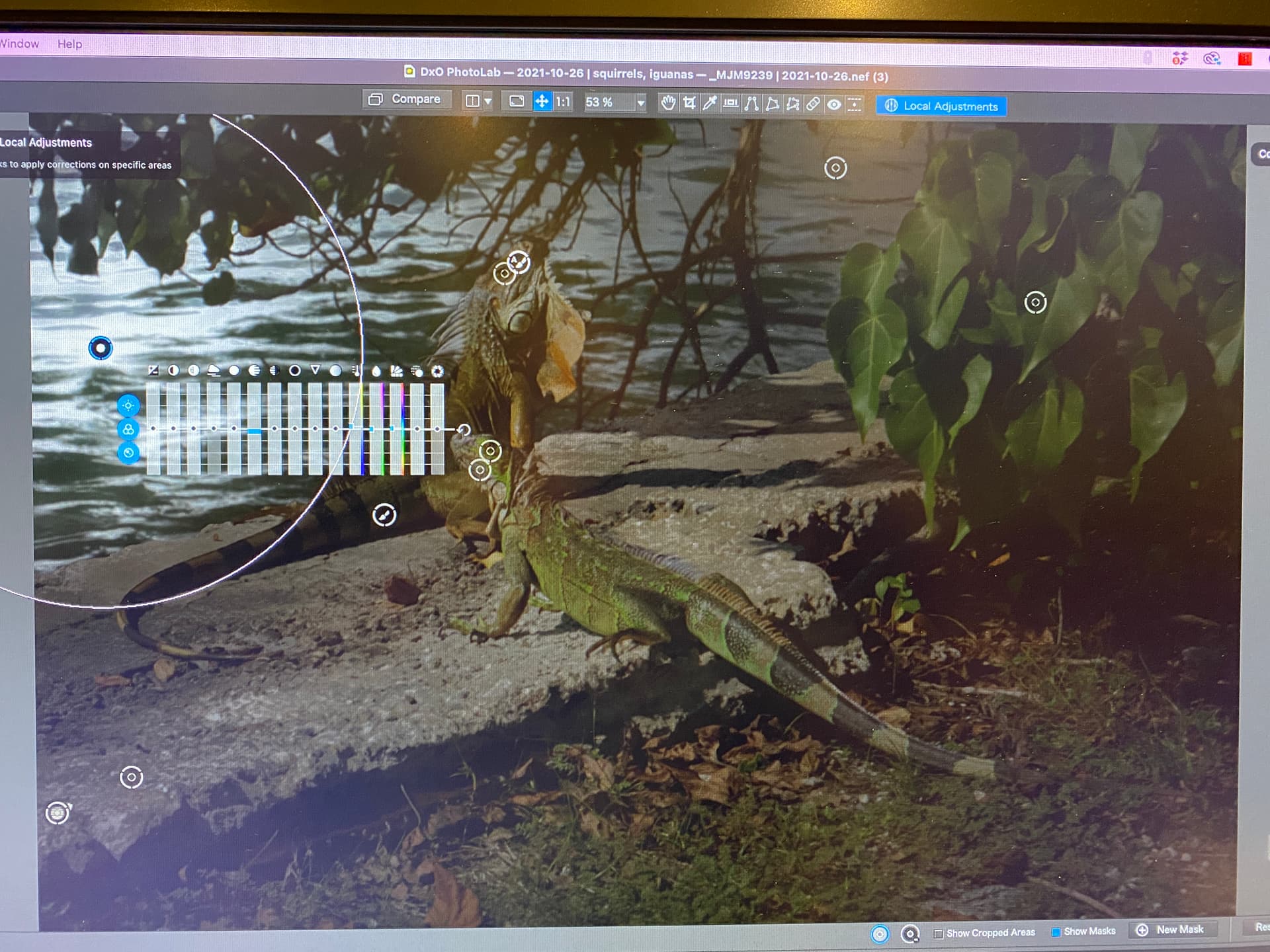
4 - Control point - bush less pronounced

5 - Auto mask - Iguanas more prominent

I think the best way for me to learn this, is to start with a “clean” image, and re-do each of the five steps you have listed. When I see the individual steps like this, as I do now, it does seem logical, but that doesn’t mean I can do it yet on my own!

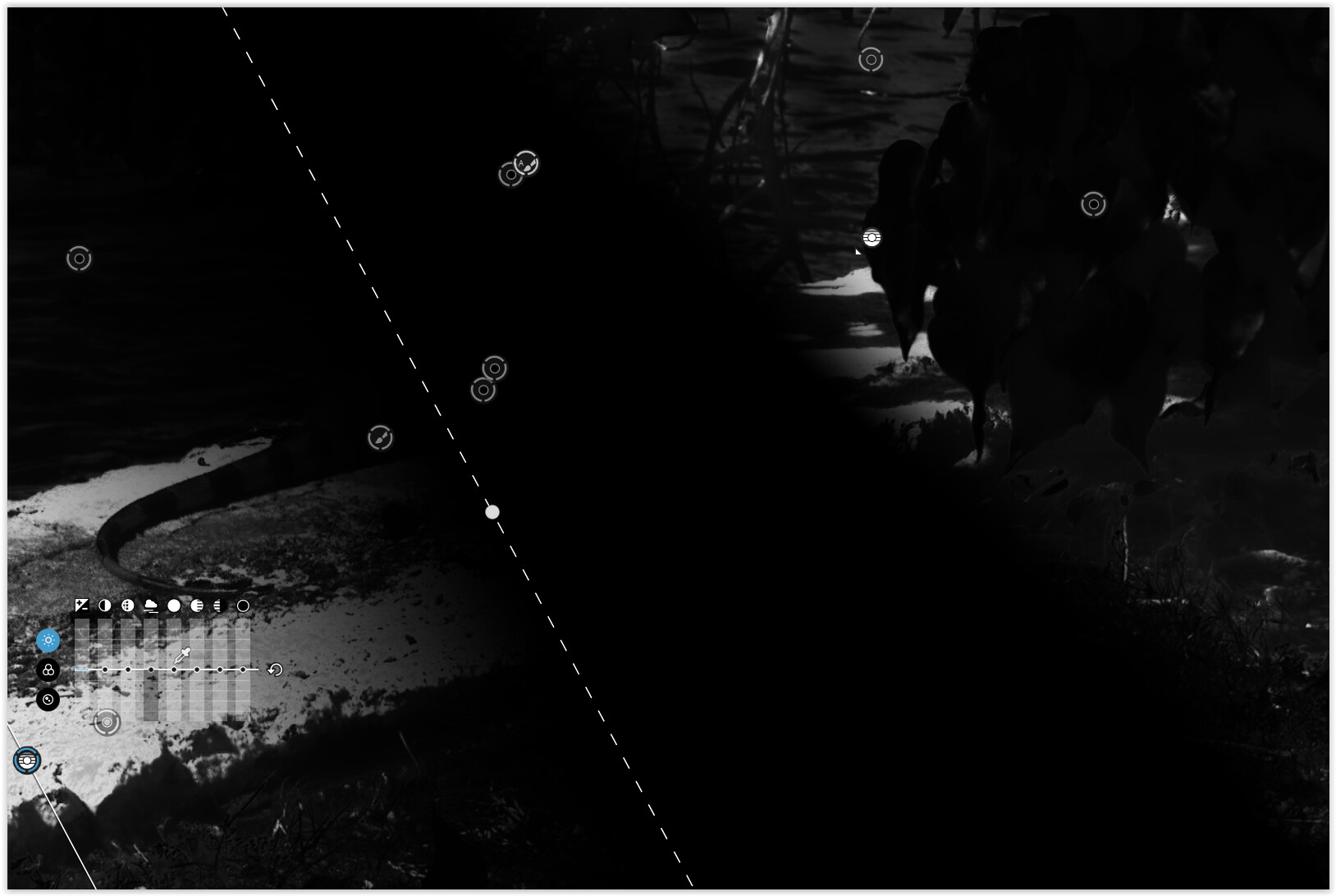
Possibly an easier way to understand what Wolfgang did is to turn on masks. Then you will see which circles are positive and which are negative. Here is the “1 - Control point - wall darker:” control point mask…
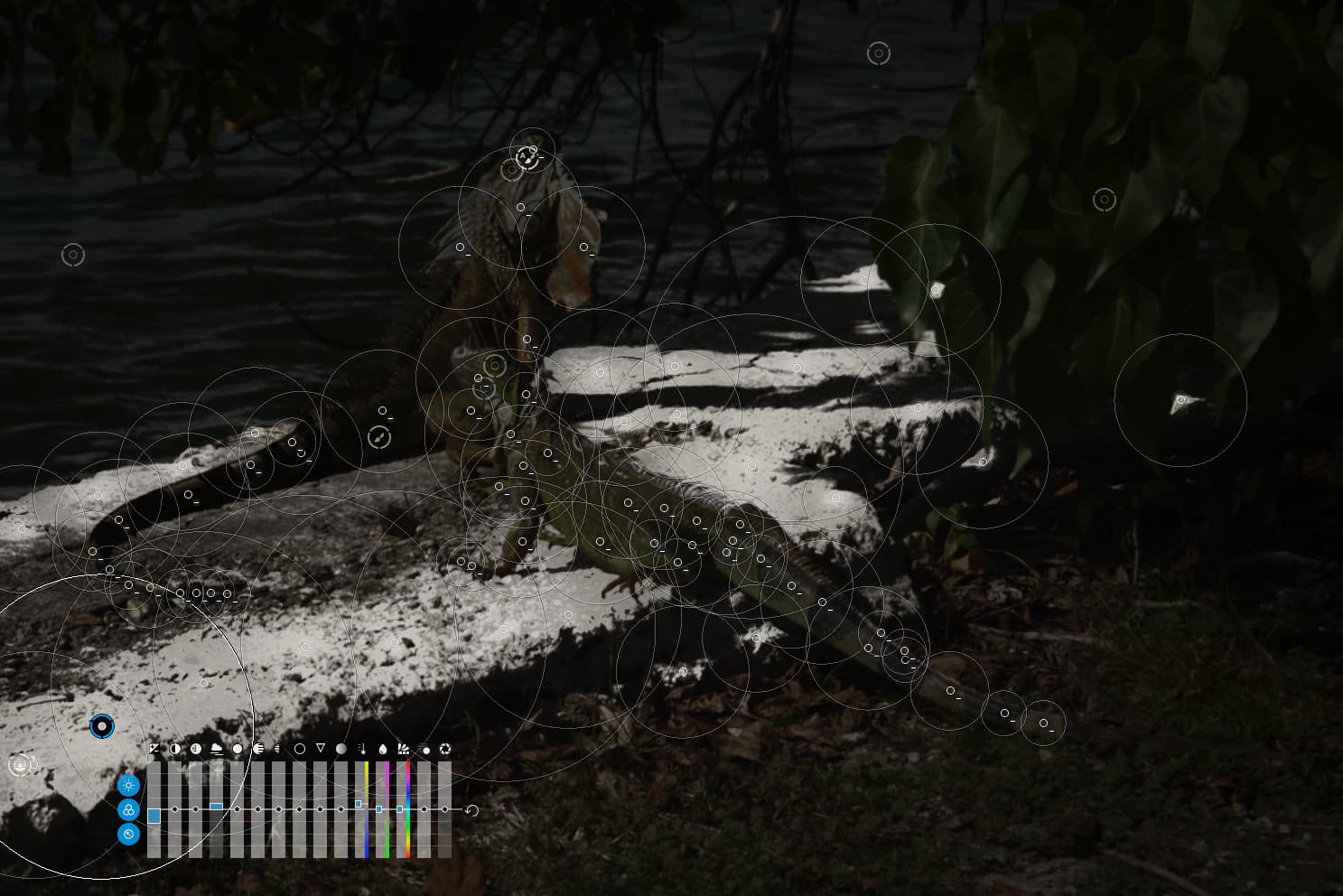
Then you can try deleting some of the negative control points to see the difference they make to the selected area. Here is the “1 - Control point - wall darker:” control point mask with the negative CPs removed…

There doesn’t appear to be much difference visually, but what Wolfgang did by adding these negative points was to protect the Iguanas from getting darker along with the wall. There are so many because each point selects a different tonality on the iguana and adds that to the mask - one point alone will only remove the tone of the skin directly under the point and not the bit of skin next to it which is a different tone.
In the case of these Iguanas, I think Wolfgang’s choice of tool were possibly the best.
But there is another technique you can use for isolating textured subjects against textured backgrounds which, depending on the complexity of the subject, can be easier and more precise.
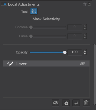
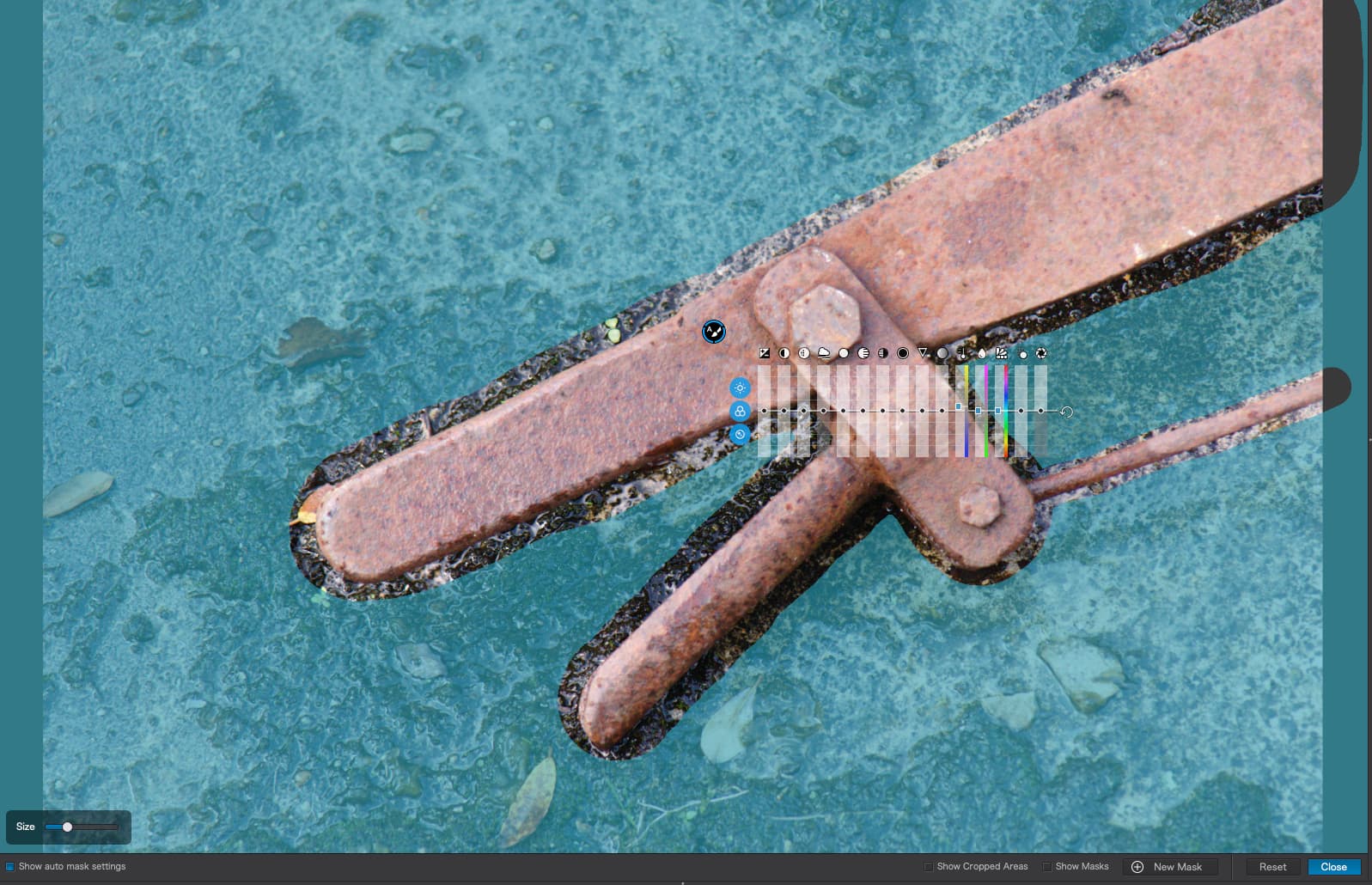
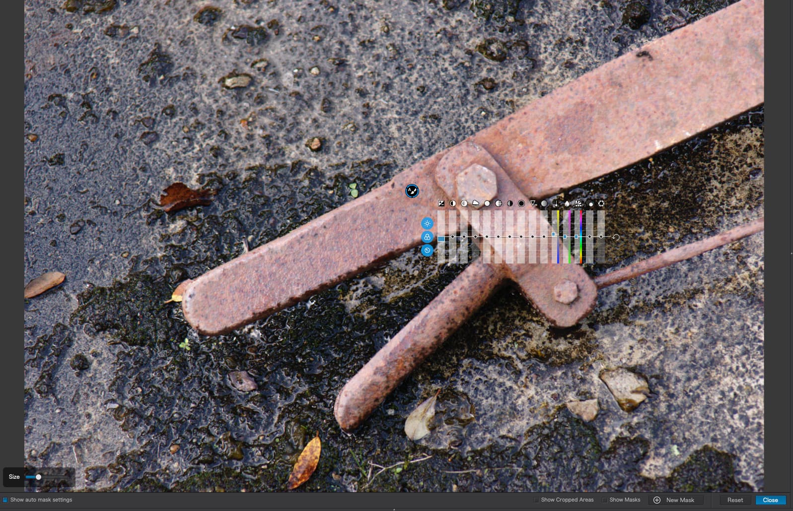
Take this image of a railway signal lever lying on the ground…

In this case, I am going to use the Auto Mask tool. This is like the Brush tool but it detects the edge of the area you are masking…

The inner deeper blue circle must remain inside the edge and the outer circle must cover outside the edge. You can change the size of the tool and also zoom in or out to “scale” the tool against the size of the area you want to mask. Then just “paint” the area so that it is totally covered in the blue mask the tool produces…
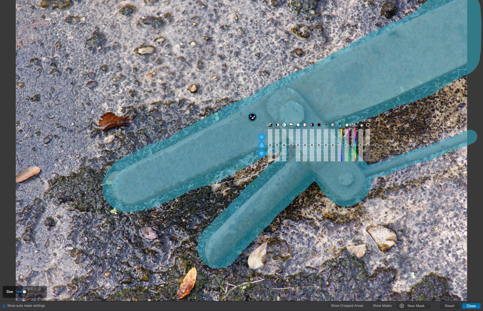
Then I’m, going to lighten the lever…
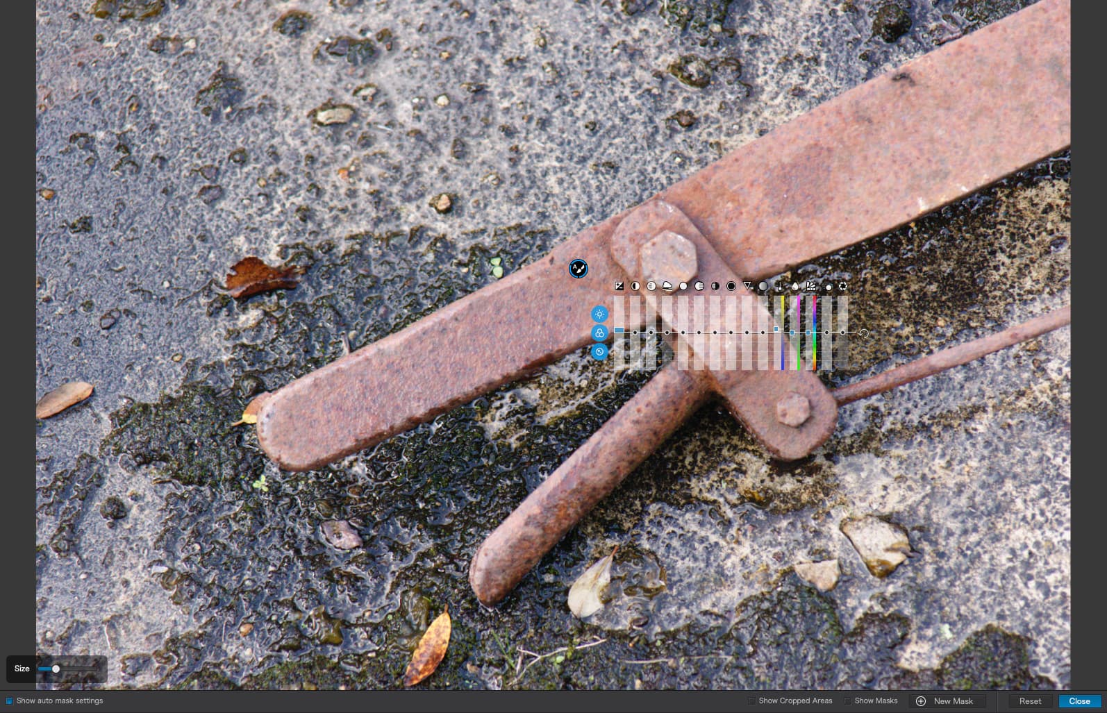
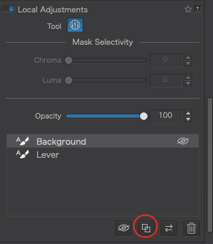
Now, what I want to do is to darken the background. I could do the same thing that I did for the lever, but for the background, but there is an easier way. I go to the local adjustments palette and name the adjustment for the lever…
… then I duplicate it and rename the duplicate…
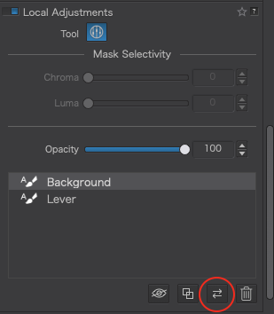
Now I reverse the mask for the background…
Hovering over the background control point in the image now gives me this…
… which I can now darken to give me this…
The difference is subtle, not perfect, but it should give you an idea of what the Auto Mask tool can do in the right circumstances.
1 Like
… to add as I didn’t mention
I used Auto mask for the animals, but cleaned it up before I copied that mask to revert and use it for the background (the rest of the pic).
While in general it isn’t necessary to erase what’s gone ‘overboard’ – that’s the sense of Auto mask – I wanted to make sure … (temporarily press & hold ALT/OPTION to get the eraser)
BTW, to see the result of the corrections (or the mask) without all the ‘circles’, just move the mouse pointer out of the pic.
1 Like
And you did an excellent job, especially around the claws and other finer points. But would you believe I didn’t notice because they had scrolled out of view in the palette and, with all the control points, it was hard to see them in the image 
Anyway, I thought Mike and others might benefit from a quick and dirty tutorial on the technique 
1 Like
Mike, sorry for that. I simply downloaded your files and that’s how they were saved on my side (retried the download, but no idea why the “|” is left out).
I think the best way for me to learn this, is to start with a “clean” image, and re-do each of the five steps you have listed. When I see the individual steps like this, as I do now, it does seem logical, but that doesn’t mean I can do it yet on my own!
Well, to fully experience you might have to do it yourself.
I left the tool names visible and added some description so it’s easier see / realize, which tool you are dealing with. You might want to disable / enable the masks to see the effect.
- “Control point - wall darker” is the most obvious example
- “Auto mask - exterior less prominent” invokes small corrections
Just remember, your screenshoots don’t show the (numeric) correction values. Most of the correction masks (your local adjustments) act on their own, but for a satisfying result they (have to) work together.
As the saying goes “Rome wasn’t built in one day” – take Your time!
This is all good - I don’t want to replicate your “numbers”, just what you were trying to achieve, and the only way it will become part of MY toolbox is to do it on my own, and NOT to blindly copy you.
I want to concentrate on ONE thing at a time. I took some good photos of last night’s sunset, and some interesting photos of Halloween on Lincoln Road in Miami Beach, but I want to do the “iguana photo” before I move on. I expect I’ll need some help - maybe. I very much like your finished version (with the possible exception of the. crop) more than mine, and now that I know what changes are helpful, I need to do them, one at a time.
That’s not the intention – there are always different possible solutions.
When suggesting to disable / enable those existing corrections it’s about to see first
before you start from scratch. – Otherwise there is no ‘need’ to give you an example.
– But hey, you’ll discover on your own!
Hello, It is realy interesting theme and I learned alot from it. Thanks. If you allow me some offtopic comment:
Sunstars or starburst is a purely optical effect that is obtained from the edges between the aperture blades.
Each lens that is closed enough can give such an effect, but each is different depending on the number of blades and the size of the edges between them. The more clearly they stand out in the aperture ring, the more pronounced is the stellar effect. Usually more expensive lenses have more rounded blades and are therefore more difficult to make such a star, but not nesessarily. The other important thing is the number of blades - when it is even - the number of rays is equal to the number of blades, and when it is odd - the number of rays is twice as many.
Personally, I’m still learning to use this effect, but what I’ve found is that the smaller the light source is, the more pronounced is the star. The other key condition for a good star is that the background sould be significantly darker than the light source, so this effect is most easily obtained when the sun shines through a small gap between objects.
There are a lot of articles on Google on the subject that can be useful to you for example this, but experimentation is the main way to master this technique, and you should be careful with the Sun - not to burn your eyes or the matrix anyway. I think it is safer to experiment with lamps at night.
Very, very true! To be able to achieve what you did, I think it will be VERY helpful to understand what you did, and how it worked. Lots of learning, just as I do with Joanna, but then I need to create a “blank slate” and start from the beginning. I’m already way ahead, as you “see” things I didn’t. I’m much better at “seeing” other people’s photos, as when I view my own, I’m too likely to accept them the way they are, and less likely to change things. I used to squint my eyes, and look for “shapes”, and then adjust, without being lost in the details.
It also bothers me that the photo I posted reminds me of what I actually saw. Your version is better than what I saw, and what the camera captured, but sometimes it’s difficult for me to think “hey, how can I improve this?” My window of potential improvements is 100 times more powerful than before, but my brain “accepts” what I did, and struggles to find improvements. In retrospect though, your image is what I “imagined” as I took the photo, and is not an exact copy of the image created on the sensor. You and Joanna are both SO, SO much better at this than I am capable of being - I need to correct that, and be much more critical of the images I capture.
And very importantly, I need to understand, and know when and how to use all the new tools I have at my disposal, and how to do this correctly, not blindly. I used to love “ClearView” until I realized how terrible it made my images look.
The “pipe” sign is often used in command line interfaces (terminals) to concatenate multiple commands. Some systems consider the pipe to be a special character that cannot be used in file names. I don’t use it in filenames.
Good show,
Two things to add.
1 first click on a shape takes a sample of the colorbrightness. I am fairly sure it’s autoselection is luminance based. So not color based. But i could be wrong.
So a edge by luminance difference of the object and the surrounding is key for a clean selection.
2 one big drawback is the autoselection field, outer ring does have the same blue masking so you don’t see the selection properly unless you use desaturarion or exposure to light up the painted object.
And with reverse mask you get a gab. Which is the automask area.
I would like to have a “clean autoselection field” button so only the mask is over the selection area.
Now i use ALT to get eraser and clean it my self, much more work. 