Editing high dynamic range images in PhotoLab 5

I’ve known about the “golden hour” since long before I heard those words, but I don’t remember ever reading about a “blue hour”. What is it, and what makes it special?

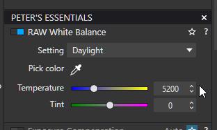
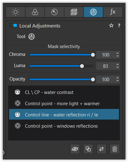
Because of Joanna’s suggestion, I have set all my cameras to 5600K, and RAW, and I used to think that when shooting in the golden hour, I should play with the white balance to make this more obvious, but I think what it’s really doing is making the camera “see” what I felt I saw with my own eyes. I’m not very good at this, and for much of my life, I never paid much attention to it. I started using it for real in India, and it’s probably from all the dust in the air that the world started to look overly “golden”. My favorite outdoor temple photos were from when the sky was just starting to get really dark, a deep blue color, but before the sky turned black. The low-level golden lighting just added so much more to the photos. I realized I had between five and ten minutes to take the photos - anything earlier or later lost the effect I wanted. This means being all set up ahead of time, waiting for just the right timing, and shoot. I’m no expert, but with trial and error, I soon found out what worked best for me.

Nowadays I find my favorite photos are from early morning or early evening, when the sun is low on the horizon.

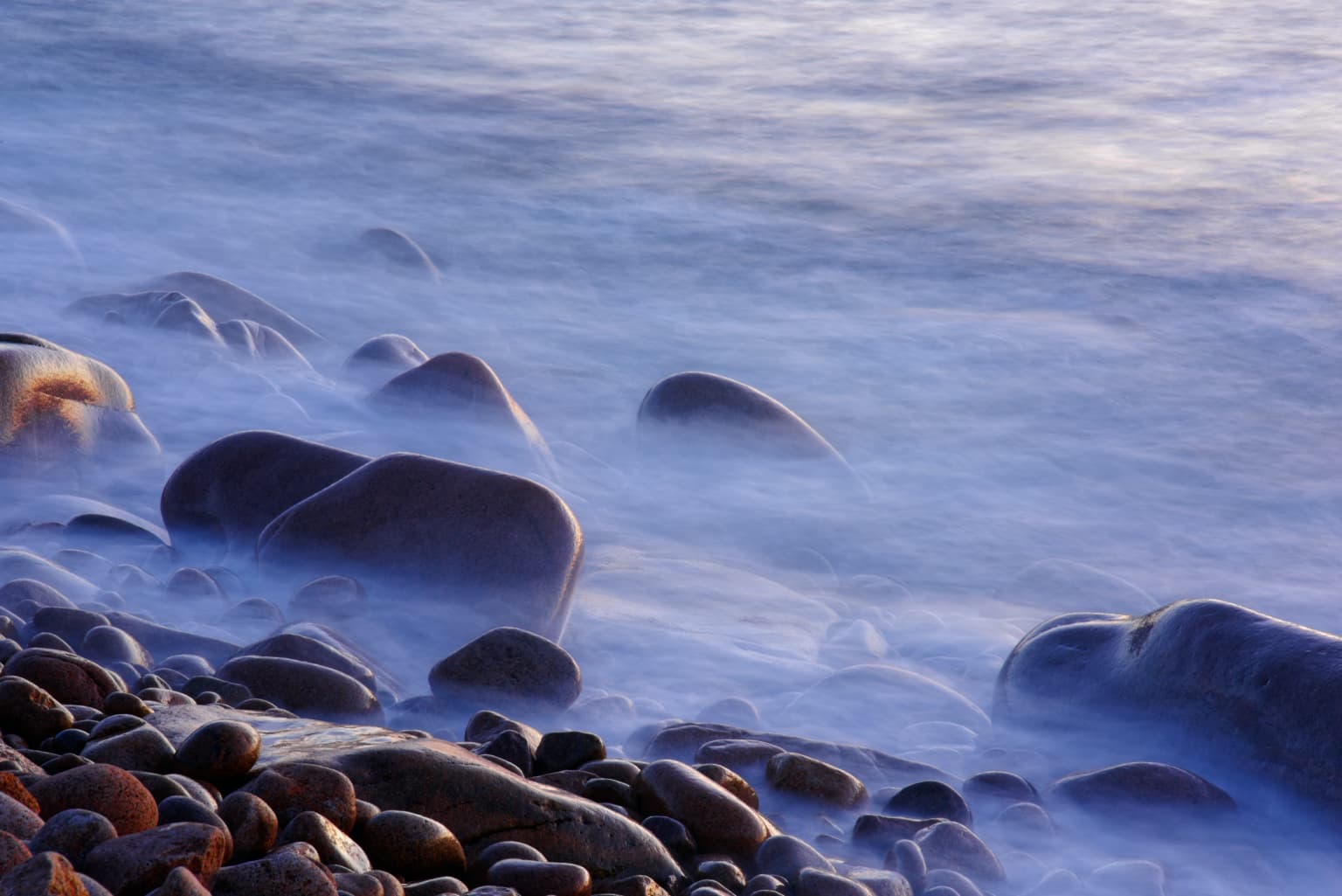
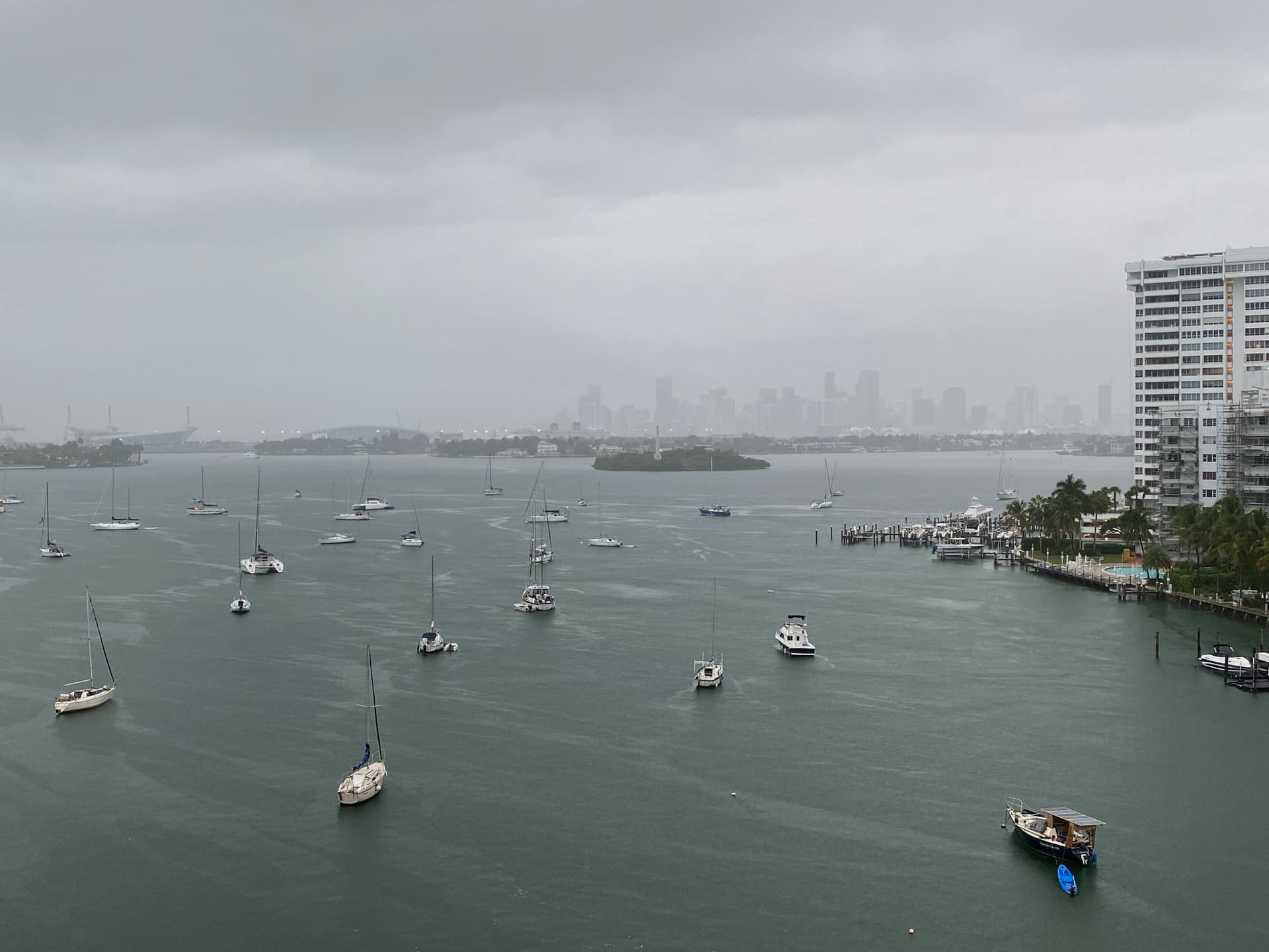
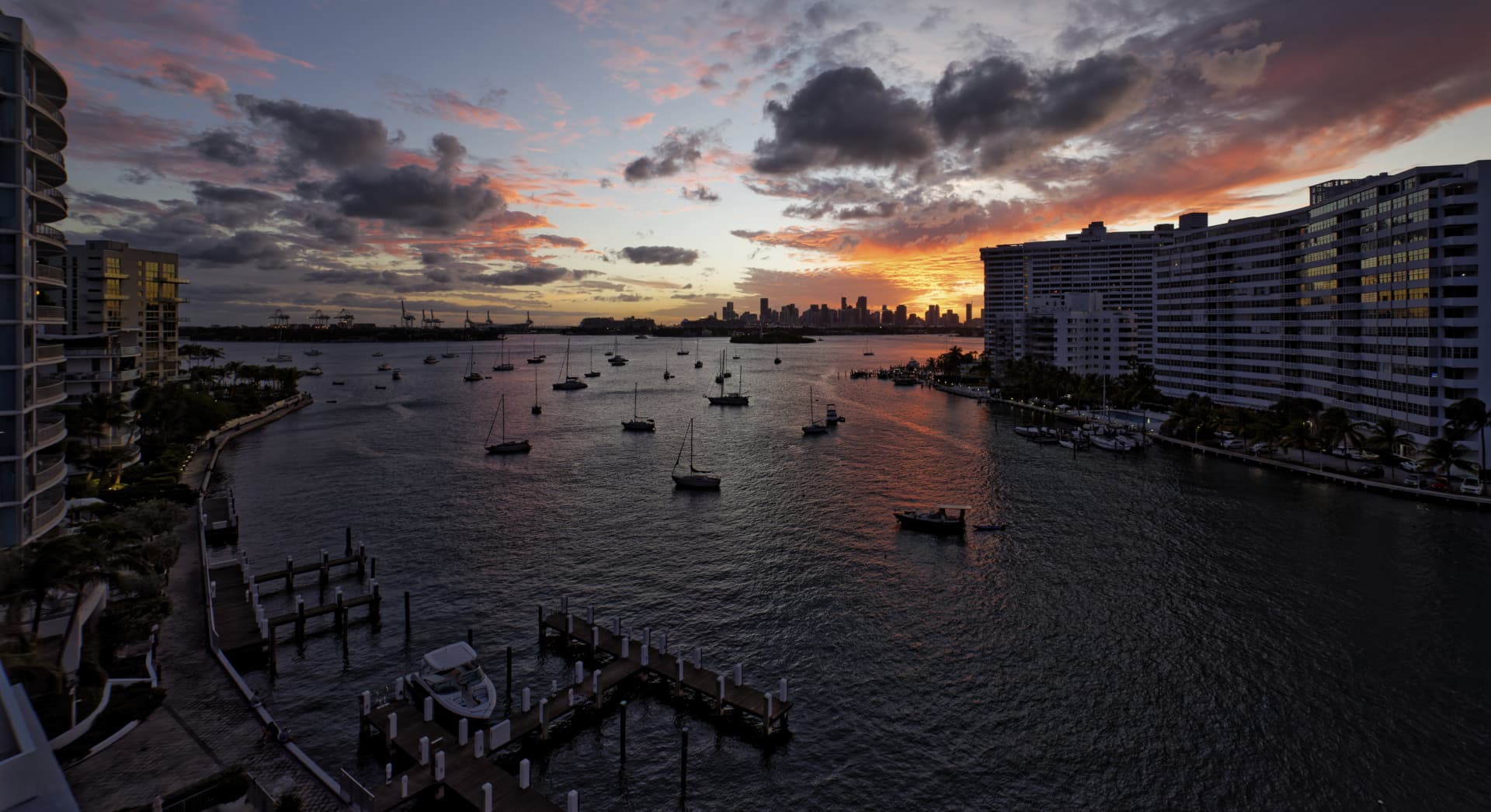
Anyway, can you please post a photo taken in “blue hour” so I can understand what you mean?

Just set WB and never change it. WB settings don’t change what your sensor sees. They just change how the shot will look while chimping or before being processed in DPL. WB will also define the looks of out-of-camera JPEGs - if you care to keep them…

I suspect this is where “Golden Hour” came from, as back then, we were all shooting film, and the lighting changed, it was obvious when we viewed our prints. Of course back then, there was “daylight film” and “tungsten film” because of the change in the lighting.

Nobody’s aware of this nowadays, as most people set their camera to AWB, Automatic White Balance, and never realize what’s going on.

It’s one more bit of advice I got from Joanna, even though at the time I wondered how it would work for me. As you wrote, the camera will record whatever the sensor “saw”. Makes me wonder what I’m seeing on my LCD screen, since I have AWB turned off, and the camera is now “seeing” at 5600K. If I’m shooting RAW, would it matter if I set the WB to some strange, goofy number? One of these days I’ll have to verify that - but it shouldn’t.

On the other hand, since the LCD screen and the histogram will vary based on the color of the light, why would I not want to leave my camera set to AWB, if for no other reason than to possibly make the histogram more “accurate” based on the lighting? Maybe this is why I’m likely to get a different exposure metering when I use a viewfinder, compared to when I use “Live View”.

Unless/until I know differently, I’m going to just leave my white balance set at 5600, with the camera permanently set to RAW only.

The histogram varies with what you set as WB. Unless you set it to UniWB, the histogram will reflect the preview rather than what the sensor recorded. I’d not think of the histogram as a precise measuring tool, but as an opinion of someone more or less well informed…

Don’t forget:WB is a correction factor to correct a non-white light source. Mostly we want to correct that non-white light but not with sun down/rise. We want to keep that feeling.

George

1 Like

@GIBF4 & all-- about Control lines

Hi Jeroen,
as you have been working on this pic your ‘old’ way, you might be interested how to in PL5 …

_MJM9746 2021-11-16.nef.dop (57,2 KB)

M = masterfile (from post #303 / with optical corrections)
VC1 = Mike Myers
VC2 = Wolfgang (2nd Control line to extend sampling range)
VC3 = Wolfgang (2 Control lines to extend sampling range)

Choose the COMPARE MODE

  • to compare different versions instantly
    (w/o recalculating; also not side by side …)
  • and keep the pic ‘in position’ with Local Adjustments activated
    (w/o jumping around because of crop)

While I wanted the big block on the right to ‘get out’ of the pic, I decided to crop the sky down
to about 1/3 and let the water mirror its beautiful colour, enhancing the strong perspective.

After correcting perspective (temporarily lighten to …) I set the Spot Weighted box here right onto the sun and the second one somewhere at the bottom right, cropped to taste, moved the second Spot Weighted box around to get the ‘right’ amount of visibility in the water and played with global Contrast / Shadows.

Control the range of the Local Adjustments with MASK VIEW [M]

To bring more attention to the buildings and the water I used a Control line / ClearViewPlus (excluding the sky w/ CPs). A big Control point on the main reflection with a little light and a tiny bit of warmth helped to guide the viewers eye. Then I brought up the reddish reflection on the right and with a 2nd Control line the one on the left.

  • in VC2 both CLs use the same settings, but different pipettes to extend the sampled range
  • in VC3 I simply duplicated the CL and only moved the new pipette as in VC2

Lastly I enhanced the vibrancy in the reflecting windows on both sides.

To finalize (balance out) the pic, I revisited several steps ( and experimented with VC3 ). :slight_smile:

have fun

wiki: The golden hour, also called the magic hour, is a term from photography that indicates the short period after sunrise or before sunset when there is more indirect sunlight, making the light more red and softer. Because the sun is on the horizon, the light travels a longer distance through the atmosphere.

golden as in The Best Time To shoot soft light. (small DR and soft shadows) And yes also as in warm glow mostly.

Blue hour is next to golden hour twice a day.

Those red dark blueisch image of above is the “twilight zone between golden en blue hour.”
and it’s not always an hour too, depends on the place you are: the further from the equator, north or south from the equator, the longer the golden “hour” and blue “hour” is.

the discusion of fixed WB or just AWB is based on which point of view you have on the previewbefore shot (on LCD is a processed sensor image with WB) and aftershot view in LCD( the rawfile’s onboard jpg or ooc-jpeg).
Fixed: it takes every color of light as it is and even as your brain correct it when you look with your eye’s , you see every colorcast or direct lightcolor back in your ooc-jpeg and preview.
for landscape photography could that be a plus. Which always are slow and careful taken, prepared i mean. So you can shoot and reschoot after examination, use Live Preview-mode to wait for just the right time of falling light/newlight. (midday shooting is only in landscape photography when you can’t avoid it or justy want to show the hars dessert sunburning deadly daytime… :wink: )

AWB: sport and every other point, quick AF, frame, click. and indoors with all kinds of lights and light temps i think i would lean also on AWB.

This is also a good place to be for colortemps

1 Like

I need to remember this from now on. I know, and mostly knew, you are right, but when I’m taking a photo, and viewing the histogram, I’ve been paying too much attention to it. I will go back to what I’ve learned here, and any in-camera histogram I will consider as a rough estimate, no more.

I guess there are other exceptions, like the photo Helen took of a village street with lots of street lights in the photo, some with globes around them, and the image was tinted a “tan” color to make it look more realistic, with the streetlights illuminating the scene. Until now, if I took a photo like that, I might have adjusted the WB to look more like “white” light, but what she captured, edited the way she did, it looked far more realistic because of the color of the lights. One more thing I need to remember for the future…

I was so disappointed when taking this series of photos. I like the way you removed “excess” stuff, and kept the heart of the photo. I liked the processing before, and I like your processing even more, but I still don’t like the photo. While taking the photo, I was tempted to remove the 14mm lens and use my 80-200 instead, but I convinced myself I could try that the “next” day… but it’s been several days now, and Miami has been more or less cloudy every day, getting worse (for me), not better.

Simplified, even now, with your new view, when I stare at this photo, my eye doesn’t know “where” to go. There is too much to see. You reinforced my thought that photos get better by EXCLUDING things that are not needed, even more so than by INCLUDING more things.

Oops, when I download your images for .dop I need to always remember to add the vertical bar, so the file name becomes:

_MJM(file number) (space vertical-bar space) year-month-day new.dop

I wonder if anyone with a Windows computer does not get to see the “vertical bar”. The reason I like the vertical bar, is because it makes my photos look more “organized”:

Screen Shot 2021-11-18 at 11.26.53

to explain the way smart lighting works;
i have it set up as default face detection because without a “box” it works just like the centerweighted version.(fitting a rawfiles DR in a jpeg) (in in the first section of the clip how i switch without a change in the image)
the clip shows how i use smartlighting to set a pin in the brightest part of the image and then just adjust the image for the shadowed part until i am satisfied or the blinkies shows that 25% isn’t enough anymore, then i turn to highlight controll and balance some more. after that i use locals for finalising.
(push some shadow blue out so to speak to get the overal colors warmer.

example movie

i kept it realistic as my eye would see it.

next the two box way in highlight and shadow as in setting brightpoint and darkpoint, not white and black!
you will see that it is difficult to get a natural look because you push the contrast and saturation out the image when you raise the slider in smartlighting.

examplevideo 2

So when do you use bright and shadow boxing?
when the image is already inside the “photograpic DR” of the preview and you like to lift shadows a bit and saturate and contrast raising. the boxes hold the borders of the DR of the image inside the perimeters/borders . So it helps you to play within the posibilities of the image.
example 3

so i almost NEVER touch 25% to raise it only lower in smartlighting.
i use it as a “pinpoint system” let the smart part work but not too hars. subtle so i can work around it.

easy right?

Peter

1 Like

Now this shot was definitely taken in the Blue Hour. 5 seconds @ f/29 ISO 64 because I didn’t have my ND filters with me…

The rocks look bright red because they are “granit rose” (pink granite) and they reflect low sun light very strongly.

1 Like

That’s amazing! There is a “line” beyond which the water changes from blue to gray - very strange! Is “Blue Hour” just after “Golden Hour” in the evening (and presumably before it, in the morning)?

I imagine I’ve seen this, but never understood it, or even heard about it. I’ll pay more attention from now on.

This is due to all the waves breaking during the long exposure. What you are seeing is blurred surf, as is all the mistiness around the foreground rocks.

That’s right.

Curious, the camera obviously saw the “blue”, but did you see and notice it with your eyes? If so, maybe if I had been paying more attention in India, I’d have noticed it too. From now on, when “Golden Hour” ends, I’ll try to notice this. I don’t think my eyes do a very good job of “sensing” the color around me, other than the Golden Hour which sometimes is very intense.

Most likely I did “notice” it in earlier images, but didn’t recognize what it was, and maybe corrected the image until it looked “right” to me.

(I’m not doing anything much with my camera today, as it was raining for most of yesterday, and again today, and right now, if I aim my camera at Miami, all the buildings are invisible! I just went as far out onto my balcony as I could, to document it.)

Absolutely. But my guess is where you live, there is far too much light pollution to notice it, with all sorts of coloured lights from the city reflecting on the sky.

One of the reasons I always stick to 5600°K is because I then know what I see in the preview JPEG is what is actually there in relation to “daylight”. Then, if I want, I can alter the mood in PL.

Of course, there are some times when shutter speed choices are limited :wink:

But it still needed a touch of PL magic to bring out the detail in the surf.

Hmm, I never thought of it that way before, but now that you’ve mentioned it, it makes perfect sense, and if I see color there it’s “real”. All my cameras are set to 5600K, or as close to it as I can get. …yes, about the light pollution.

By the way, this is from my iPhone, after the rain had stopped, and the city started to re-appear out of the fog. No editing, no nothing.

I took photos earlier with my D750, but in those the sky was darker and the city was invisible.

Nice, the way you brought out all the excitement - can I assume you were on shore, with a gigantic telephoto lens made for astrophotography? (Nobody could pay me enough to get me to try that!!!)

Tryed this but ended up sith lots of extra work in afterwards WB calibrating.
So i reversed it.
I shoot AWB but use in photolab a preset with 5600 0 and all auto modes who alter tonality like microcontrast and such (the blue wants) off.
If i want to know what’s recorded i use that one in post.

But yes when you have time like when you wait for sunset the it’s better to go to manual WB in order to preview on LCD the mood.

But when using PL you should use 5400.

George

wb daylight
funny it’s 5200k in pl. :wink:
i found 5600 - 0 as good reverence.

Peter

Yes, but I found out that 5400/0 is the temperature to which PL is correcting the light. That doesn’t have to be the daylight. It’s not hard sience.

George