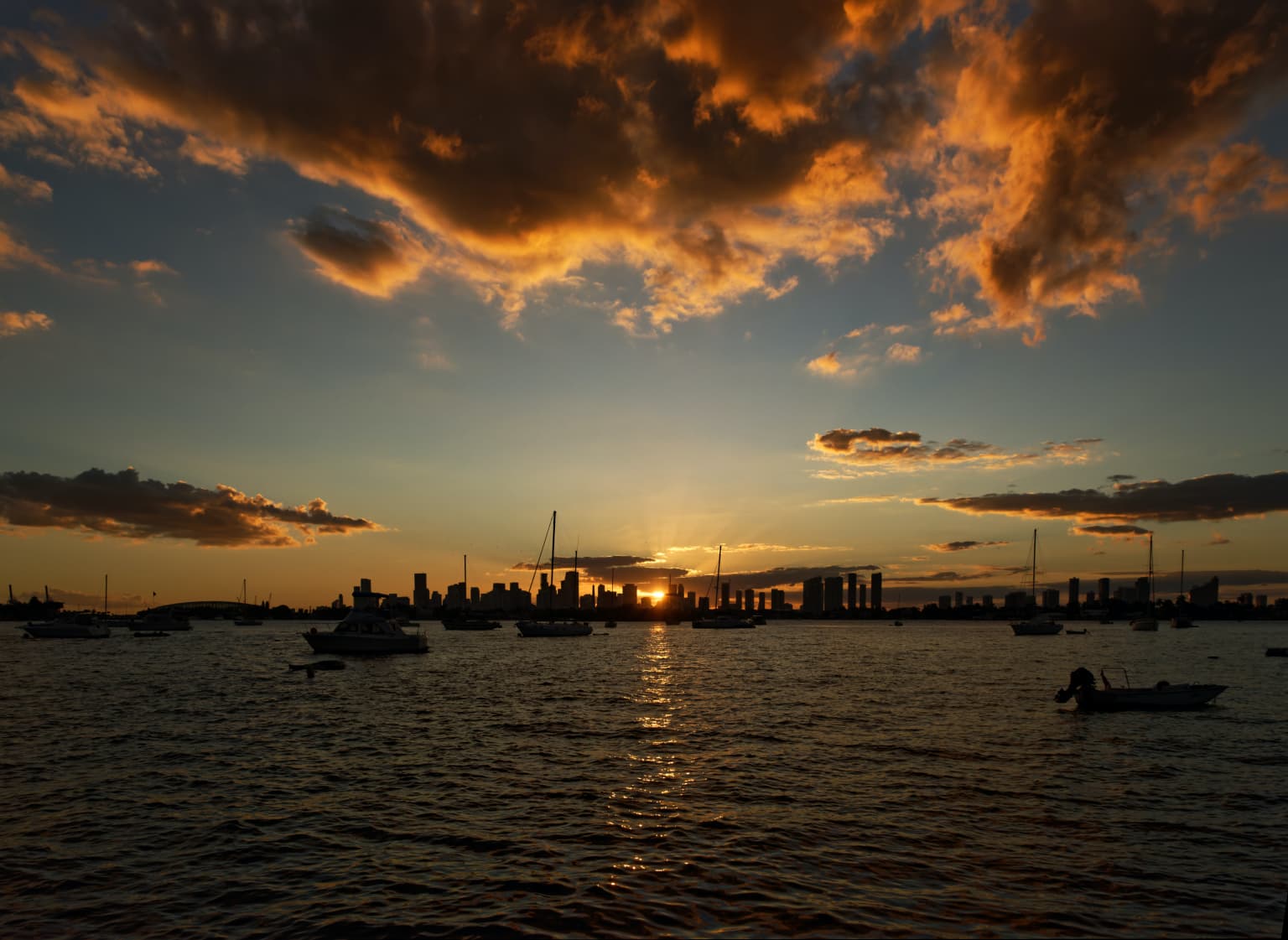
Don’t you see the halo?
Be very careful when you use Microcontrast. You also got a choppy sea and the pic looks overcooked.
Don’t you see the halo?
Be very careful when you use Microcontrast. You also got a choppy sea and the pic looks overcooked.
I think I may have made a mistake - now I’m confused. This is what I wrote about my image compared to yours…
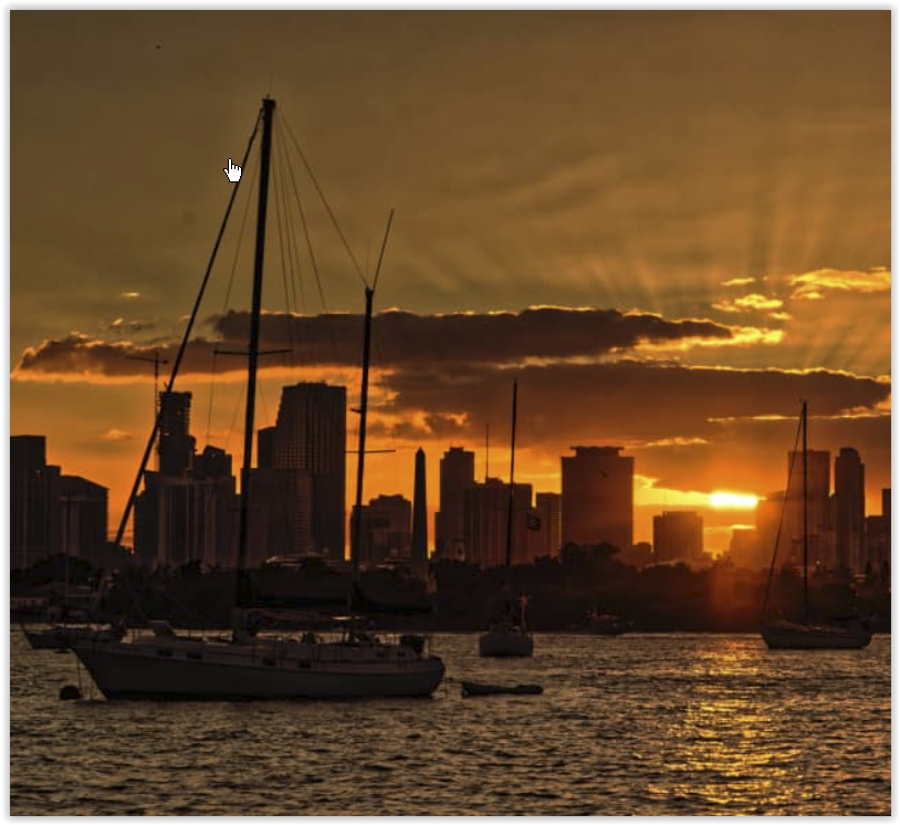
I got an email from my nephew, who is an architect. His question, simplified, was whether my image was real or Photoshopped.
I liked the way I got all that detail out of the sky, but I don’t like that people may feel it was “photoshopped”, meaning fake.
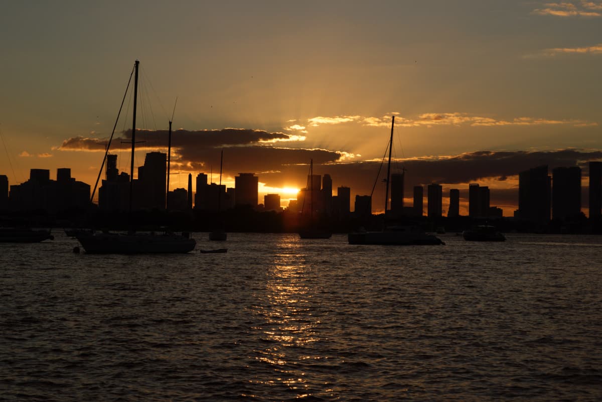
Wolfgang, this is a completely un-edited un-anything copy of the photo that I took seconds after the one I edited:
I agree with you - From now on, I will be careful NOT to edit the water. It does look more realistic in the un-edited photo.
How about the sky? Was I “wrong” to make the sunbeams so obvious? Maybe I over-did it?
Of course, that could lead to why the buildings are seen so clearly in the edited images, but in the un-edited image I just posted, they are all black silhouettes in front of a colorful sky.
How much editing is “just right”, and when does it become “too much”?
I’m beginning to think that I crossed that line, and Joanna stopped short of crossing it.
Mike, I got since long that you wanted to show the sunbeams, which for sure is a nice additon to the sunset!
Just don’t use Microcontrast (at least not that much) for the sky. Sky (air) doesn’t have texture at all.
I know, some people like to enhance clouds and stuff (I don’t), but try Fine Contrast w/ it’s additional setting for it.
Otherwise I didn’t want to comment – it’s your picture and you decide how to present it. 
Personally, I prefer to frame the shot at whatever vertical angle it takes and then adjust it using perspective corrections in PhotoLab after, not forgetting to allow room for the inevitable crop after the perspective correction.
I deliberately removed all adjustments and just took a screenshot of the image in PL with the exposure warnings on. It looks severe but, in fact, if it only takes 2 or 3 points in the tone curve to get rid of them, it’s nothing to worry about as the indicators can sometimes be too sensitive, especially when dealing with heavily saturated colours.
Stop fretting! You got a very good exposure the worked well in PhotoLab. That’s what counts.
The pipette isn’t there for changing appearance, but for selecting the area to change. Once you have the selection right, then you can hide the mask and start making adjustments.
You need to start by showing the mask then adjusting the selectivity to get the area that you want to change as white as possible, and it is important that the pipette goes in the area the you want to change.
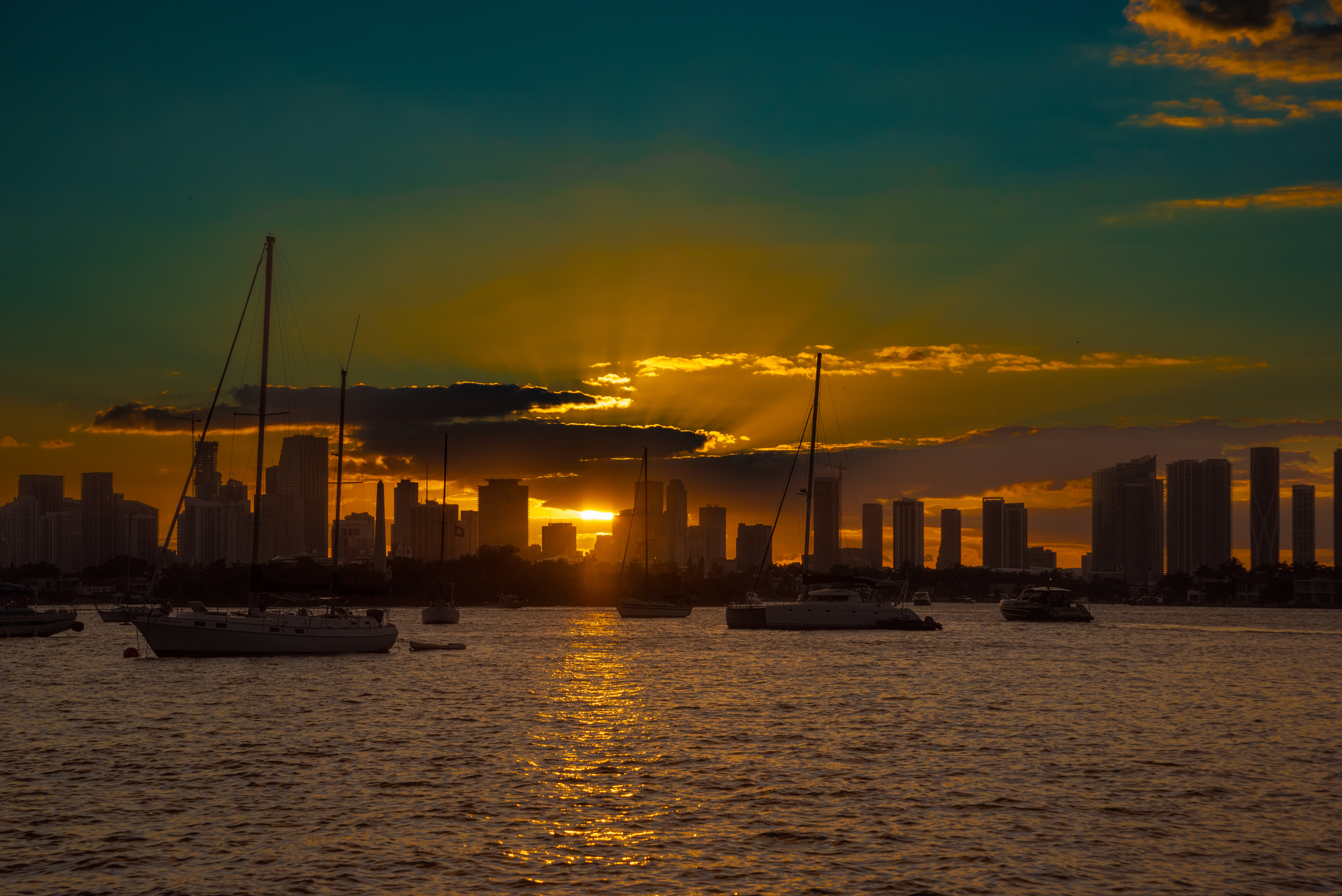
Mike, your crepuscular rays are clearer but I wouldn’t like to print your version too large because, as Wolfgang says, too much Microcontrast doesn’t do an image any favours when you want smooth skies of smoother water.
Yours at 100%
Mine at 100%
Yes, it’s a compromise and as I mentioned earlier, you are the one who didn’t like the “photoshopped” look 
Well, you can truthfully say it wasn’t Photoshopped  And it isn’t faked, just a tad overcooked, that’s all.
It’s a very fine line between not enough and too much. It just takes practice and practice and, did I say, practice.
…you forgot another practice
Just another version, this time done in Lightroom Classic with its new mask tool for the sky and a reverse mask for the non-sky parts.
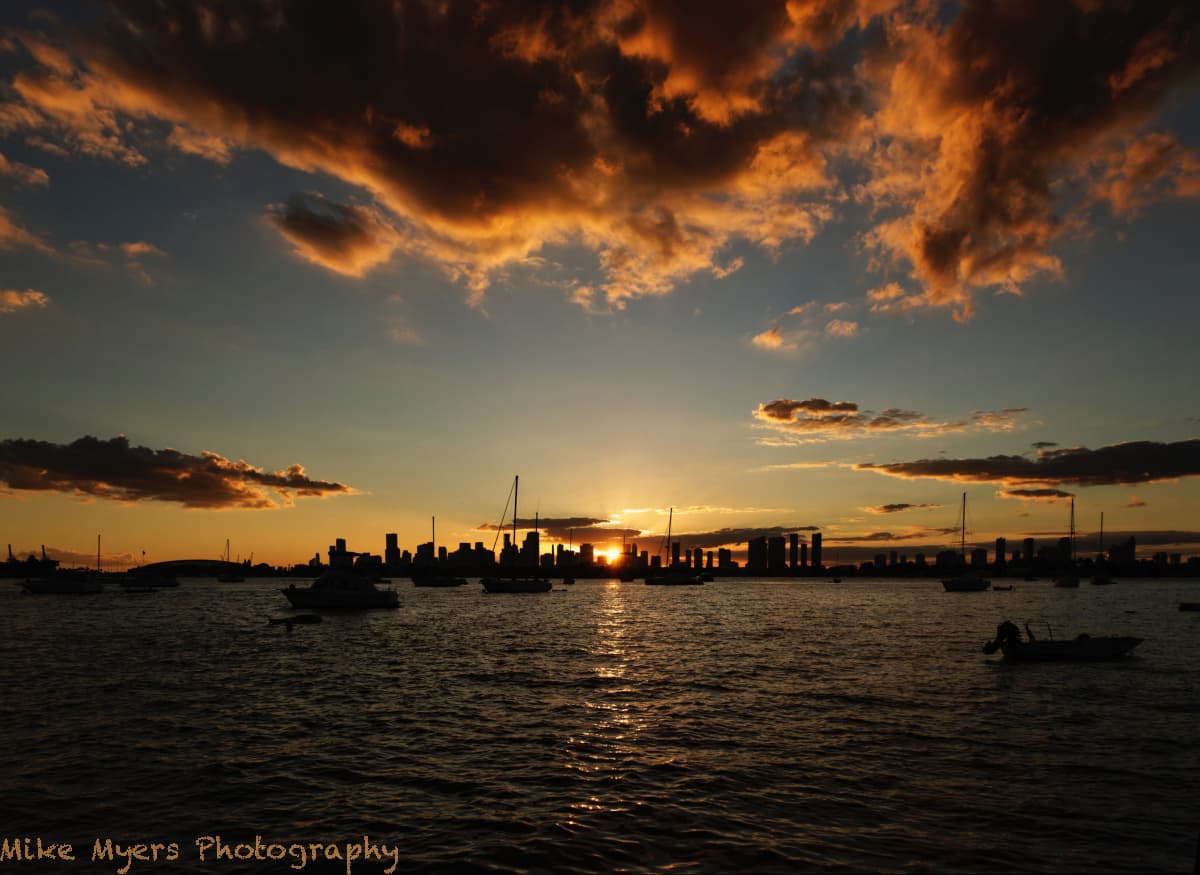
This photo was taken slightly later, but I switched to 24mm. I think the horizon is now flat, and the “Force Parallel” tool now has the buildings standing straight up. I used Exposure Compensation, setting it at 1.67, which got the Histogram centered better. I lost the sun rays, but gained more clouds. I used Fine Contrast, so the water hopefully still looks natural. I worked with the Tone Curve until things looked nice to me, and my “Clipping Warnings” remained off. I crossed my fingers and selected DeepPRIME which worked with no problem. I adjusted White Balance to just slightly warmer, 5819K. I tried to increase Vibrancy, but the Clipping Warnings came back on - I finally left it at -4.
Overall, I like this view because of the clouds, now lit up by the Sunset, but the SunRays are barely visible.
_MJM9480 | 2021-10-31.nef (25.6 MB)
_MJM9480 | 2021-10-31.nef.dop (14.0 KB)
To me, it’s pretty, but I prefer the closer-in view with the SunRays. It is more, well, exciting. But this proves Wolfgang is right, the water is definitely better in this view, and no longer looks “processed”. One more lesson learned.
Not bad at all but “could do better”
The crepuscular rays are there to be had, it just required a bit more jiggery-pokery with Control Lines and a Control Point to get them to be more obvious…
And I wondered if a more panoramic crop might focus better on the sunset rather than the empty water in the foreground?
Here’s the DOP - yours M - mine same crop VC1 - mine panoramic crop VC2
_MJM9480 | 2021-10-31.nef.dop (46,9 Ko)
Waddya think?
Hi Joanna, I am following your discussion in order to learn. There seems to be sort of a “.dop versioning” but I do not find it (WIN) I’d be happy to get advice. Thanks.
I don’t especially like this photo, as the “interesting part” is now so tiny
About the crop - in my version, almost everything in the image draws people’s eyes right to the sun - the clouds, the reflection, the city skyline. I like that, but perhaps I should have put the “horizon” only 1/3 up into the photo by cropping.
In your cropped version, my eye isn’t sure what to do - it’s almost like I’m being drawn to the bottom of the photo. I think if you were to put the horizon 1/3 of the way up into the photo, we would both be happier. There isn’t much reflection in the lowest part of the water.
I will use your .dop file, but put the horizon higher, unless you beat me to it.
I’m not sure it’s worth the effort - the “wow” factor is lost, and the “crepuscular” rays are insignificant. Nice word, I need to try to remember it. As soon as those crepuscular rays showed up, I fell in love with them, and that is what I enjoy most in my original edit.
Have you downloaded Mike’s NEF file and then my DOP file?
I would agree. I just wanted to see how far I could go with a Control Line to bring out the crepuscular rays. More to establish technique than to create a stunning image.
Yes, it’s one of those words that “feels” nice. Here’s a page that I just looked up that might be interesting - it even mentions anti-crepuscular rays, which is something I didn’t know about and can’t remember if I’ve seen them, but I will now be on the lookout for them.
From shots at dusk to shots taken in the middle of a bright summer’s afternoon, against the light.
Before PL5…
After PL5…
Yes I did. I can see the lens data and the Copyright and author (Mike) But DXO seems to be using a standard preset as if there’d be no changes at all. Maybe it’s relevant that I’m on PL4?
Yes, you won’t see PL5 edits in PL4.
When you have time, please post the link. I’d like to learn more about this.
So, all those radial lines are actually parallel. Wow! Thanks for the link.
Despite converging toward (or radiating from) the light source, the beams are essentially [parallel] shafts of directly sunlit particles separated by shadowed ones. Their apparent convergence in the sky is an illusion. This illusion also causes the apparent convergence of the otherwise parallel lines of a long straight road or hallway at a distant vanishing point.
Oops! Thanks, I’ve added the link
Mike, your getting better in this game.
In taking and editing.
If those centre clouds where just a tad more deep in the image it would be much more powerfull. (nothing you could do)
Now you have two pieces of empty space on each side of the horizon in the centre.
Cropping does lose the sun strike on the water and cropping the cloud could damage the cloud structure, losing dept.
Maybe on both sides a inch
Bottom cut through the darker section of the sunstrike and at the top just above the yellow lining of the cloudstructure. Like squinting your eye’s.
Maybe a tad 1/3 max exposure level adding to the boats and skyline and two lower dark clouds to extract some details.
But anything else would make it worse.
Nicely done.