Deneice
(French photographer | PL5, Film Pack and NIK suite user)
1
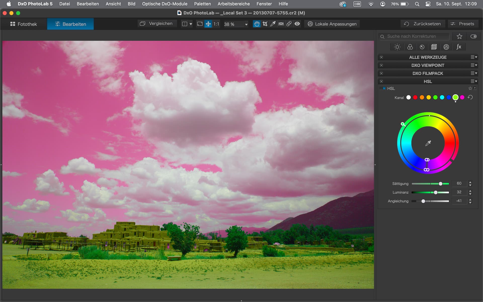
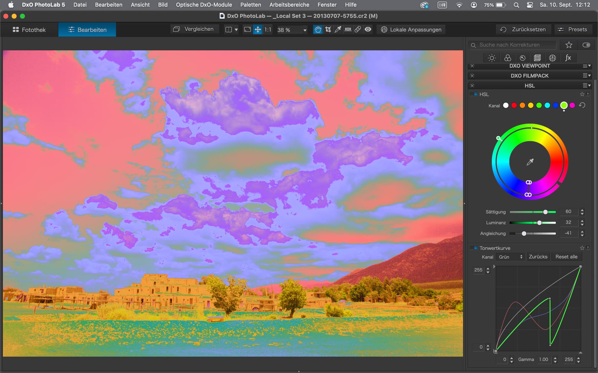
Need too add a Luminosity sliding tool feature for the white color of the color wheel that appears grey (deactived) in PL5 ?
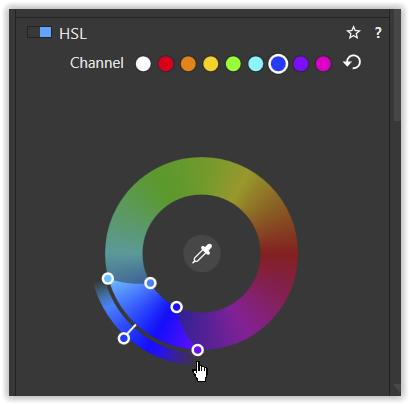
Just pick any less used color, join the sliding cursors from one side to the other side (360º). You would need to stretch it to its own color before, to be able to join perfectly the both sides (the more square…)
And now you can play with it ! It’s so powerfull that it should be a dedicated sliding tool (easy to add in the dev roadmap…) below/above the vibrance tool.
For sure it takes all sens with an Adobe monitor, embedded raw profile, etc…to adjust conflictual colors (red, blue and green) with kid gloves.
It gives me another flavour to PL5 that missed a strong luminosity tool (S-Curves) but until it appears one day, we could be satisfied of this custom use.
To be honest, if that is the aim, thanks but no thanks. What does that have to do with luminosity masking?
Mind you, having never used luminosity masking, I’m not in the best position to judge it, but I didn’t think it would affect colours like that. More research required obviously.
Having just looked up luminosity masking and how to do it, I would say that the best way to achieve the same thing in PhotoLab is to use the Control Line tool in Local Adjustments, making sure to use the pipette and selectivity sliders to choose the areas you want to change the luminosity on, then using the highlights/mid-tones/shadows/blacks sliders to adjust the levels of the selected area.
The Local adjustments palette gives you the ability to select multiple areas and apply different adjustments to each selection.
At least that’s what I do for dodging and burning on B&W images.
3 Likes
Deneice
(French photographer | PL5, Film Pack and NIK suite user)
6
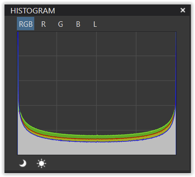
Luminosity and to be more precise, Tone Color Luminosity can give a bleached effect with vivid color (R, G or B), a kind o bad reflection on green leaves, blue or red painted surfaces that kills the original color density. It’s due to the reflectance of the objects that receive the light and of the way the sensor receives this same light. Adjusting this layer does not affect the level contrast, just the level color tone and for the vivid colors only. Sometimes, those colors are too far from the overall contrast of the scene and need to be adjusted to keep a consistent look and feel.
It can also recovers some contrast or zone like a dehaze tool. Of course it’s not suitable for all pictures and a targeted color ajustement would ever give better control.
Comparing it to Vibrance, I would say that Vibrance is limited in the zone range from shadow to Medium and does not recover the “original” density of a vivid color.
Regarding Local adjustments, even with the control line, it reaches its limits. It’s unusable on heavy detailed picture (tree leaves ,stone walls, etc) and it takes moreover time and it’s lagging when adding others tone circle or protected zone with other circles or brushes masks…
This is subjective but it matters in the last final touches. I invite you to give it a try. Saturation should be adjusted afterwards !
I will illustrate it later with examples.
1 Like
Deneice
(French photographer | PL5, Film Pack and NIK suite user)
7
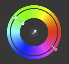
Your color wheel should looks like this one with only a black line and 2 points if correctly reached and at the 180º opposite you should keep the target color wheel as is, except if you decide to use it…
It would be really great if you could share your idea and process with us. The forum likes to discuss, but we need your input. And no idea is so crazy that it can’t be discussed objectively and with other ideas. Everyone can learn from each other
Many greetings
Günter
1 Like
Deneice
(French photographer | PL5, Film Pack and NIK suite user)
11
Sorry Guenterm, very busy this week…
In a few words, all you have to do is experiment with your own reference pictures (each one should have got ones ) and some charts but the more important thing is to do it with a calibrated monitor at first and by checking your icc monitor profile used by your system.
What I could also tested is that saturation runs differently with this “hack” than the original one (try it with the chart and you will see that it applies from light to dark tones instead of the original one wich use a “range” limitation.
Luminance should be used with care because not for all pictures, in any case what is interesting is that it does not touch the grey tones contrast only the more vivid colors.
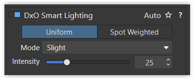
Your “360_… . preset” reacts the very same as “1 - DxO Standard”
( just activating the HSL tool, but w/o changing settings )
and both activate DxO Smart Lighting
which then leads to changes …
. w/ DxO Smart Lighting on the Granger chart
. no DxO Smart Lighting
I also tried it w/ other pics (raw & pixel) – manipulating as you described before –
but don’t get anything, what I would get from a Luminance S-curve,
except on the selected color range preview → press/hold Crtl + pointing/clicking on the tool
My line is more thick, but eventually it’s a problem of my old fingers and eyes and/or the touchpad or a combination of all
and I give up because of more serious work to do
My guess, it’s the result of working on an inverted colour channel ( → conversion of negatives )
and would be more comfortable when selecting the ‘right’ colour instead.
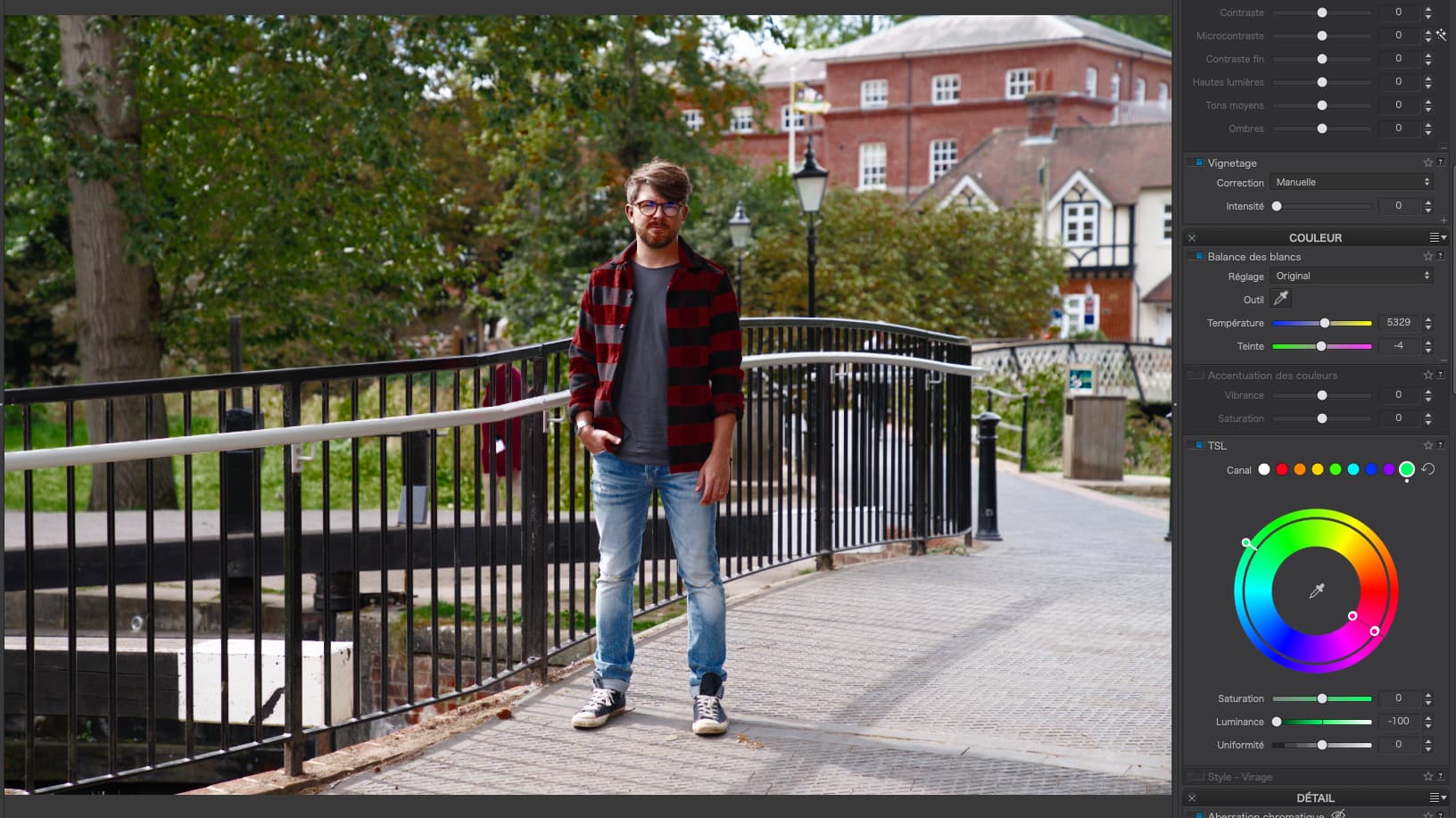
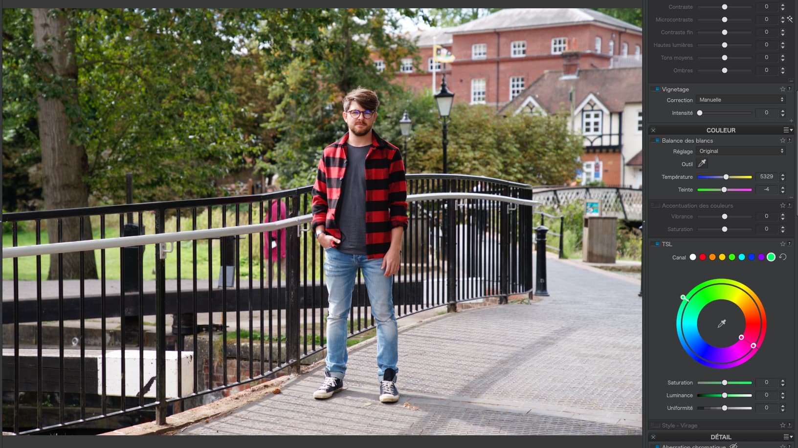
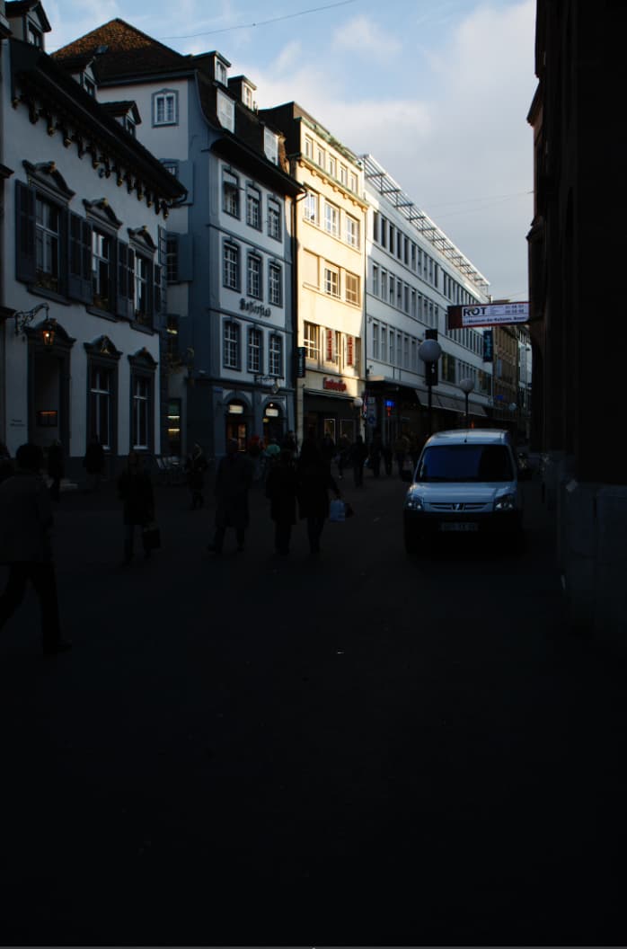
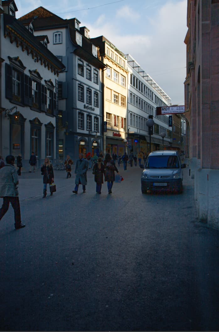
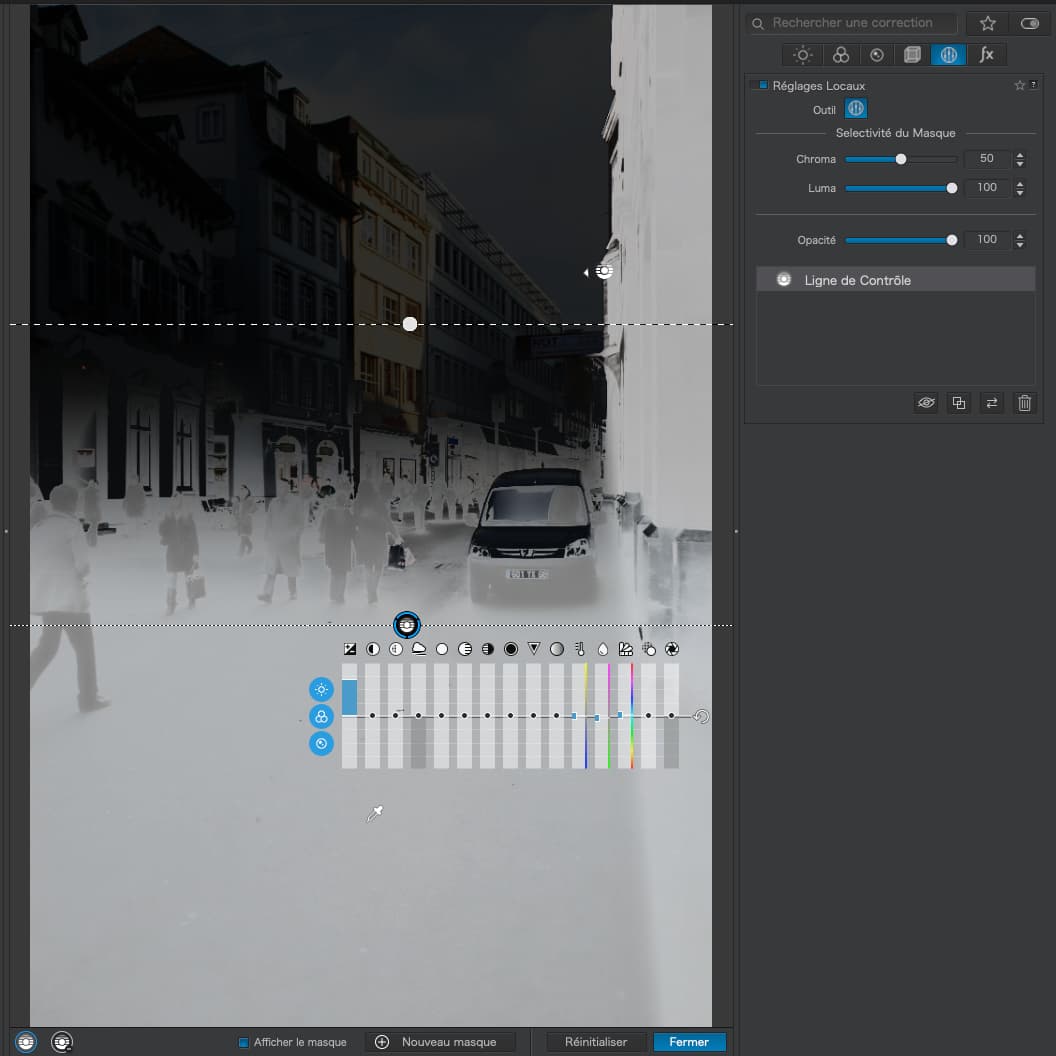
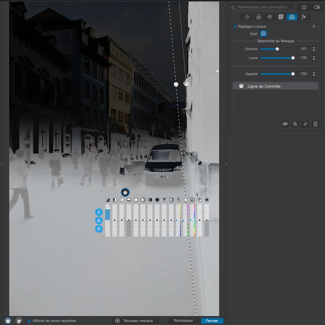
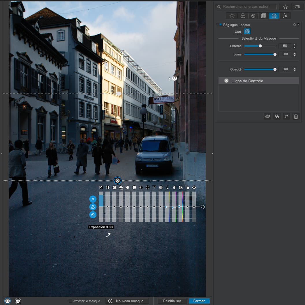
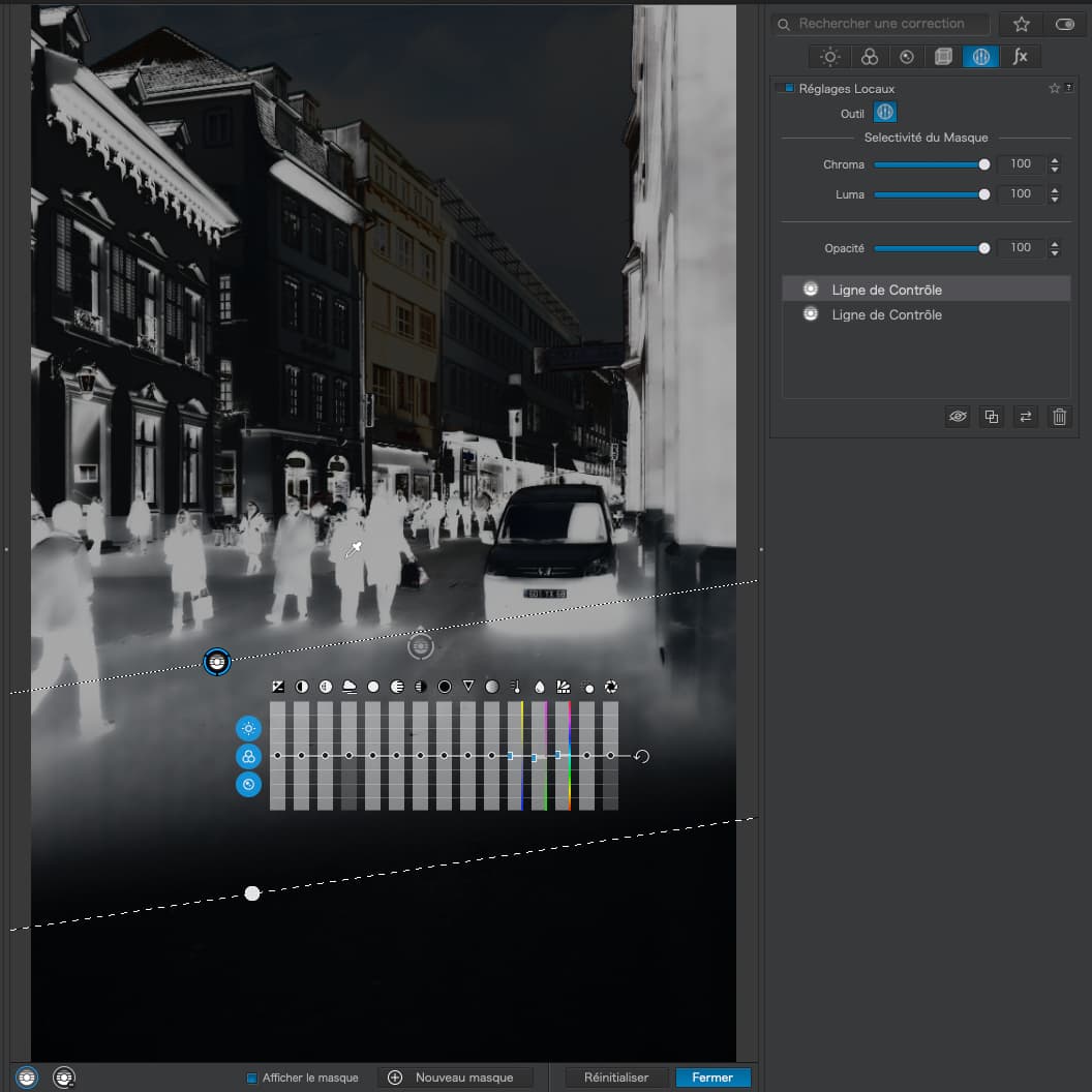
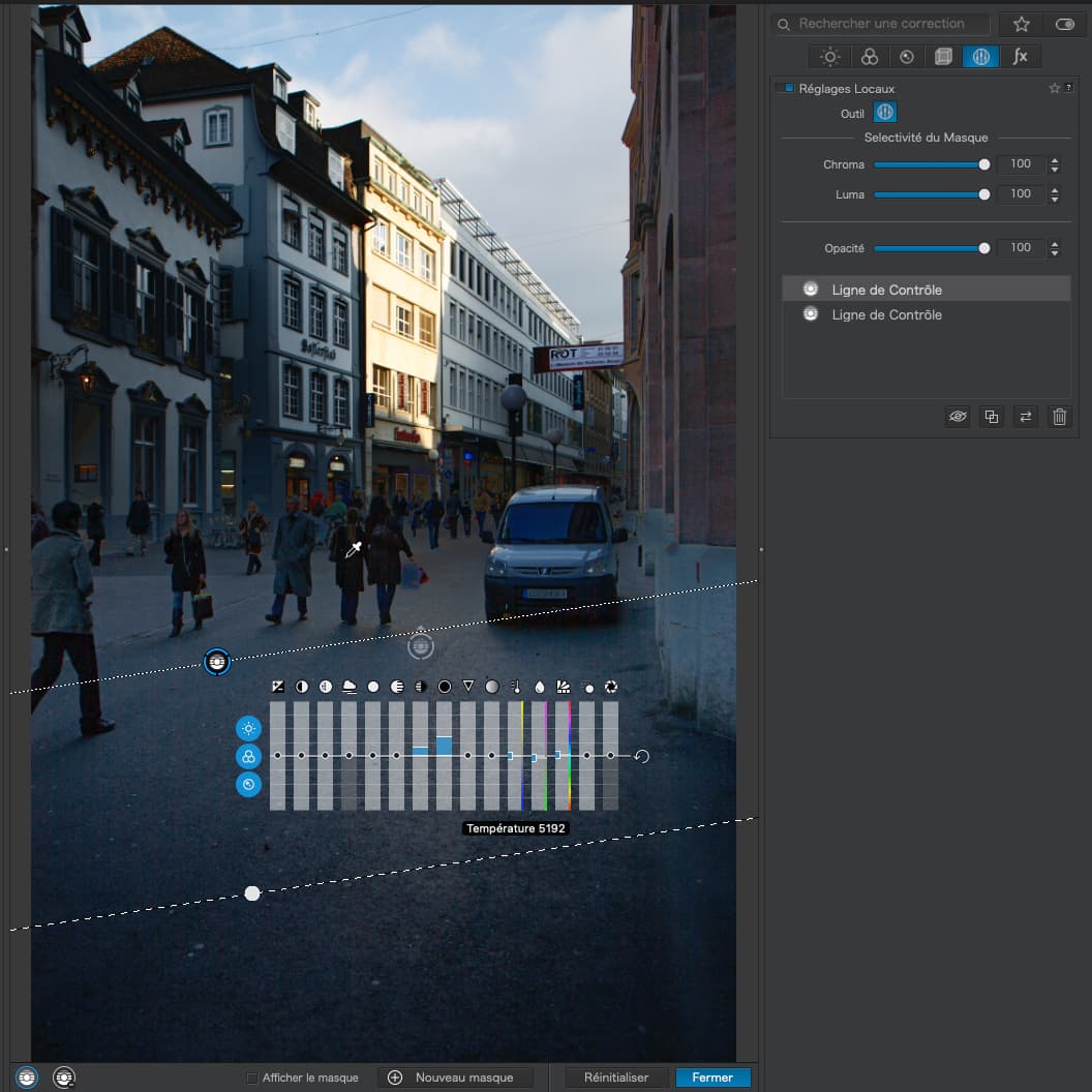
First, I started by drawing a Control Line, in much the same way as a graduated filter, to cover the lower half of the image by placing the pipette in the street…
Not bad, but I wanted to just lift a bit more detail in the people in the street and some of the deeper shadows, so I created a second Control Line, with the pipette on one of the people and a very tight selectivity on both Luma and Chroma…
So, if you really want to replace what Photoshop calls Luminosity Masks, you need to have a play with Control Lines (and Control Points) selecting with the pipette and adjusting the selectivity levels with the mask showing, then hiding the mask and making necessary adjustments.
I really can’t see anything significant that I couldn’t do just as well with selective local adjustments. Have you tried using them?
1 Like
Deneice
(French photographer | PL5, Film Pack and NIK suite user)
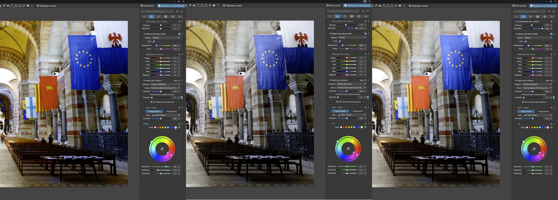
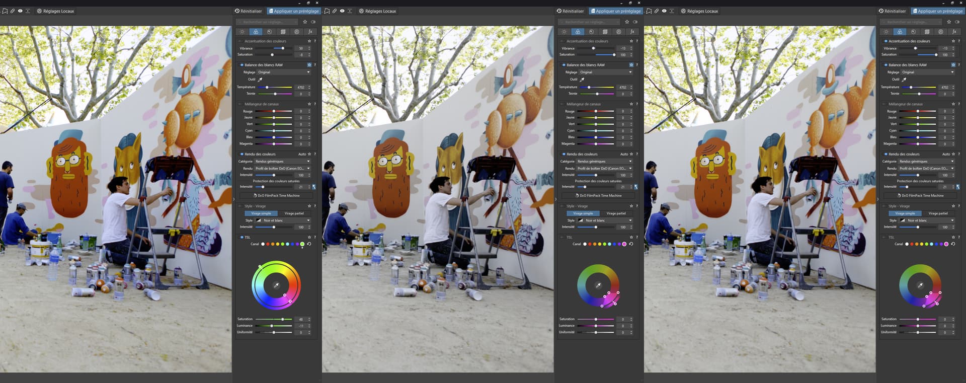
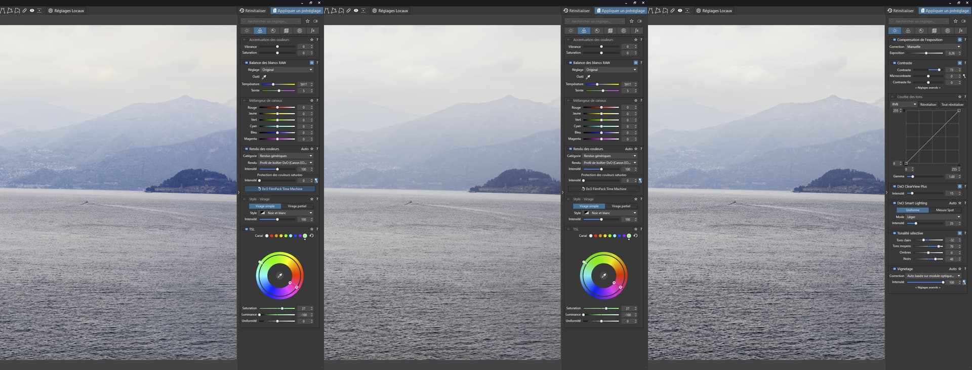
20
Sure I do use local adjustments that are so powerfull but very processor costly ! And your’re right you can achieve the same with’em. Everyone will find something with their liking with this hack.
I give another example here with a sort of “dehaze” process.
From left to right : colorwheel hack, normal, clearview plus.
The hack has enhanced the contrast by recovering details and colors in the fog BUT without touching the clearness of the picture that Clearview has added in addition to that kind of fx border between 2 contrasted zones that I dislike with this tool.
It’s subtle but it can help in some cases to keep the overall luminosity, contrast or clearness. I can’t say more about it.
Thanx for sharing your thoughts.


 …I’ve not seen any reasonable examples provided by