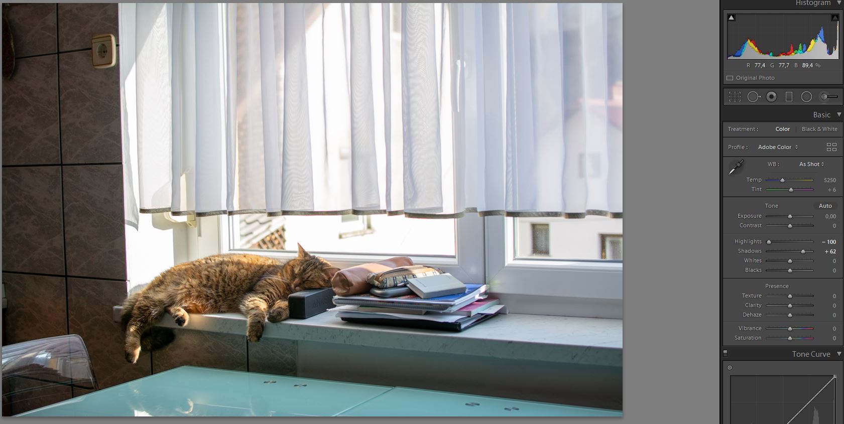
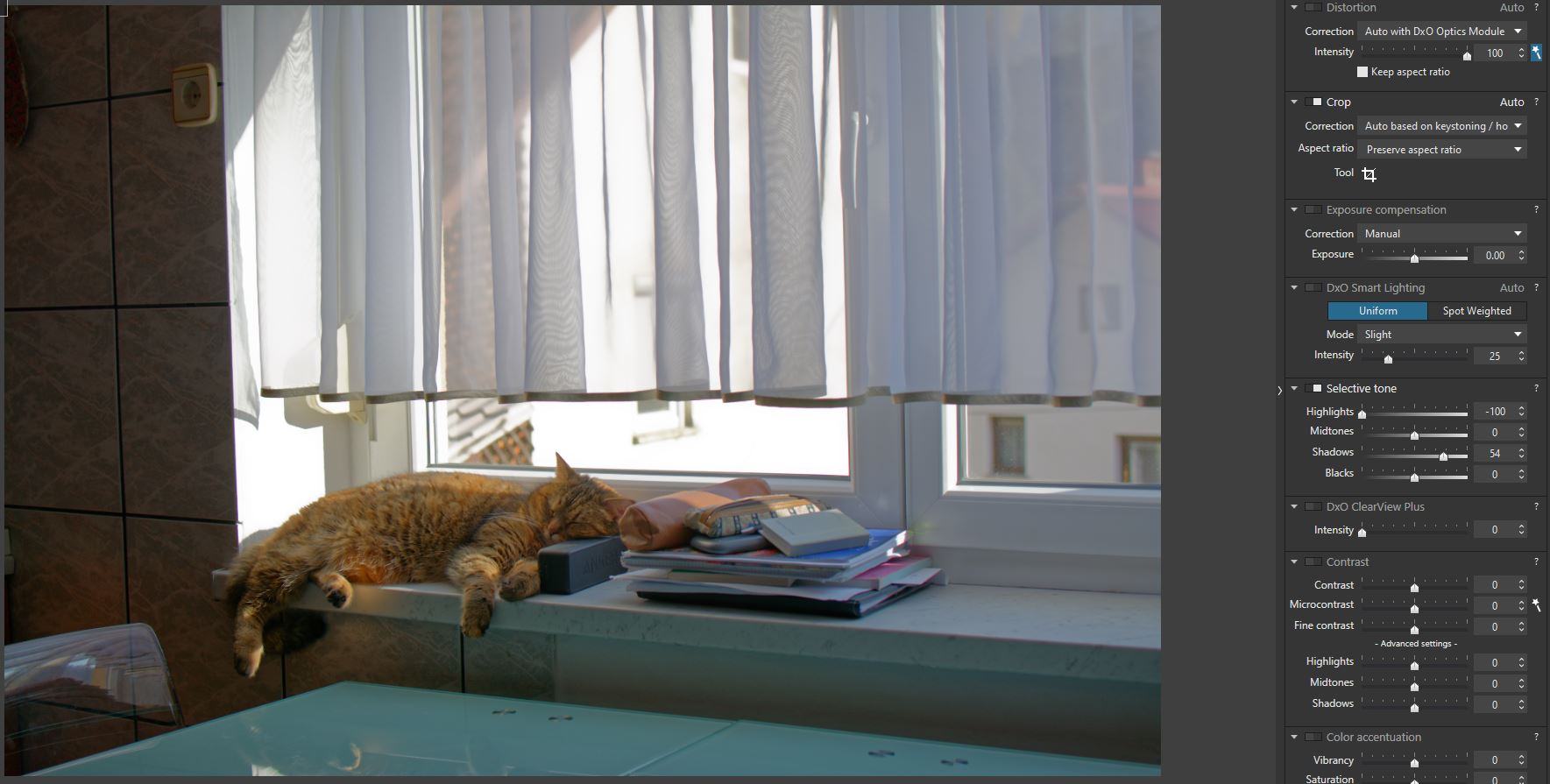
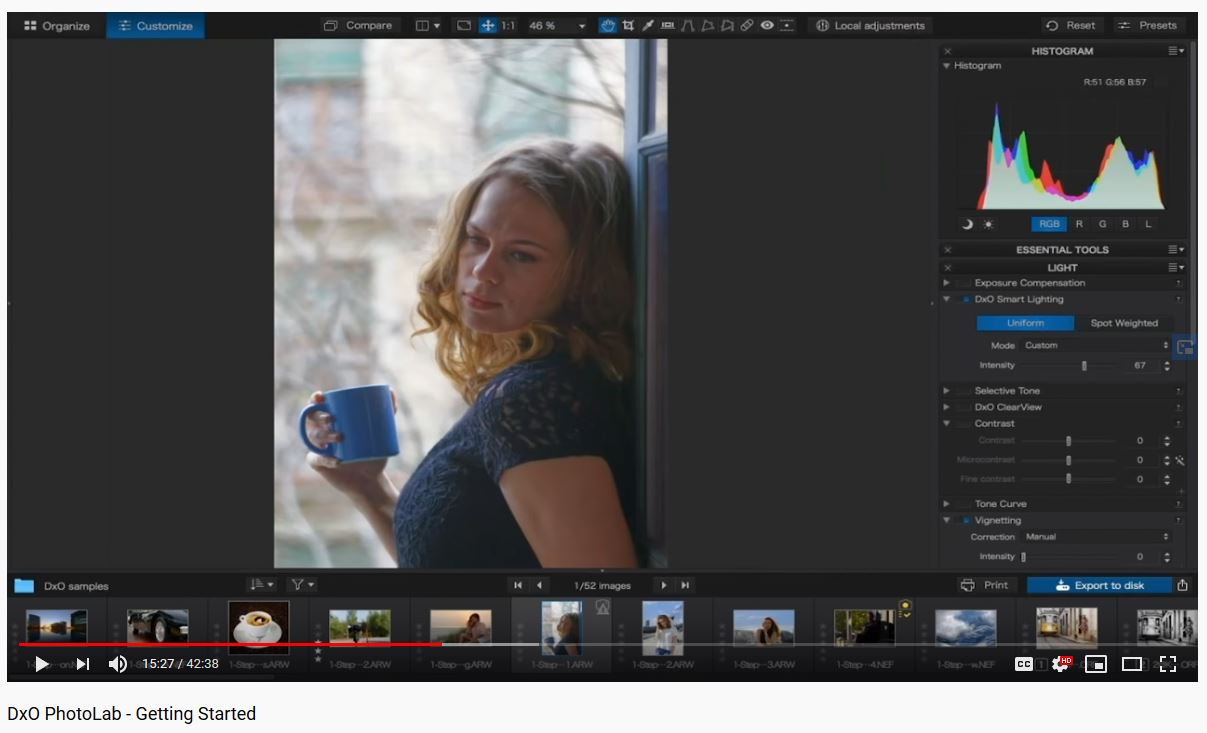
Why I need to move those Smartlight boxes? Why I can’t just use those Selective tone sliders.
Check results below. I only moved 2 sliders. Why DxO result is so different (no contrast, dull)?
Why I need to move those Smartlight boxes? Why I can’t just use those Selective tone sliders.
Check results below. I only moved 2 sliders. Why DxO result is so different (no contrast, dull)?
I guess what I’m (effectively) saying is that if you want PL to work exactly like LR - - then why not continue using LR (?) - it would be easier for you to do so. Alternatively, you could try adapting your process to the PL paradigm instead.
Here is some explanation/advice from the online manual that may explain this a bit better:
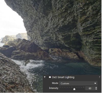
DxO Smart Lighting is probably the most complex of our corrections. It has a global and a local effect on the image – affecting the whole picture and local details – and has a strong influence on contrast and brightness. Such a complex correction can only be mastered with practice. However, you will quickly see for yourself how effective DxO Smart Lighting is even for difficult images.
First, generally speaking, DxO Smart Lighting changes bright images only slightly, but has a stronger effect on darker images. It has little effect on highlights, unlike Exposure Compensation. Second, you should stick with the three automatic correction modes as much as possible, as they can cope with most situations, and then fine-tune with the Intensity slider afterwards. If you need to do further corrections, use the Selective tone palette or the Tone Curve.
John
Because DxO is not Lightroom. the developers of each product have decided to do things differently and provide different methodologies of handling a RAW image.
As John says, if you don’t want to do anything more than press a magic button, then carry on with Lightroom. If you want all the goodies that DxO provides, you will need to get to grips with how it works - differently.
Personally, I place one Smart Lighting rectangle over a highlight area and another over a deep shadow area, then possibly another over a more mid-range area if necessary. Look at the .dop file I sent you to see where I placed them on your image.
Don’t forget that RAW images are intrinsically flat and will need contrast enhancement. Maybe Lightroom’s magic gives you what you want but, looking at your screenshots, it would not be what I would expect. I want to be in charge of how much contrast and in which part of the range it is applied.
Yes, it took a little more effort in the case of my version of your image but we are still only talking a matter of a few minutes. Learn to play with DxO, discovering what each palette does. In my version of your image, I used ClearView Plus to enhance the contrast but there are a number of different tools that can give you similar results.
Then, don’t forget local adjustments, which will selectively change only part of the image. Or are you expecting to do everything globally, simply because it is quicker?
Oh, and definitely make sure your images are correctly exposed, especially avoiding blown highlights. It’s easy to do - simply turn on the blinkies on your camera and review the image. If there are blinkies showing, simply adjust the exposure compensation. Don’t forget to choose either spot, centre-weighted or matrix exposure mode, depending on the subject - don’t just leave it in one mode and expect to get good pictures every time.
I notice that you used Aperture Priority mode, which is always good to ensure control over depth of field. But you also used Matrix metering, which forced you to apply +1⅓ stops of exposure compensation. And yet you still managed to blow the highlights.
Might I suggest, for this kind of shot, that you go into manual mode and use spot metering to determine a non-compensated reading for the brightest part of the image. Because you know that the metering will try to adjust the exposure for the highlight to 18% gray, you should set the exposure compensation to either +1⅔ or +2 stops of compensation. This will ensure that the highlights will be as bright as they can be without being blown (at least, that’s what I’ve found on the majority of Nikon cameras). The shadows will fall where they will but, as I have said before, DxO can recover shadows but, once you have blown a highlight, it is completely irrecoverable.
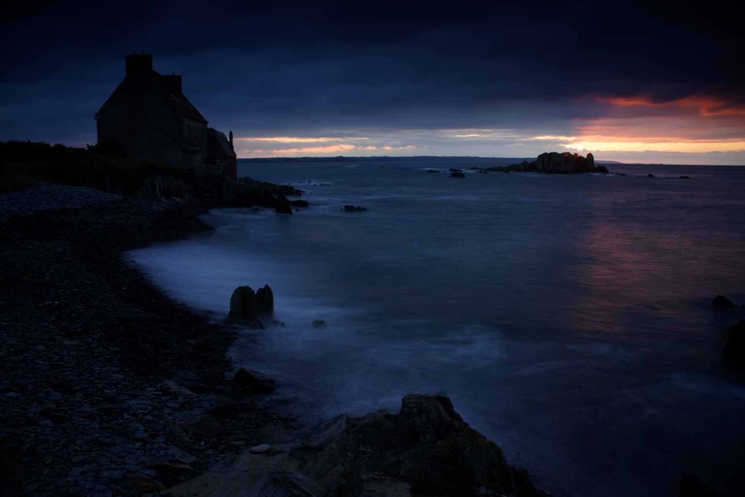
Here’s a shot I often use as an example of correct exposure of high dynamic range without blowing the highlights. Spot metered on the brightest area of the sky and over-exposed by +2 stops.
Before treatment
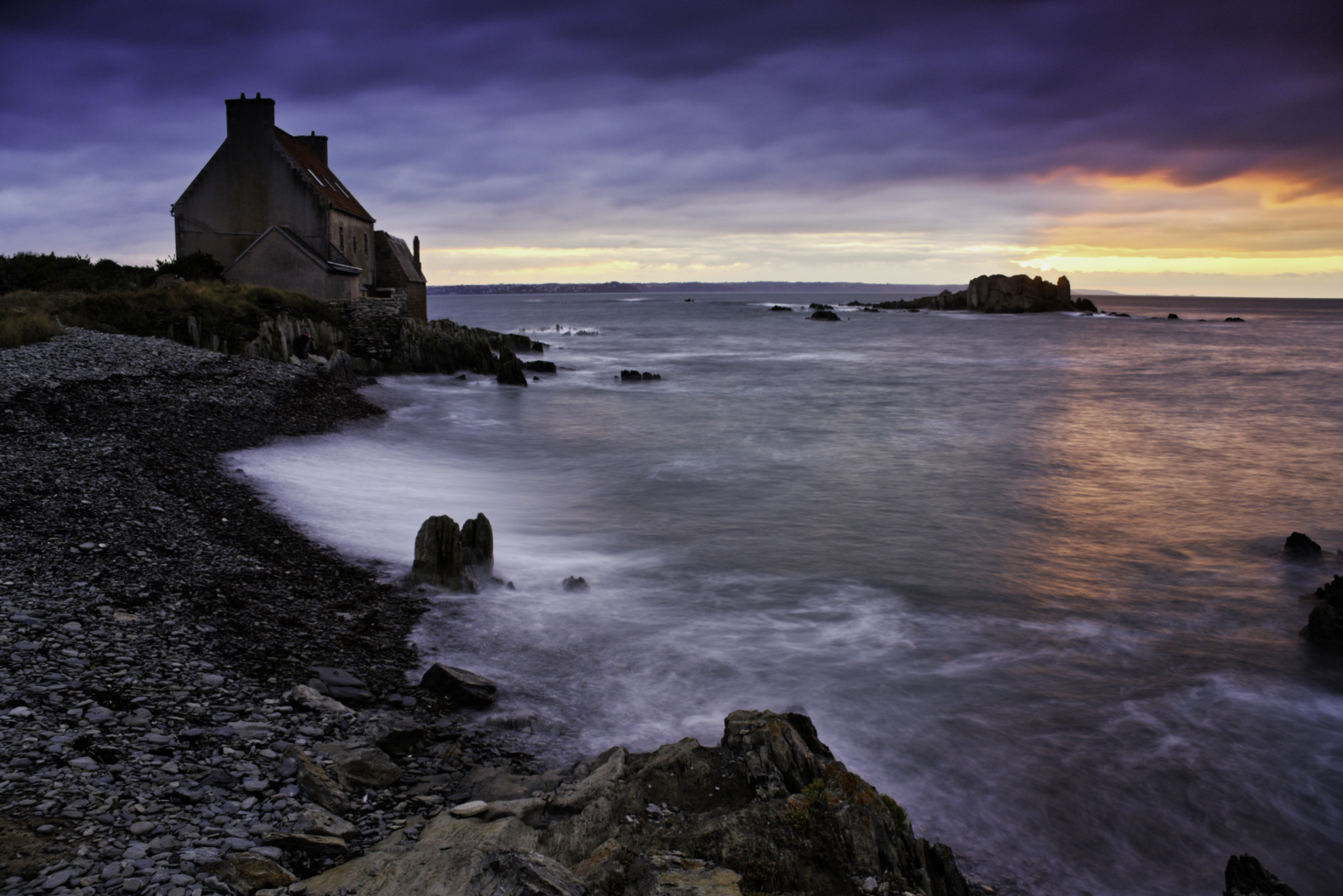
After treatment
And, no, it didn’t take just a few seconds 
Joanna; that’s a very good photo. Kudos to you.
I have learned a lot how to use Lightroom by watching videos from Julia Trotti, Jessica Kobeissi, Jared Polin, PiXimperfect,… to name only a few.
I didn’t have to watch Capture One tutorials because when you know how to work with Lightroom you can figure out Capture one in an hour or so because they are similar. At least I had no problems to understand Capture One.
So;
would you be so kind to point me to some Youtube videos where I can see how masters work with DxO. I would like to see step-by-step, what they do and how those masters are using DxO.
Can you point me to some world known photographer who is using DxO so I can learn from him to understand DxO workflow?
Well, here it is…
I have found a DxO tutorial and that’s what I was I talking about - ‘‘orange face effect’’ when using Smart lighting.
How to avoid that?
Is this any closer to what you were hoping for? To be quite honest your LR version that you are using as a baseline for comparison looks a bit washed out to me,
Mark
My two cents:
And the sidecar:
the_cat.NEF.dop (12.6 KB)
My feeling is that there are several things that make you uncomfortable at the moment:
When I tried other developers after having used Lightroom for a few years, I saw that each developer produces a different interpretation compared to what I had thought was “correct”
Learning other developers, I found that each of them had specific strengths and that none combine these in one product, moreover, things changed over time, new releases brought new interpretations with the “default” rendering.
Doing the same thing gets a bit more complex: Two systems are only equal, when both output and failures are equal. DPL is not Lightroom and vice versa, they have different built-in functionalities and produce what their sw and color science engineers think is “right” or “best”.
I can only propose that we all try to set aside the thoughts of “correct”, “best” etc. and learn what we can do with the tools we have and start to enjoy the multitude of the things we can or cannot do, the later as an invitation to explore even more…
Driving a screw in with a hammer is easier than driving a nail in with a screwdriver 

Yes platypus; yes!!! Thank you.
You are reading my mind. This is the answer I was looking for.
I’m not trying to say what’s best. I’m just looking for the results I like or want and how to get them.
I think we can’t just say that DxO is better then Lightroom or vice verse. They are tools designed for the same job and the job is to convert RAW files.
I’m using DxO and I’m trying to understand why some things are different.
I understand how Smart Lighting works. I can use Uniform and Spot Weighted. I also understand how ClearView plus works. I understand how Contrast works and I also understand how Microcontrast and Fine contrast works and I can use them. I also understand how those advanced contrast sliders work – to adjust contrast only for highlights, midtones and shadows. I also understand curves.
So let’s make this simple for now and take it step by step. I wan’t to understand the logic behind those Selective tone sliders.
I hope my English is good enough so all of you can understand me.
The only thing I DO NOT understand is why those Selective tone sliders in DxO are made like they are.
Why Shadows slider affects midtones so much? Why Shadows slider also affects blacks? Why Highlights slider affects midtones? Why Blacks slider affects shadows?
Of course you can say again ‘’DxO just works different’’ or ‘’DxO has different logic’’. But tell me honestly; do you find any logic in those Selective tone sliders? Why Shadows slider needs to affects modtones and blacks? If I move Highlights slider why all the image goes dull because Highlights slider also affects midtones.
Please; I just want to understand how this would help me to convert my RAW files. And I beg you; don’t just say DxO is different then Lightroom. I also beg you; don’t say ‘’just use Smart Lighting’’.
I would just like to understand how to use those sliders and why they need to interact so much. I’m just looking for a honest aswer.
If I’m pushing just stop me and say ‘’stick to Lightroom’’ and I will understand.
I used LR from V1-6. When comparing software it is necessary to remember that just because a slider has the same name as a slider in LR it does not mean that it does the same job. The highlight recovery slider in LR does just that, recovers highlights. The highlight slider in the tonal range tab is simply a broad tonal range for the indicated regions.
Highlight recovery in DXO is largely done automatically as part of the default correction and can be adjusted in the Exposure compensation tab with drop down menu selections for slight (default), medium and strong.
Similar confusion happens with C1 where the whites slider is assumed to be the same as the whites slider in LR which sets white point. In C1 the levels tool is used to set white and black points. LR does not have a levels tool and so the separate sliders are required.
So if you change software you need to understand how it works.
Personally for the test image the default settings in DXO retain sufficient details in the net curtain that I would simply add a gradient and set:
Exp - 0.6
Cont - 50
Micro con - 15
Shadow - 18
Black - -7
Only took a few seconds. Whether the final image is what you are looking for is personal 
Ian
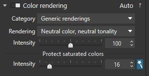
Ah, that. While it’s something we have to deal with, I find it’s much less of a pain in PhotoLab than it used to be. Sometimes, the easiest way to avoid that is to go to the Color rendering palette options and raise “Protect saturated colors” to 80 or higher. It depends on your camera and the lighting. I find the problem tends to be worst when elevating skin tones in shadow - in which case further adjustments to color or white balance might be necessary. You can try other “Color rendering” options (there are so many) if “Protect saturated colors” doesn’t have the desired effect - or, more simply, lower saturation of orange or red or yellow in the HSL tool or make a local adjustment to saturation using, for example, a control point on the subject’s forehead.
As you likely know, since you’ve been participating in some of them, there are many discussion threads where this conversation is already ongoing. Many. It’s clearly a concern shared by others. Just search the forum for the words selective tone. Perhaps one of those threads already has the answers you’re looking for?
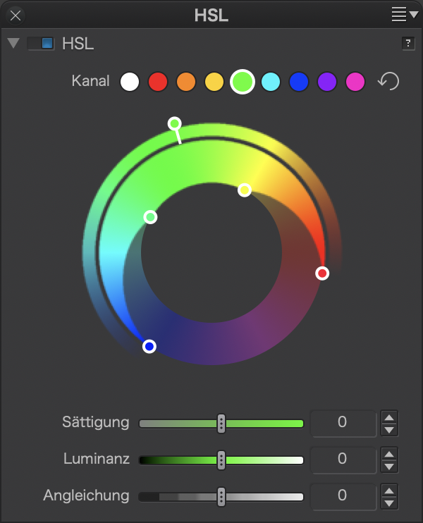
I’ll try to illustrate using the HSL tool.
Click on the green button and see that “green” extends into cyan and yellow to a certain extent. Mountains can look like Mt. Fuji or like the mesas we know from monument valley.
In the HSL tool, we can define whether we want a Fuji-san or a mesa by dragging the outer handles clockwise or anticlockwise. When we set the outer handles like this…
Now, let’s think midtones: Depending on where the designers have dragged the outer handles (so to speak) “midtone” extends into highlights and into shadows and it looks like DxO has designed the selective tone tool with Fuji-style slopes rather than mesa type cliffs.
It would be nice to be able to influence these slopes, but it is not possible as of today.
Maybe that DxO will add such functionality (I’ve proposed it a while ago) in a future release?
And while we’re at it: Why not add a luminosity mask feature?
Going back to your original post …
1). Here’s my personal RAW preset file (with which I replace the standard DxO Default):
… JM_RAWpreset.preset (6.8 KB)
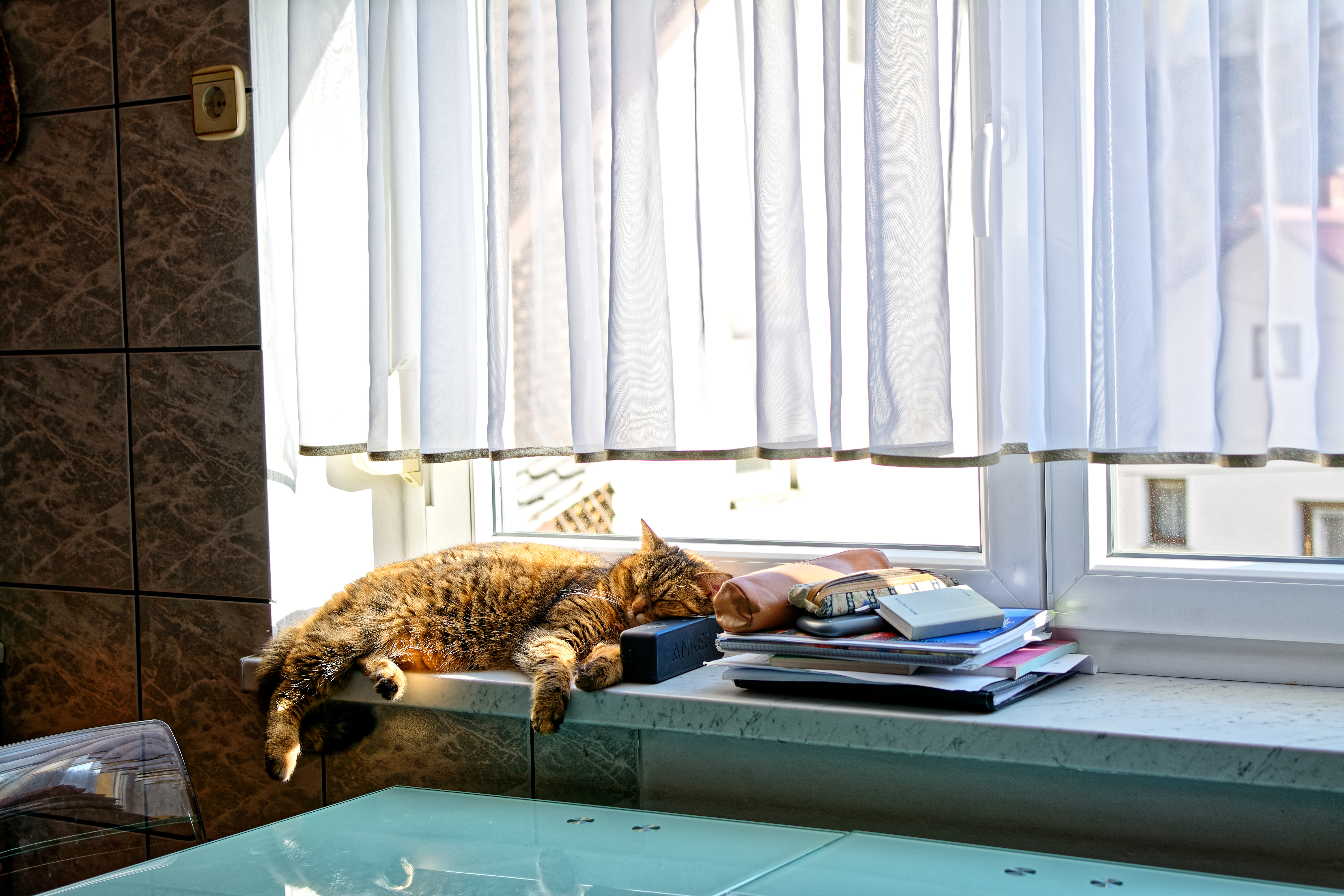
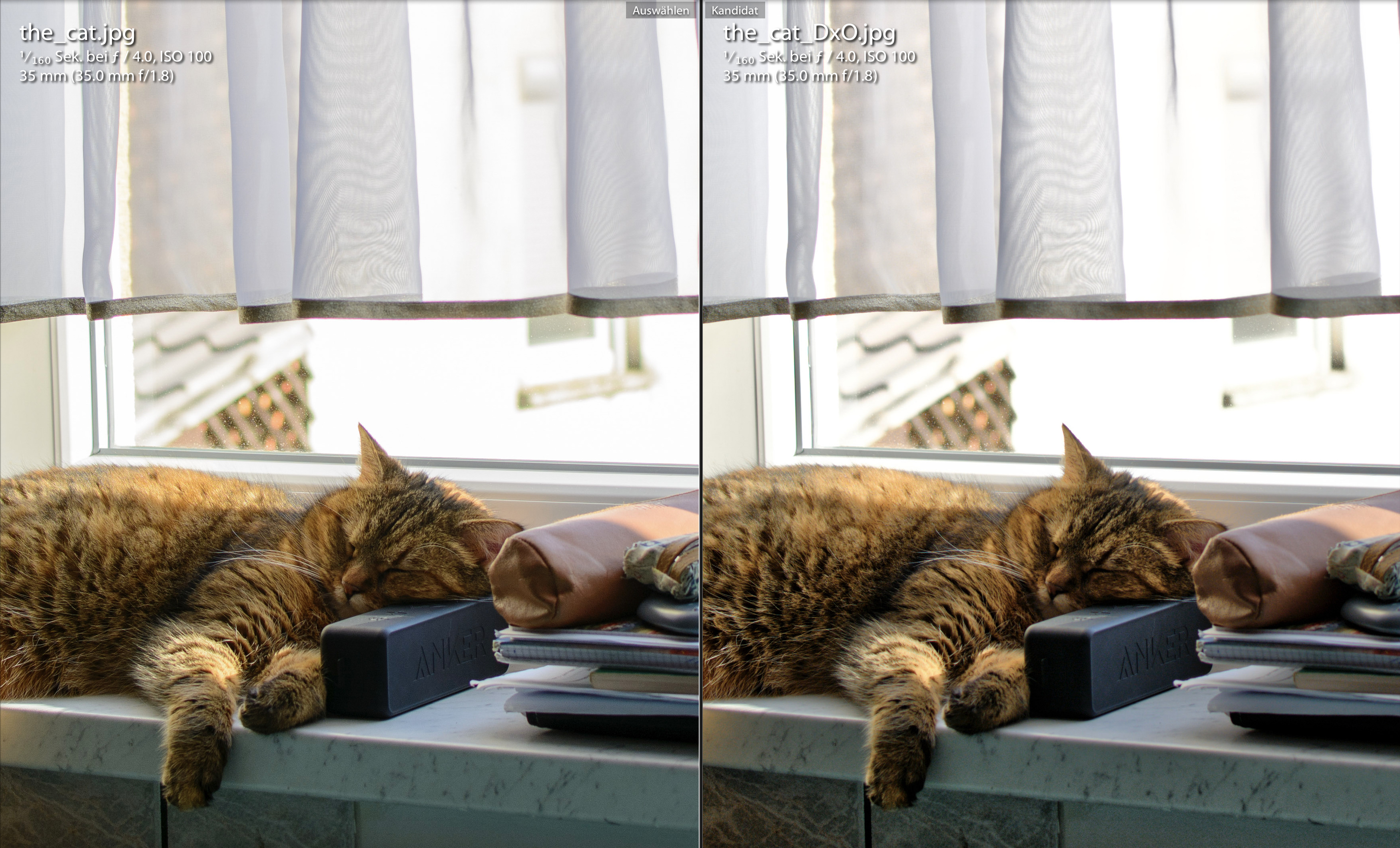
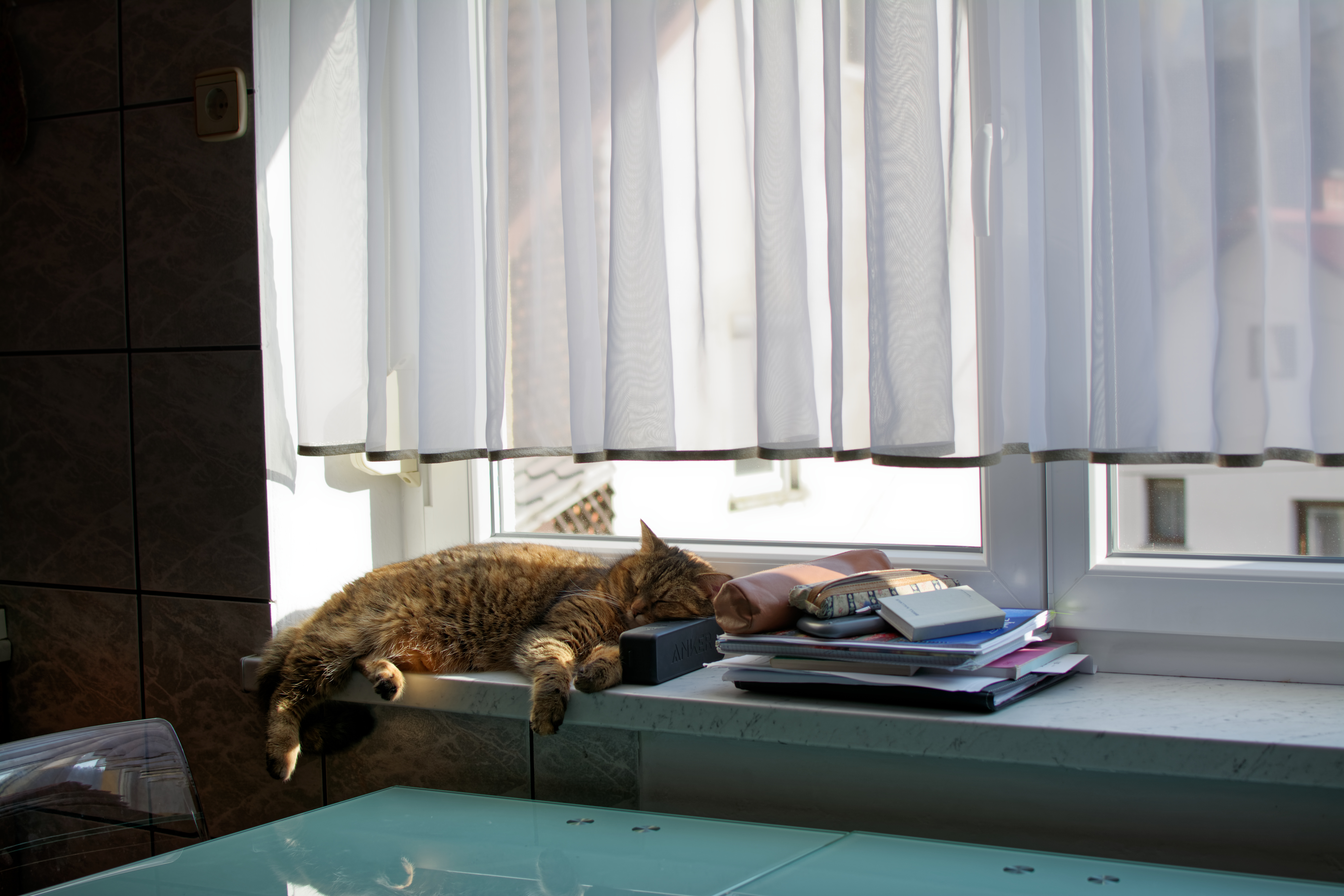
Just humour me and try it out on your cat image (which I really like, BTW)
– Note: Since PL has already applied your version of the RAW default to the image, you’ll need to use the Apply Reset button to force application of my version over the top of yours (and I suggest first creating a Virtual Copy to avoid any regrettable results!).
Then use the Smart Lighting with Spot Weighted method (with box covering both cat & curtain) that I described earlier, to get the contrast settings that you like.
– Note: The Selective Tone & Tone Curve controls work at the Global level - and are rather “crude” in their application, compared to the sophistication of Smart Lighting.
2). For the “orange tint” issue;
 - and adjust sliders to your liking.
John M
Thanks for all the answers and help and your time you took for my cat raw file.
All your variants of my cat are good and I like all of them. Sometimes I’m looking for punchy look and other times for more relaxed and moody look. It depends what I want at the moment.
I also tried the preset from John-M and it’s a good preset. Thanks.
By the way; neutral color affects all the image and not just faces. I usually need to repair faces with local adjustments and this is additional work I have to do.
About this ‘’orange faces’’;
I know it’s not my imagination. You can see it on those two screenprints in my previous posts.
I can also see those orange faces and orange skin effect on Pascals photos from DxO tutorials and I can also see this effect from all those DxO tutorials on Youtube from DxO Optics Pro 8 to DxO Photolab 3.
I know how to repair them. I just don’t understand why DxO is giving me this nasty effect and Lightroom does not. I need additional work in DxO to repair this nasty orange tint. As the name says Smart Lighting should be smart. If it can recognize faces it also could apply some sort of action to avoid this ‘’orange’’ effect. Just thinking …
At the end I agree with platypus about RAW software: ‘’ I found that each of them had specific strengths and that none combine these in one product….’’. I know; I just need to fully accept this. I suppose I was hoping I can get all the goods from one software and DxO will be the one. Not yet but one day I hope it will be.
I can’t pinpoint but something is dragging me to DxO. It’s just different and apparently I like this difference.
About those Selective tone sliders;
I know; this was mentioned many times in many threads. Still nothing much changed from DxO Optics Pro 9 so I suppose the developers have a very good reason why Selective tone sliders work that way.
It’s just I can’t find at the moment how this behaviour of those sliders help me and gives me advantage against Lightroom sliders. Drag Highlight slider to left and then I need to drag Midtones slider to right to compensate. It’s beyond me. Nothing personal; I just don’t like it.
I suppose it’s that the generic defaults don’t work well for everyone. For example, my Panasonic micro four thirds images require much less color adjusting than my Olympus images (same format). It’s mainly the color rendering module that’s to blame, even though it has camera body selections for the Olympus cameras but not for the Panasonic cameras.  So I apply a custom preset for my Olympus images (the majority of my photos) and simply switch to the generic color rendering for the Panasonic images. If you’re consistent in the cameras you use, you can create custom presets that take care of the most common problems. Will it be as spot-on as Lightroom for you? Maybe not - but I think it can get you closer to the ideal of having to make very few additional adjustments for a good result. What do you think?
By the way, I’ve tried using various Adobe DCP profiles for my Olympus cameras. They are a bit more color-accurate for my cameras, but also tend to blow out highlights and prevent some FilmPack adjustments from being effective. So I use them as a reference but usually switch to either a generic rendering with protection of saturated colors or a color film emulation I like (FilmPack add-on). Takes me just a few seconds.
Do you find orange tint harder to correct due to a different cause? Or is it pretty much the same?
Hi Gregious;
I appreciate your answer.
To be frankly I haven’t thought that my camera profile could be responsible for this ‘‘orange tint’’ effect.
In general DxO gives me very good colors and skin tones. Usually I have no problems.
But whenever I need to push shadows with Selective tone sliders or with Smart lighting I get this nasty effect. I can see the same problem (orange tint) in DxO videos on Youtube and on some photos in DxO tutorials on this forum. I posted example photos to this thread where you can see orange skin - I did a printscreen from DxO videos you can find on Youtube.
So I can assume this problem is not related only to my camera profile or my computer.
As far as I can see this is more or less general problem and happens to me whenever I need to adjust shadows or with Smart lighting or with Selective tone sliders. Photos become lifeless, dull and with no contrast. On the other hand; when I push shadows in Lightroom it maintains (preserves) contrast.
I have attached two photos from DxO Optics Pro 10 tutorial I have found on Google. I think you will understand what I mean by dull photos without contrast.
We are now on DxO photolab 3 but the problem is still here. By the way; I had the same problem in DxO Optics Pro 8.
So; tools for the same job but with different capabilities.
Here is a quote from platypus:
‘’ Driving a screw in with a hammer is easier than driving a nail in with a screwdriver ‘’
I agree on that and I can also say;
You have big screwdrivers for rough work with big screws and you also have very small screwdrivers for delicate and precise work like watch repair. Then you also have battery screwdrivers ad they do most of the work for you. But basically they are ‘’same tools for the same job’’ but not just quite; would you agree?
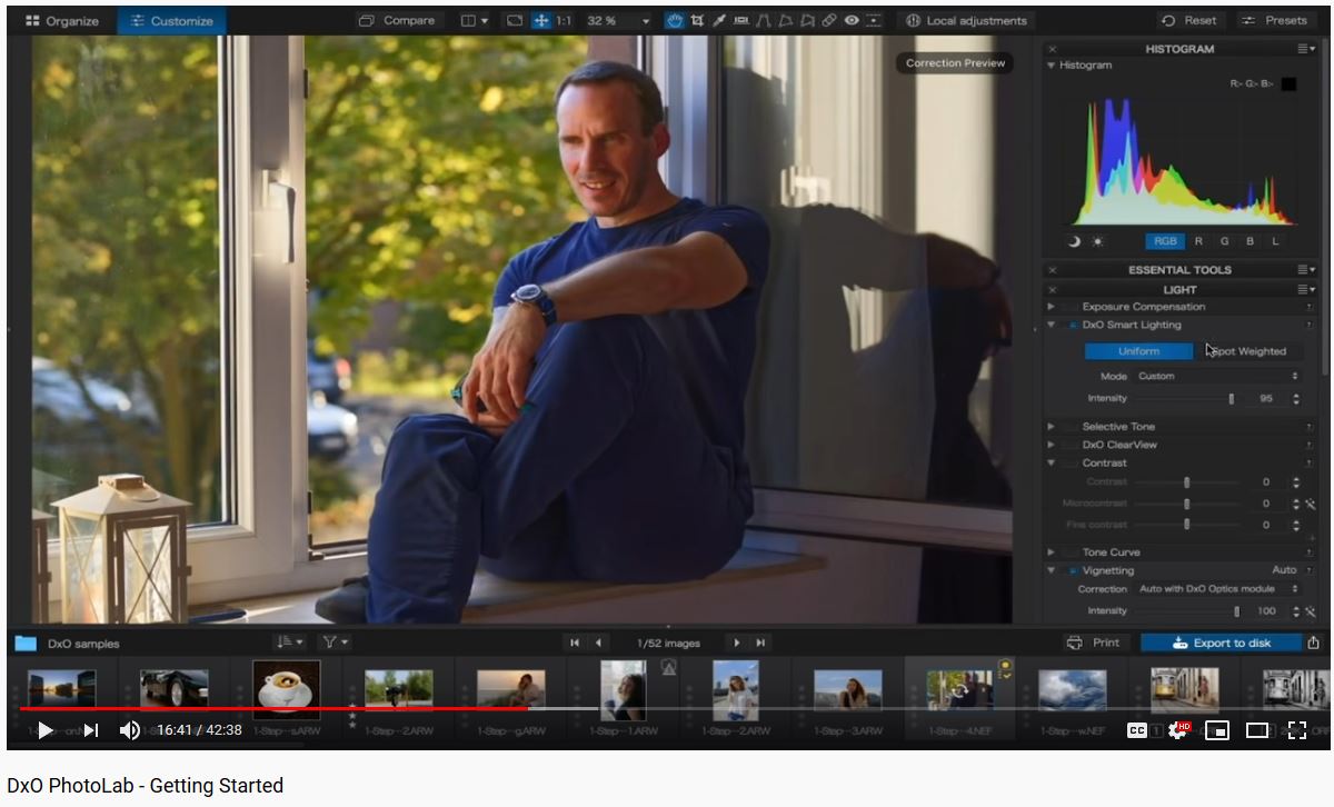
I know I’m labouring this point (and you’re probably sick of it  ), but … I see you’re still persisting with Uniform mode for Smart Lighting …
For this example, I would be using Spot Weighted mode - and I’d be drawing a box that covered BOTH the sky and both sides of the rocks … and I’d be assured of achieving a well balance image.
Just saying …
John M
Edit: Looking again at the screen shot of your Smart Lighting palette, I see that something unusual … Why does it not look like this (in Uniform Mode) ?? 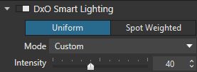
Which version of PhotoLab are you using ?
JohnM;
You didn’t read what I have wrote.
I will quote me from my post above;
‘’ I have attached two photos from DxO Optics Pro 10 tutorial I have found on Google. I think you will understand what I mean by dull photos without contrast.’’
So this is not my screenshot and you need to tell this to DxO – it’s photo from DxO tutorial ‘’how to master shadows in DxO Optics pro 10’’.
As I can tell in DxO Photolab 3 still exsists the same problem — when raising shadows photos became dull and lifeless.
Those two images can be enhanced but with additional work.
No such problem in Lightroom; it can preserve contrast when pushing shadows.
The PhotoLab shadows tool does not work like LIghtroom’s, as you’ve found out. It is too aggressive and covers too wide a range. It can often be difficult to use it effectively when recovering deep shadow detail from specific parts of an image without negatively impacting the entire image. My solution is to first apply smart lighting and then use local adjustments to recover shadow detail in selected areas. This does not have any impact on the rest of the image. Additionally, I sometimes create separate masks to treat multiple shadow areas differently from each other. Using local adjustments allows me to to have much more controlled shadow recovery than even the global Lightroom slider is capable of achieving.
Mark