Am I wrong if I read your graph right that PSCA is added before the conversion?
George
Am I wrong if I read your graph right that PSCA is added before the conversion?
George
We don’t actually know for sure how any of this works, George - - but, for general understanding of the process, that seems like a reasonable assumption to me.
John
Although the diagram places the PSCA before conversion, I suspect the conversion is part of the PSCA itself and it is actually a single step.
I show the destination profile as being input to both the PSCA and the convert step as the profile is used to describe the output colour space used by both steps. It is for this reason I suspect the two steps are actually one.
My problem with being the psca being part of the conversion is that pl created its own conversion. That would be in conflict with a general color management system. But adding psca before a ‘normal’ conversion in both the export and soft proofing would remove that objection.
George
Keith,
Thanks to you and the others for this diagram . It provides a clear view of what is happening as you move from an image in a camera to an output (monitor view, print or saved file) and where colour spaces and soft proofing kick in.
For me, the only thing I’d change is the way the steps are tagged. I know (or at least assume) they are just to give each one a tag to allow it to be referenced in any subsequent discussion / explanation, but once I see numbered steps I can’t stop myself expecting them to be followed in sequential order. So routes such as 1,2 or 2,4 to arrive at Working image, or from 3, via Working Image, to 6 Apply PCSA feel odd. This may well just be me, in which case please feel free to ignore my comment.
An other idea is shown here:
YES – to assign a colour profile to a pic is used, WHEN the pic in question has none.
Then one can try the different possibilities (profiles) to hopefully find out, how that pic was produced.
Otherwise keep off !
You’re welcome ![]()
I understand but they are there for reference only although they do follow more-or-less the order of the workflow. Follow the arrows rather.
@Lucabeer & @Wolfgang, Assign is only used when there is no profile associated with an image, so you need a starting point in a colour managed application. Of course the profile may be completely wrong but one has no idea what the profile is in the first place. For a supported RAW file a profile is assigned by PL.
Gentlemen, thanks for putting that table together, very helpful. DXO should be paying you.
Thanks for your support ![]()
![]()
Are you not adding the “convert to monitor profile” in the softproof section? It’s essential.
What you see on the monitor is always in the monitors profile. But it good be slightly different from the standard view due to the extra conversion to the soft proof profile. Depending on the oog colors.
George
The whole idea of soft proofing is to see what the image looks like after converting to the target profile. As long as your monitor gamut is larger than the target gamut then you will see the difference when you soft proof with the target profile. Converting back to monitor profile completely negates the function of soft proofing.
It’s done nevertheless. It’s an essential part of color management.
The usability of viewing in the gamut of soft proofing depends on your monitor not on ones wishes.
It’s not mine diagram, but it’s a pity if that last conversion is not part of it. It gives an answer on many questions in the different soft proof threads.
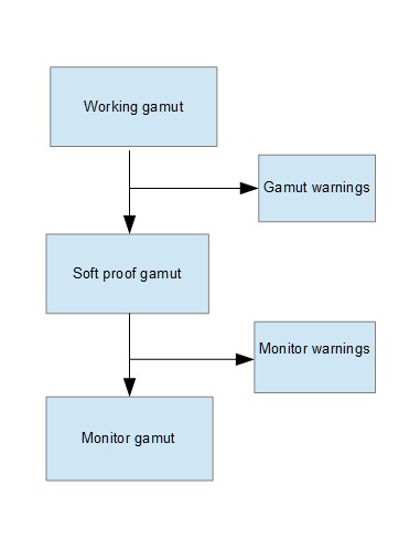
I also believe, not sure at the moment, that the monitors gamut warnings are showing the oog colors from the soft proof gamut to the monitors gamut. The gamut warnings show the oog from the working gamut to the soft proof gamut.
Just added a diagram
George
The (main) difference in our version is that we’ve tried to make it specific to our understanding of PL’s unique implementation of the CM pipeline - especially with regard to its proprietary “Protect Saturated Colors Algorithm” (PSCA), which has some specific implications for PLv6 users.
We decided there was only so much that could be included in one diagram - and we didn’t want it to become so complicated that it couldn’t be readily understood. For simplicity, you can envisage “convert to monitor profile” as being part of “#7 Convert to soft-proof profile” … the absolute completeness of which will depend on whether or not the monitor is capable of rendering the specified soft-proof target.
For example, I can see 4 distinct scenarios for soft-proofing;
Using, say, a P3-capable monitor - and Soft Proofing for an sRGB monitor
– In this case the P3 monitor IS able to accurately simulate the sRGB rendition
Using, say, an sRGB-capable monitor - and Soft Proofing for a P3 monitor
– In this case the sRGB monitor cannot simulate the P3 rendition - so, instead, we need to review the OoG warnings instead (as made available as toggle-buttons on the Histogram)
Using, say, an sRGB-capable monitor - and Soft Proofing for an sRGB monitor
– Counter-intuitively, soft-proofing IS still advised in this case … because; PSCA (See the diagram) !
Using any-capable monitor - and soft-proofing for output to a printer
— This is the classic and obvious purpose of soft-proofing.
John M
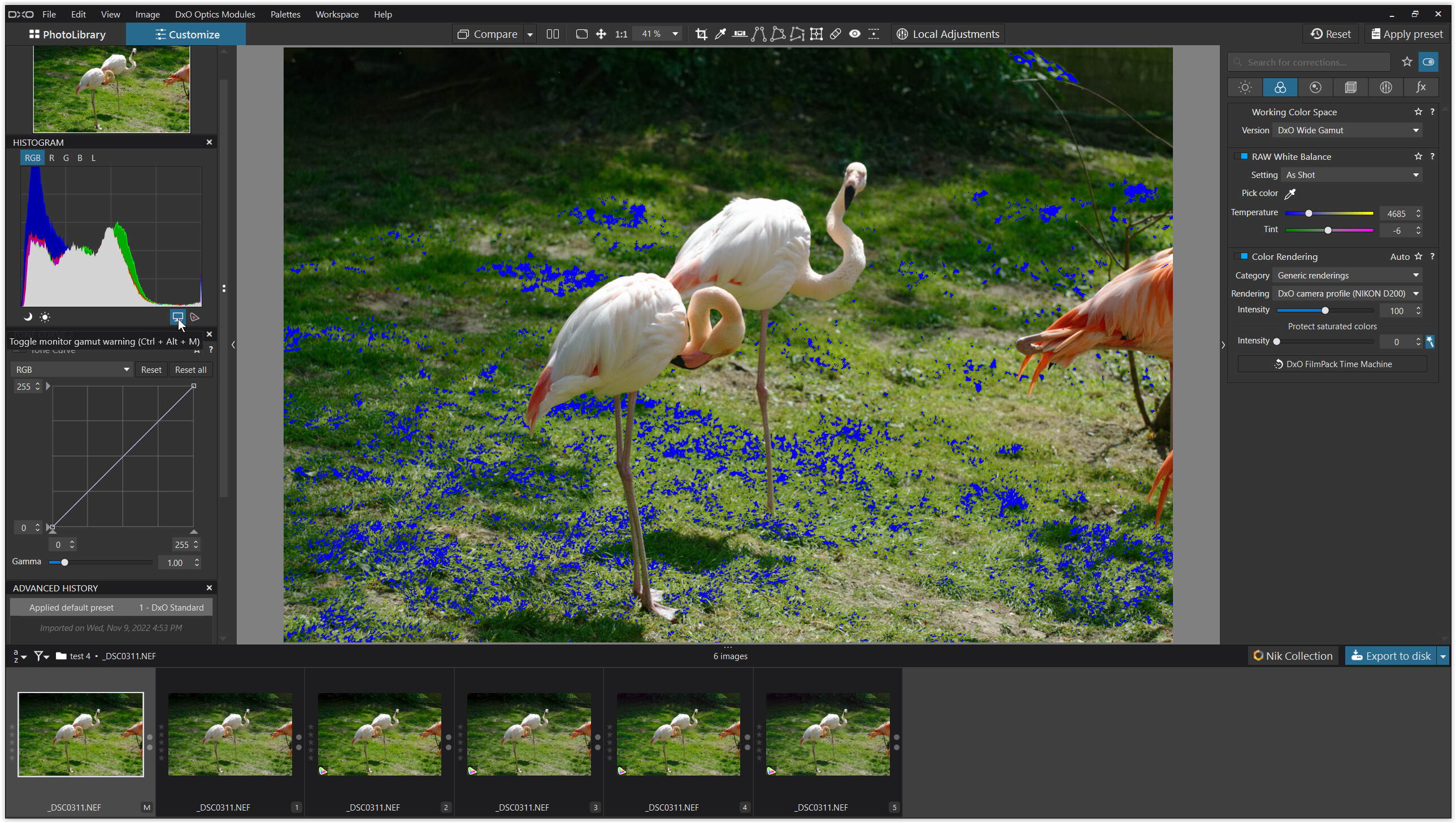
The Monitor out-of-gamut warnings show where image colors (as “defined” in the Working Color Space gamut) will not “fit into” the current monitor’s rendering capability.
The Destination out-of-gamut warnings show where image colors (as “defined” in the Working Color Space gamut) will not “fit into” the color-space as described by the ICC Profile specified for Soft Proofing … which is why that button is deactivated when Soft Proofing is not activated.
– Which, just BTW, is contrary to the Export-to-Disk ICC Profile setting “Same as Soft Proofing” which is (quite confusingly !) provided even when Soft Proofing is not activated !!
John M
changing the softproof profile with one of the upper profiles doesn’t change the monitor gamut warning. but changing with one of my imported profiles does,the working gamut and the monitors gamut doesn’t change
george
This statement
triggered me to do experiments …
some comparisons
(w/ sRGB screen, PL6 WG)
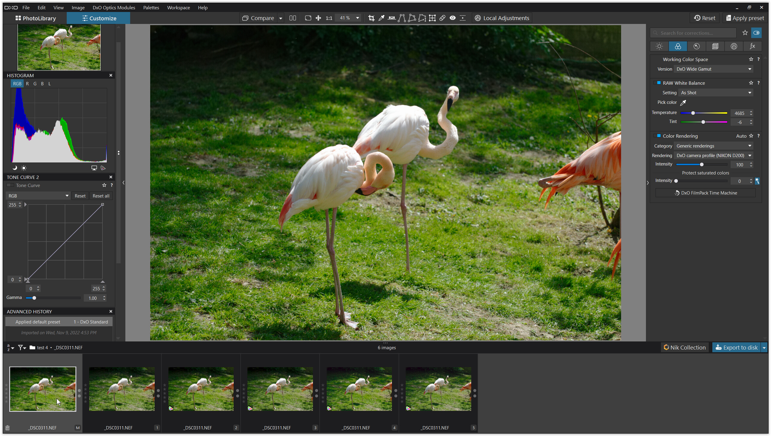
→ used an old pic with a ‘casual’ scene
_DSC0311.NEF (15,9 MB)
_DSC0311.xmp (8,0 KB)
_DSC0311.NEF.dop (61,7 KB)
→ RGB paper profile
SaalDigital_Fotobuch_glanz_10-15.zip (971,4 KB)
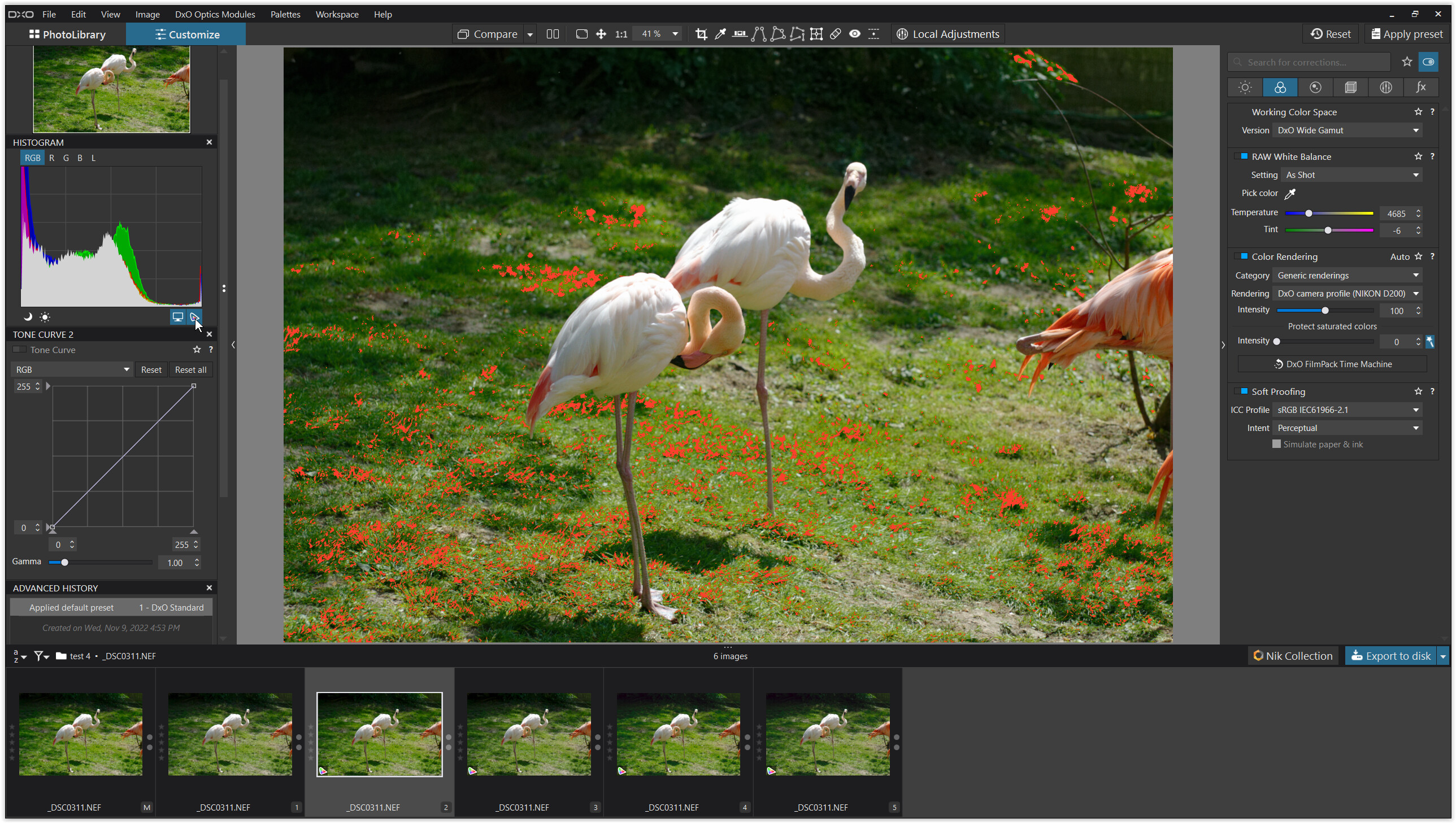
.
1.
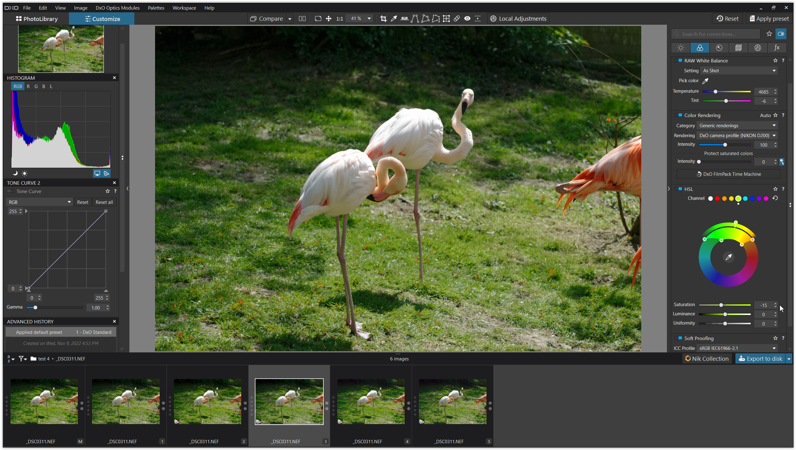
.
2.
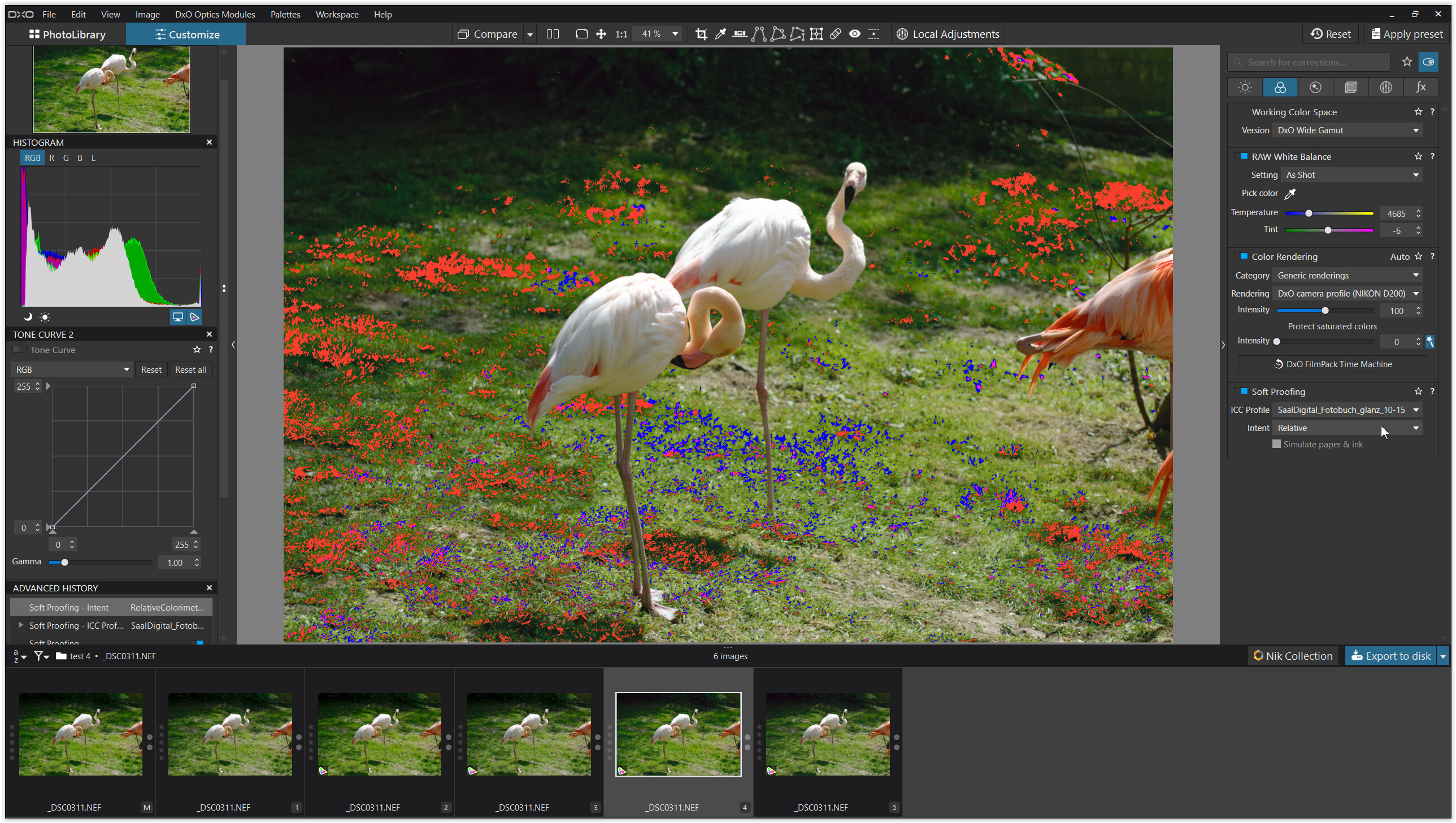
.
3.
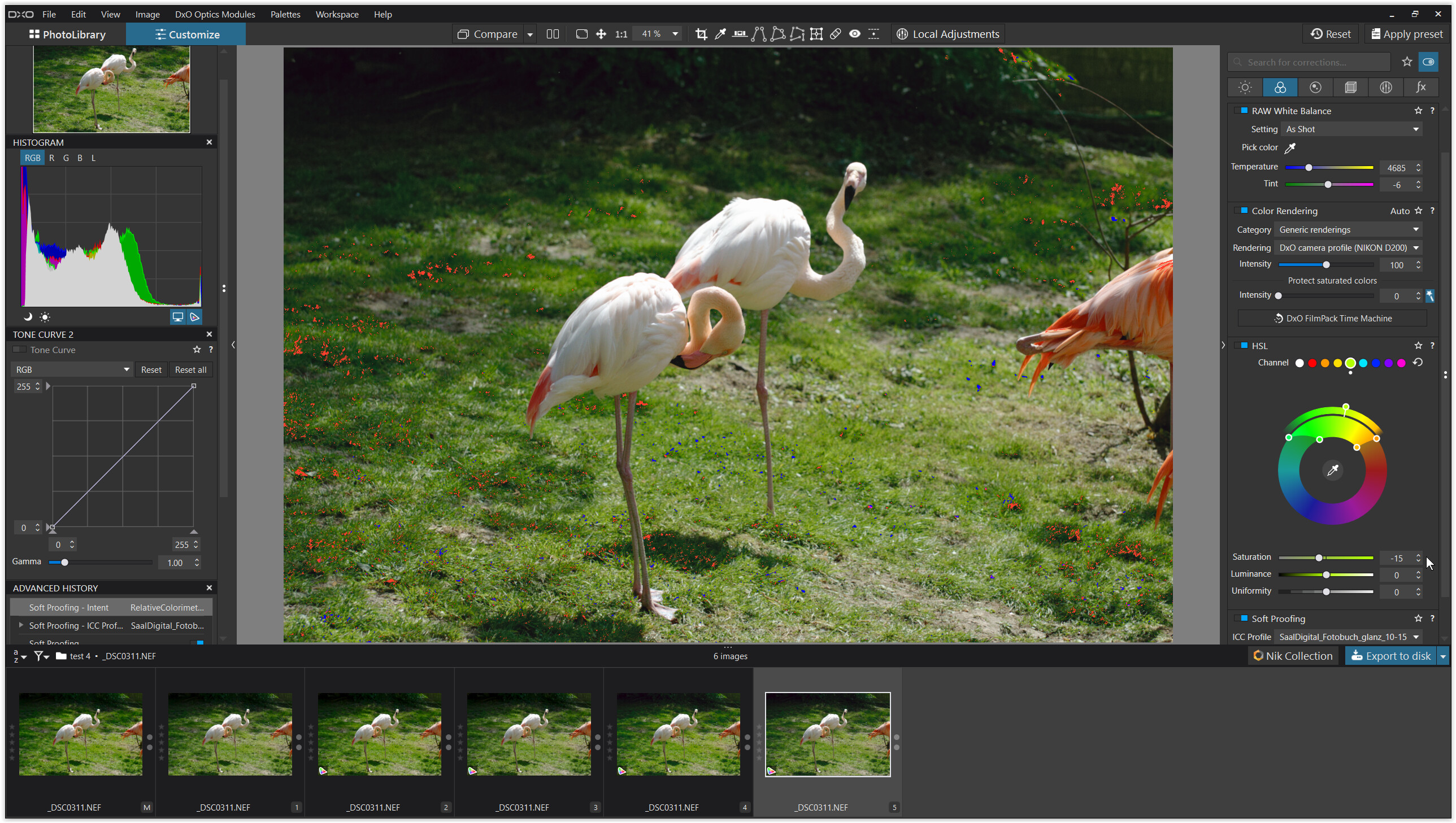
.
4.
.
5.
.
6.
.
7.
.
8.
.
9.
.
general note
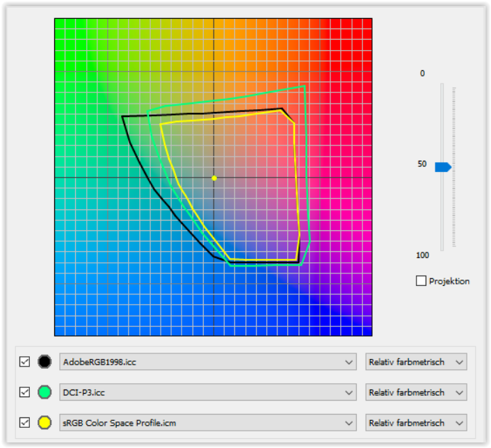
With softproof & export to sRGB IEC61996-2.1, DCI-P3 & AdobeRGB & ProPhotoRGB
DxO uses its ‘automatic’ rendering (“PSCA” → the initial graphic).
The visible rendering intent (perceptual / relative colorimetric) is not used.
With softproof & export to paper profiles DxO uses
the rendering intent perceptual (by default) or relative colorimetric.
→ see here … for further info
Thanks for producing a processing flow or pipeline, something for which I asked DxO for many times, so that we could all be talking from the same set of understandings.
I wonder about the assign nomenclature and separating out the use of PSCA.
PSCA - is this not just part of the various color space conversion algorithms? Are you highlighting that the algorithm works differently when sent to a monitor without soft proofing then with soft proofing? By this, I mean that (6) and (7) are one process and (8) and (9) are one process, and each of these processes uses a different transformation from the working space to the destination space.
I think confusion set’s in because both “standard preview” and “Soft Proof Preview” end up on the same monitor (assuming a single monitor setup). And isn’t the “monitor profile” supposed to be used all the time?
IN a typical situation, the Raw gamut is larger in some colors than any RGB working space is. Then the monitor gamut is smaller than the working space gamut. And once again, the printer gamut is smaller and different than the monitor gamut. So, we need 3 kinds of out of gamut warnings:
Since we see these warnings on the monitor, they can only be indicators of the out of gamut situation and warnings to us, the user, that the algorithms that covert between the color spaces will do something about those out of gamut warnings when we look at it on the monitor. It will not look the same on a different monitor or a printer.
From what we can deduce, the wide gamut working space (WGCS) .encompasses the gamut from all cameras profiled by DxO which means there is no need for any gamut warnings from RAW to WGCS.
For your other questions, please read all the boxes that describe the differences between Assign and Apply.
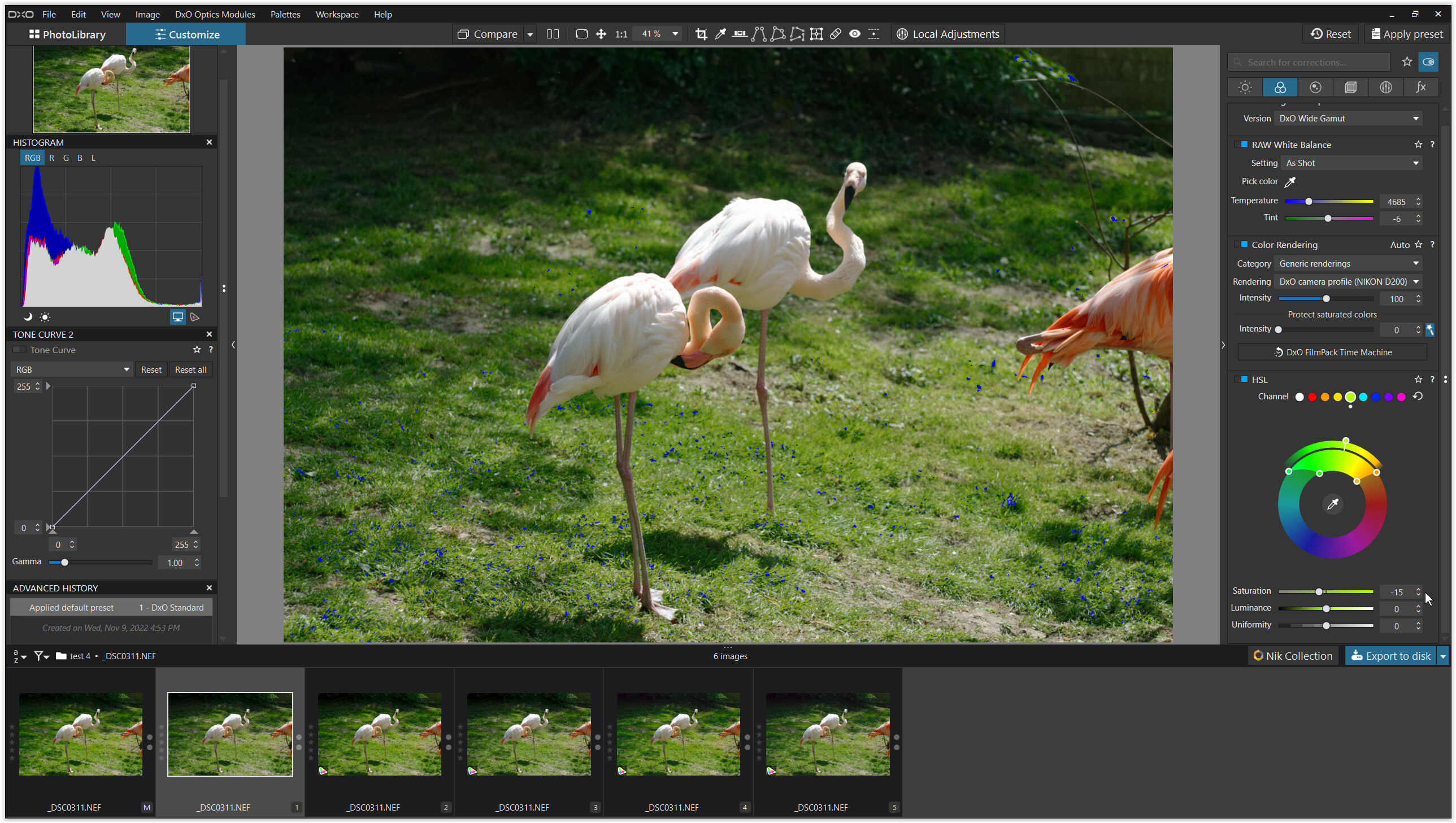
I just want to highlight and clarify something in your test.
Going from #3 to #5, you reduced the monitor out-of-gamut warnings, and in doing so also reduced the visible saturation of green being shown on your sRGB monitor. So what was the out-of-gamut green being rendered as on your sRGB monitor? Was it being wrongly rendered? Perhaps the saturated green was shifting a bit to yellow because it was clipped. It’s also possible that the out-of-gamut warnings are a bit aggressive like the highlight and shadow clipping warnings are - I don’t know (probably not). But with soft proofing on, you might possibly be seeing another adjustment by PhotoLab - what is being called the PSCA.
Here’s how to know if the PSCA is having an effect. If the exact same colors show up with soft proofing off, despite the out-of-gamut indicators showing warnings, then it’s hard to say that anything is going on over and above the ordinary Color Rendering selection and other Color adjustments, plus the conversion to sRGB (monitor and destination). In this case, soft proofing isn’t needed for WYSIWYG, because PhotoLab isn’t making any final automatic adjustments for export (the so-called PSCA).
However, if turning soft proofing on introduces a color rendering change even though the output color spaces are equal (sRGB monitor and sRGB export destination), then whatever PhotoLab is doing beyond your own settings to correctly render your image for the export destination (what’s being called the PSCA) is causing that difference. One can decide to keep that rendering PhotoLab generated; or, one can manually tweak the color rendering further in the adjustment palettes to get the desired output. Having Soft Proofing on even though the monitor and export destination are both the same (sRGB or Adobe RGB or whatever) ensures WYSIWYG at all times, because PhotoLab might be applying that little bit of extra secret-sauce to the image for export via the PSCA.
I also want to make sure it’s understood that it isn’t necessary to eliminate the out-of-gamut warnings in order to have WYSIWYG - we already have that assurance through Soft Proofing (which ensures that any effect of the PSCA is rendered on your monitor). By eliminating some or all of those warnings, we just reduce the saturation of a color so that it’s rendered differently in the output - hopefully more pleasantly, but possibly just more muted. It’s a choice.
Finally, Soft Proofing will offer you out-of-gamut warnings to show you WHERE the differences are in the image (monitor vs. destination - as in #8). However, it might not be possible to see exactly WHAT the differences are if your monitor can’t accurately render the image as it will appear in its destination color space. Once again, you can either manually remove the out-of-gamut warnings to equalize the outputs (monitor and destination) or just let PhotoLab do the conversion from the DxO Wide Gamut working color space, using your rendering intent if applicable and possibly including an extra PSCA at the end, and see what happens.
I hope this clarifies color management for some folks and doesn’t muddy the waters further.