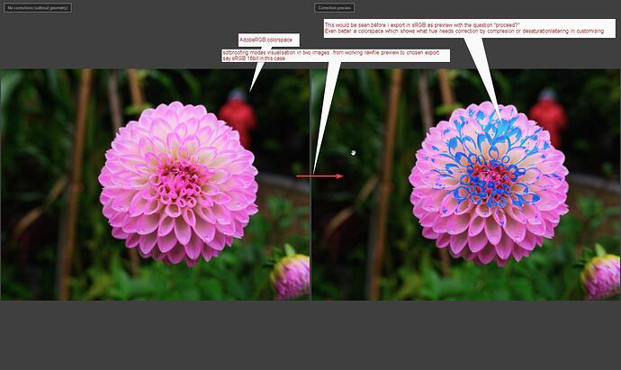
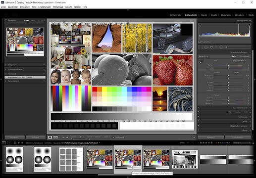
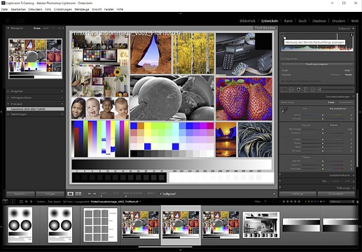
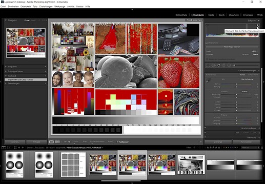
I personally would love to see such feature one day!
@nwboater do you agree that the saturation warningcolors arn’t adjusted to the screen capable colorspace? Nor the set export colorspace or icc?
And that soft proofing adjustment is done by default when you export to a 8bitjpeg sRGB or any other 16bit container in sRGB?
(workingspace is AdobeRGB. After all.)
My simple test shows that the warning is triggert by the colorchannel numbers/values which from raw to preview are always based on AdobeRGB. (inclines larger steps in the colorhue. More distance between bleeched and full saturated in the same steps (0-255) )
A exported file in the saruration warning is clipped or squeezed in sRGB colorspace.(don’t know if it’s compressed( which means recalculated for sRGB hue) or simply cut off at the 255 marker.)
In the present working the warning colors of saturation are useless if you want to end up in sRGB because of well i did show in my former post.
Peter, I’m in Kindergarten on ColorSpace. Most of what you and others discuss here is way above my knowledge level. So I just can’t answer your questions. However from what you post it certainly seems there are some issues re sRGB and I hope that DXO will resolve them.
There was some debate on the working color space and I recalled seeing what I reposted. For me it answered that AdobeRGB IS the working color space for PL. I also couldn’t see any advantage to Exporting in a wider color gamut than the PL color space and that also was confirmed in the post.
That explanation is crystal clear. Thank you for confirming.
export to Original (= camera setting), AdobeRGB, sRGB or Custom w/ perceptual rendering intent
( different to DxO’s print module )
i didn’t know but it’s answered by @Wolfgang 
explanation of Relative Colorimetric and Perceptual
https://www.cambridgeincolour.com/tutorials/color-space-conversion.htm
what i find struggling is for most people is a straight forward color management mostly enough.
clear if 's => then’s and some check modes to see if it’s in or out.
[in] means no futher action needed => print or export to jpeg done.
[out] means warning must be shown. like the warning colors of the sun and moon ikon.
So if i would like to check if my AdobeRGB preview image would fit inside any choosable ICC or sRGB 8 or 16bit it should be shown in the preview of the export modes.
development to jpeg or tiff or lineair DNG (not rawDNG) is the same as printing in essence.
So my ideal kindergarten modes would be:
And i would like to have the possibility to adjust the warning colors in possible settings:
AdobeRGB, sRGB, 8bit 16bit for file export (in the histogram window the controls) and a printheader for printer icc’s for those who like to print themselfs. (i never do only on basic toner printers cmyk so not so much knowledge about printerprofiles and creating colorprofiles to match to the paper Whitelevel in order to keep the WB correct.)
Aslong as we can’t control the warning out of gamut of the sun and moon ikon colors
These:
FastRawViewer is using the following color scheme to spotlight the areas of overexposure:
• Magenta – areas where the green channel is clipped.
• Cyan – areas where only the red channel is clipped.
• Yellow – areas where only the blue channel is clipped.
• Blue – areas where both green and red channels are clipped.
• Green – areas where both blue and red channels are clipped.
• Red – areas where both blue and green channels are clipped.
• Black – areas where all 3 channels are clipped
Can’t find DxO’s list of explanation of warning colors. but what also odd;
histogram takes over the warning color as image color in the channel numbers!
So in order to see which channel is clipping you need to toggle on and off. i would say the warning overlay should not influence the image pixel channel information right?
Hi Peter,
I’ve read your posts a couple of times …
-
Your screen is 100% sRGB capable, which means the display also plays back in AdobeRGB colour space – but only to a certain degree (roughly as far as sRGB is contained) → see graphic
-
I do not understand your explanation about “Protect saturated colors” (below your camera’s Color Rendering), while of course OFF with an exported TIFF-file.
-
The blueish complementary colour is nothing else than an overexposure warning and the clipping indicates some overload in the red colour channel → too bright.
Similar to when taking a photo from an object with a brigthly lit, predominant colour. -
There also might be oversaturation, but there is neither a gamut warning nor a softproof capability
– if not introduced ‘secretly’. -
Did some experiments with my ColorChecker and adjusted the raw-file’s (black &) white point
with the Tone curve, just shy of the clipping warning.
-
Export as 16bit TIFF-file w/ AdobeRGB colour space didn’t show clipping
inspite of the histogram moving slighty when compared to the adjusted raw-file. -
Export as 16bit TIFF-file w/ sRGB colour space showed some clipping (as your example)
and a slightly expanded histogram, ‘touching’ the (black &) white point.
To solve that ‘issue’, I just took down the Tone curve by 1 point (255 → 254).
.
BTW, all exports were done with monitor set to AdobeRGB as well as sRGB colour space
(changed custom profile preset & restarted PL) → no display profiles involved !
note
When exporting a file, at present DxO uses the rendering intent perceptual.
– Say, you have a file in AdobeRGB colour space with some colours, which when exporting to sRGB colour space would land outside the target’s range. The perceptual rendering intent takes care of that and all (not overexposed) colours are moved into the target’s colour range, so that the perception of the present colour renditon is kept. – While simple and userfriendly, all colour values change to some degree, depending on how much ‘outlandish’ has to be stored in.
As already said, with a screen like yours the ‘best’ solution is to export in sRGB colour space
– and even better when your screen is properly set / calibrated.
Should you have a special project, you export as AdobeRGB and reduce to sRGB later.
→ The way back doesn’t work, as you don’t get the ‘extra’ colours back.
And do yourself a favour and try some of the mentioned test pics. 
have fun, Wolfgang
addendum
The above test was done with “Protect saturated colors” ON.
-
After digging into that topic (and some understanding), I switched “Protect saturated colors” OFF and repeated the test (5) – but no change w/ the clipping indication, independent if the monitor was set to AdobeRGB or sRGB colour space → no display profiles involved !
-
Comparing the histograms of the equivalent output files, I could see the influence of that saturation protection switch, now leading to some ‘sligthly’ higher saturation values in the 3/4 tones (the bright side).
If you have the magic want active this slider starts to clime, from 0 til 100%, if the saturation of colors are passing the boundery’s of AdobeRGB. It "protect’s your image from clipping colors due desaturation of the full saturated colors in that image when you change contrast and such.
So in order to have saturation warning in AdobeRGB. I just pushed saturation until i saw the protection starting to be active. Just for the test not as editing skill.
3 and 4, i was earlier in a search about the color indication’s and dxo doesn’t have that specific explanation as FRV has,
It’s over brightning or over exposure of the rawfile and saturation of one or more of the channels. I think they used this:
About gamutwarning, it’s as far as i can detect pure based on there working colorspace AdobeRGB. And fixed on that. Soft proofing is adjustable between colorspaces.
So dxo has no softproofing.
I know and agree.
Which test pics?
The perceptual intent rendering give DxO the wiggling space to let the warnings just be done in AdobeRGB. Workingcolorspace. During export all colors are squeezed inside sRGB equally spread out giving a natural look.
My proposal is creating a easy userinterface with some softproofing capability’s.
A side by side image view one in working colorspace as always AdobeRGB and one depending on the choosen export colorspace.
Marking the oversaturated/clipped colors with colors and maybe the same kind as FRV has a channel separated underexposed and over exposed Percentage.
Peter.
I always have fun working in dxo. It’s a hobby 
I think what you see on your screen is in the color space defined in the preferences. In my case sRGB. So also the clipping warnings.
If you want to see the underlying pixel values of your clipping warnings, set the mouse pointer on a warning and switch with Ctrl-W or Ctrl-B. You’ll also see that clipping warnings for highlights start at a value of 254.
George
Hi Peter,
now I understood what you did (never watched that functionality) 
→ addendum …
- something irritating:
one can activate this protection slider also w/ output files,
but unexpectedly it has no effect ( → tested by comparing saturated VCs … )
.
while it does – as soon one applies Color Rendering / Film … *)
And yes, you might be right that the “Protect satured colors” magic wand

acts in conjunction w/ AdobeRGB colour space
- as this is PL’s internal color space
- and can avoid some oversaturation
– otherwise covered by a wider colour space ( ProPhoto, Melissa, ROMM RGB … )
only,
- it’s neither an out-of-gamut warning
- nor has it to do with softproof
both realized e.g. in LR – and (also) helpful when using sRGB monitors
have fun, Wolfgang
addendum
From → here … I got a test pic in ProPhoto RGB colour space
set my monitor to AdobeRGB colour space,
started old LR 5.7
and put LR in Softproof mode → sRGB / relative colorimetric
note – don’t judge the colours from those screenshots
(the Forum’s software doesn’t support any profiles)
*) Protect saturated colors (from the manual)
Hi Peter, almost forgot about …
Following the video by Andrew Rodney, I realized that Keith Cooper now has a couple of videos online.
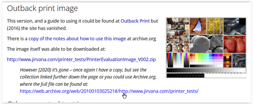
Ever since I made (and make) use of his informations and especially the well documented test pics, which are not only good for printing → see here / here.
The Datacolor test image is available in AdobeRGB color space → download …
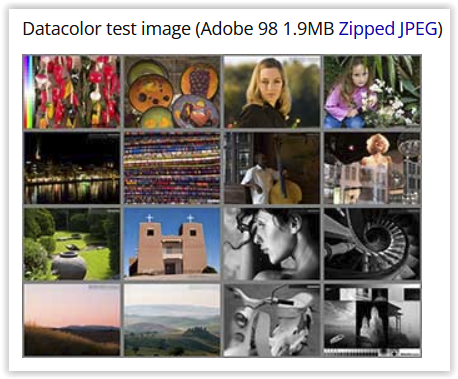
and also in sRGB → download …
but with it’s variety of scenarios → check … it is much more useful
than the (next) Fuji sRGB test image, used for Fuji’s Frontier System.
And you find → other test pics there too.
Wolfgang
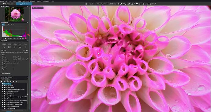
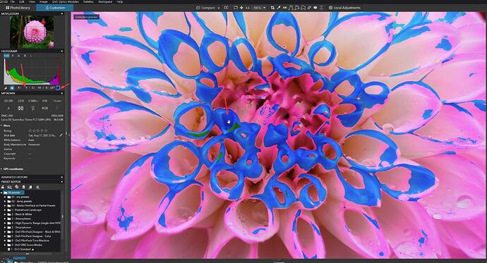
my small test shows that if i saturate red/pink until the saturationwarning (blueisch spots) and export then in AdobeRGB 16tiff and sRGB 16bit tiff you see in the adobe tiff the same warnings again. (workingspace over saturation is clipped but border of full saturation 10%/5% from 100% is usually the blinkies activation level) wile in the smaller colorspace of the sRGB tiff the warnings much more visible are: perceptual intention squeezes the outer values more inside => more pixels are 95% isch saturated.
This shows that the saturation warnings are based on workingspace only and not based on your display colorspace settings.
i don’t want to play pinpointing and nitpicking (not at all, i am not in the position to do so in this area.
Just get the things clear and recalibrate my knowledge on this.
quote from someone who knows what he’s talking about:
Gamut: This is the area in which the color producing object (a led, paint toner, ink, de sun) all redisch, blueisch, yellowisch, greenisch and all color around can produce.
i miss interpreted it a bit maybe.
but colorspace and gamut are the same if i am right:
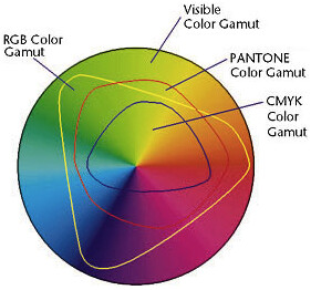
So out of gamut warning could be based on your display ICC profile or just from AdobeRGB/sRGB.
right?
Colorspace: a defined area in which a color-range is mapped for reproduction.
Notice the ProPhoto colorspace which over steps the visible gamut of the human eye.
Reply Digidog: **You’re showing the color gamut again, differently but yes. The container (with or without any pixels) defined by (in the case of your illustrations) the plotting of their primaries: red, green and blue.
That is what i allways try to remember: Gamut is the maximum capable colorrange a device can produce wile colorspace is a more structured defined colorrange. (like mine monitor has a bigger gamut then sRGBcolorspace.)
DxO is lacking any form of softproofing other the exporting “downsizing” from workingcolorspace to sRGBcolorspace wile using perceptual intent rendering . And unless they add a userinterface which holds a from of control (settings) in which colorspace is rendered in an other and on which device/paper we can speak of no soft proofing. 
Saturation warning and blown/noisefloor warnings triggered by the moon and sun ikon are as far as i understand based on two things:
Saturation of channel(s) in color and luminance level/brightnes (which is totaly different from “exposure” which is only connected to the rawfile’s “gamut/colorspace” and in pixel RGB-modes it’s a mapped kind of saturation depending on the used colorspace.)
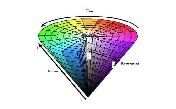
the RGB based colorcone. max value on all three RGB means you get “white” turn green off and you get magenta like purple fully saturated.
thanks i will read and watch it.
I think this is to quick. I did your test and I must say it’s fun to play with it.
Switching between the two tiff files also shows a little movement in the histogram. In my thoughts the RGB image will be expand to AdobeRGB working space and then back again to sRGB monitor space, in my case. The extra clipping you see is a difference in pixelvalue of 1 or 2. Not much for 2 transformations.
But the movement in the histogram is more interesting.
Oh, clipping starts at 253.
George
see → my last Addendum …
-
The blue overlay shows a warning about the monitor’s colour space.
– If that’s my display profile (AdobeRGB in this case, optimized for grey scale) or the native monitor color space (indicated to cover 99% AdobeRGB), I don’t know. -
The red overlay shows a warning about the chosen target’s colour space,
in this case sRGB w/ rendering intent relative colorimetric.
What matters in the end, if the monitor does show what you are working on.
yes, depending on image content (technical, not subject) as shown [here].(Color space.... again - #53 by platypus)
I think the movement of the histogram between these 2 files is due to the rendering intent. When a sRGB file is loaded the file is transformed to the AdobeRGB color space. Since this is a bigger one only the pixel values are changed to gain exact the same colors. But once in memory what is seen is sRGB. That same file is now transformed to sRGB using perceptual rendering intent. All the colors are shifting a little. And to the right of the histogram.
George
Sorry, i was off to hunt for bathroom furniture, someone wants to renovate the badroom…
drove more then 300km yesterday in order to select some things. (yes i am oldfashion i want to see and feel the product because i am the one who places the stuff so if it’s rubbisch it’s not bought.:-).)
If perceptual is used then the squeezed colors from adobe to srgb could be restored in the proces of srgb to adobergb.
see cambridgeincolors link above. its reversible.
and if the sun and moon warning colors are “set to file colorspace-index” sRGB in this case then the restored colors could be “out of gamut” which explain the more warning indicationcolors on the flower.
