I am aware that a lot has been written on this topic, but I have not yet found the ultimate sentence that gives me an “aha experience” so I take the chance to write this post.
Have read so my eyes are sore and red about which color space I should use. My workflow is: shoot an image (RAW), convert and adjust in PL5 Elite, then export (in TIF format) to Affinity for the last adjustments and export to JPEG.
If I have understood this correctly, the following is recommended:
If the images are to be printed, is Adobe RGB recommended?
If the pictures are to be viewed on an online / PC screen, is sRGB recommended? (this is what i use today)
I am working on some images that I am considering printing / making a poster. Based on the newly acquired knowledge , one would think that Adobe RGB would be the right color space, but the problem is that my lap top only has RGB 8 bit (sRGB iec61966-2.1). What color format will my laptop show if I use (in PL) Adobe RGB, sRGB? If so, is there any point in using Adobe RGB?
In Affinity I have several options on color space including 16 bit and sRGB iec61966-2.1. What is the difference between these?
To make a long question short: What would the workflow and the setting of the color space have been if you were to make a poster for an exhibition, for example?
I use the default AdobeRGB profile on both my camera and PhotoLab whilst editing, then I export to TIFF with the ProPhoto RGB profile. From there on, I do any other work in Affinity Photo, etc in that colour space.
short version:
If you don’t plan to use a different screen, stay with sRGB, also when printing yourself.
Nowadays, the category PhotoPrinters allow a colour space bigger than sRGB. As a result of this, working & editing e.g. in AdobeRGB colour space, while using a screen that cannot handle the wider gamut (bigger colour space) you may introduce & print unexpected colours.
→ Either you live with that (not every subject has an extended colour range) or you restrict to sRGB.
PL’s internal colour space is AdobeRGB. – If set like this
then the program will use the appropriate display profile (sRGB in your case) to display the pic correctly (no final conversion yet).
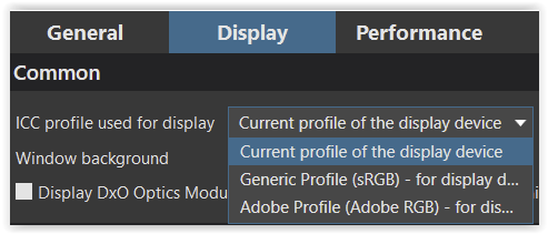
→ If there is no such display profile (or you don’t know), choose “Generic Profile (sRGB)” in PL.
Different to e.g. LR, PL cannot show you colours – or more precise a warning, when you have / edit saturated colours that go beyond your display’s colour space … you have little to no control.
printing with sRGB workflow:
When exporting your pic as TIFF to use it in AP, choose sRGB
which now applies the sRGB profile to the pic, definitely converting the colours to sRGB colour space while using the rendering intent perceptual.
→ That’s your solution, as long you don’t use a better screen as well as PL is not improved …
Should you want to keep the maximum colour space, you apply AdobeRGB ICC profile instead.
→ Having applied a small(er) colour space, you don’t get back the colours from the larger one.
…the vast majority of labs that print images for clients like me work exclusively in sRGB,
and if these labs also work with standardised papers and provide the paper profiles, you can also do a soft proof with LR and iPhoto…assuming a calibrated monitor.
I remember a post by Joanna where this was all explained and I learned a lot, but I can’t find it right now.
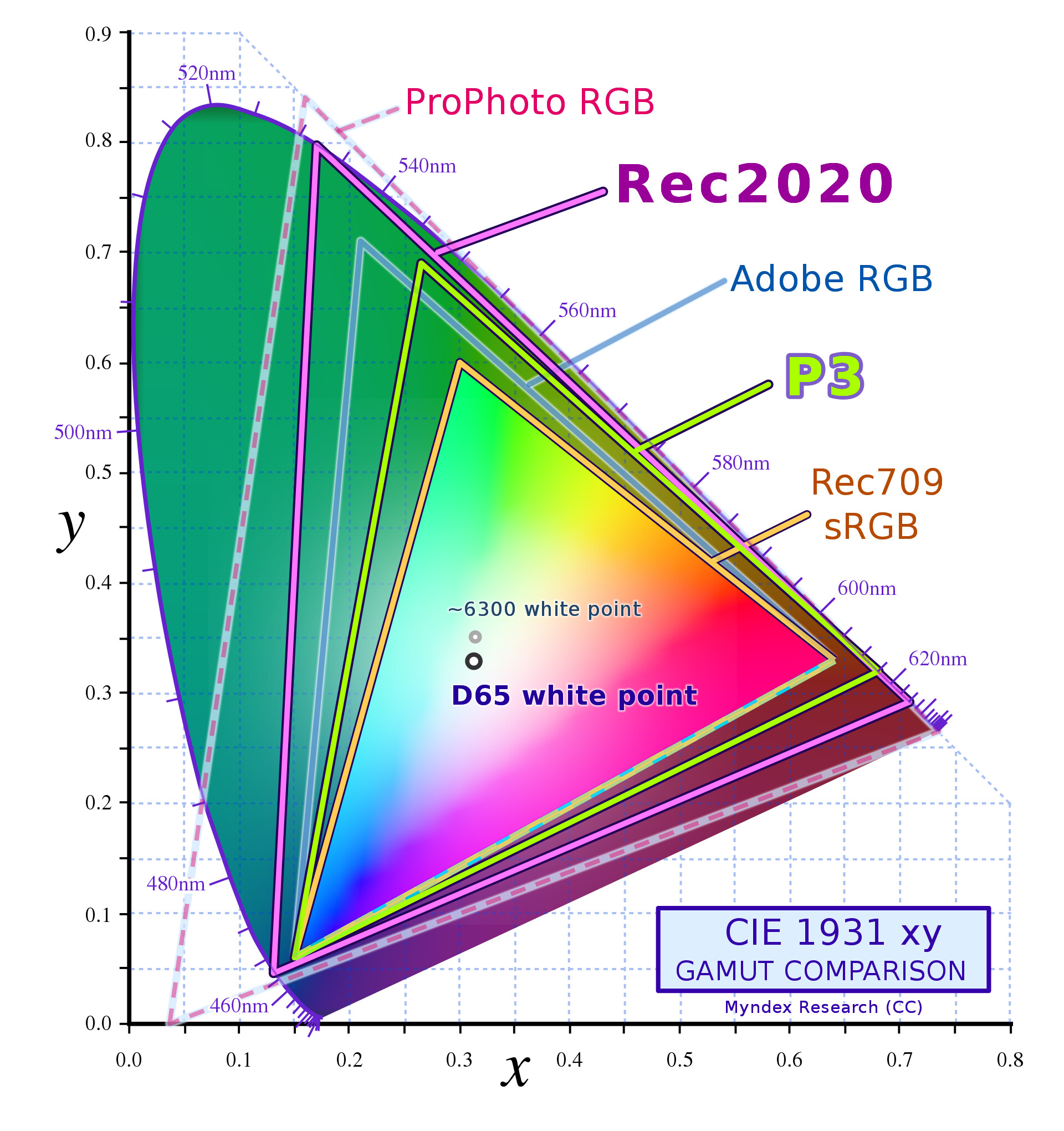
Most modern printers are capable of reproducing a wide gamut like Adobe RGB (1998) and even more.
Working on the widest gamut possible is always better, and then just at the end when exporting, you choose which color space you want your image to be “converted” to.
All web content, and basically any app, use sRGB IEC61966-2.1 which is considered as the “starting point”. Any gamut larger than sRGB is considered a wide gamut (Display P3, Adobe RGB, rec2020…).
Since a few years, the Display P3 gamut (a variant made by Apple, based on the DCI P3) is gaining traction and many displays on the market are able to cover it (even a cheap Dell monitor is able to reproduce 95% of the Display P3 gamut). It seems that Display P3 is going to replace sRGB in the coming years for all online content…
PS/ any color profile set in camera does not affect your RAW image (this only applies to JPGs generated by the camera). You can choose “sRGB” for your shooting, and when you import your RAW file for editing, you still access the full gamut captured by the camera.
PS2/ there is currently no monitor on the market capable to fully cover the widest gamuts, like rec.2020 and ProPhoto RGB…
That’s a very good point that’s little understood.
I set my camera to AdobeRGB because it affects the JPEG shown on the rear screen, for much the same reason as I choose the flattest possible “Picture Setting”.
That philosophy carries over to using PL, where my default preset is my custom Optical Corrections only, to which I have added the Adobe DCP profile that matches the camera’s picture setting.
The result of all this is the I get the flattest possible rendering, upon which I can build the tonal range and contrast that I want, rather than having to “dial back” somebody else’s idea of a default rendering.
FWIW I shoot raw and JPG in camera. JPGs are sRGB. Raws are… RAW…
When I edit RAWs and export for print I export in AdobeRGB. When I export for web I export in sRGB. If I were exporting for subsequent processing I’d export AdobeRGB and 16-bit per channel if possible.
Camera on adobe RGB so the oocjpegs made by say stitching in panorama mode has a larger colorspace. All siblings of raw files i only use for previewing before developing a rawfile. So those ooc-jpgs end up in the bin.
In PL
Working colorspace sRGB. So editing i do in SRGB but when i export a TiFF i export in AdobeRGB to give NIK or an other aplication some extra wiggle room. (yes i understand i would cut off colors if i choose to demisish sarurationwarnings before export. I let some life when i export for second editing.
Jpgs are always sRGB.
You can always export again just for printing with colorproofing active. (not a feature in PL if i remember correctly.)
As far as I know the working colorspace in DPL is Adobe RGB and this can not be changed anywhere. When you export a file though you can choose the colorspace for that file.
sorry let me elaborate:
PL’s working colorspace is AdobeRGB which is fixed:
cameracolorspace (no WhiteBalance! so no “real color” just measurements of RGBG in the widest range the sensor can handle noisefloor to saturated (overexposed))
Whitebalance is made in PL’s AdobeRGB workingspace by determine Whitepoint and blackpoint and whitebalance by the rawconverter) (all reasonable sensordata is squeezed (or clipped) inside the AdobeRGB.)
from the PL workingspace (whitebalance is set colorspace is AdobeRGB) is squeeze down to display viewingspace. (in my case sRGB but you could go to 98% adobeRGB if the screen handles that and is calibrated to that profile.) this is actual the place I work in. All warnings of saturation and overshoot/blowout (colors made by the sun and moon in the histogram) are based on that (sRGB) not on workingspace of PL’s engine (AdobeRGB).
So by setting display colorspace you set YOUR working space. (a personal profile(say a calibrated screen or default one.)
(the data of the rawfile is converted and squeezed in AdobeRGB and the warnings show if it’s clipped in sRGB but maybe not AdobeRGB could be but that’s clipped anyway.)
So say i modified a rawfile intil its nearly out of the warnings but stil some visible it would be clipping that if i export to sRGB based jpegs but if i go to a second editor, Silkypix or NIK’s editors i export in AdobeRGB 16bit Tiff.
maximal color space/depth i can send. (i get some extra wiggle room (extra image data) if i re-edit exposure, contrast, lumination, saturation) when i send it back to PL in Tiff it’s stil in adobe and it could be triggering warnings which you can ignore or readjust before exporting a sRGB based jpeg.
And to make it even more difficult i pretty sure PL is constantly converting rawdata into AdobeRGB=>display sRGB so when you adjust exposure or luminance or contrast or colorsaturation it constant recalculate what’s able to fit inside AdobeRGB when it demosiacing the rawdata (RGBG)
It’s a pity therefore that PL works in Adobe RGB. It would be ‘better’ if the RAW conversion process was done in the wider ProPhoto. Yes, I realise monitors cannot display the gamut of ProPhoto (and nor can printers print the gamut of ProPhoto) and so the colours seen on screen are colour-managed down to, usually, sRGB or if it’s a high-end screen down to AdobeRGB but at least the source data is in the widest possible gamut.
I suspect though PL is not going to work in anything other than aRGB anytime soon as the recoding needed to switch to ProPhoto sounds non-trivial.
i think because they convert continuously you have access to the full source data . it’s like moving a open A3-frame around on a A2- canvas unles you cut the piece (export) you have all data to use.
On most cameras the difference between AdobeRGB and sRGB tone is hardly noticeable on the rear screen (which keep in mind is just a temporary reference). I never turn AdobeRGB on in my cameras as it makes the jpegs created (don’t use jpegs often but for those occasions) a dormant time-bomb. It’s much too easy to let an AdobeRGB jpeg slip out into the world with bad colour forever.
So you never use panorama, or focusstacking or creative scenes from the camera?
my panorama modes i use portret from left to right as a virtual ultra wide lens. my 12mm f2.8 becomming a 6mm f2.8 lens
instant focusstacking is a 4k movie which is processed inside the camera if i want to a jpeg.
Sunset scene: is a great way to store a example of the scene and then shoot a rawfile for the after edit.
sunstars on candles is an other one. usefull? nope. Fun? certainly
Once demosaiced the data is a full-resolution image in the native colour space of the camera. That then has to be converted to a standard colour space (ProPhoto/aRGB/sRGB) and that involves multiplying the RGB values in the demosaiced image by a (secret sauce) 3x3 matrix.
My point therefore is that applying a matrix that converts the demoasaiced data to ProPhoto gives you data that inherently has a wider ranges of colours than converting to aRGB. True, you are never going to see this wider range of colours because, at best, the colour management of your system will have to manage the colours down into aRGB, for viewing on an aRGB capable monitor, but more likely mange them down to sRGB, but it doesn’t alter the fact those colours are available in the data.
In other words, by applying a matrix that converts the demoasaiced data to aRGB (which is what PL does) you are ‘losing’ colours that could be there if you were working in ProPhoto.
Meanwhile back in the real world, hardly anybody will notice or care, myself included. When I export from PL I use sRGB because:
a) That’s the only sensible colour space to use to ensure your images look more or less as you intend them on someone else’s monitor / phone.
b) My printer is good but not high end and, despite the files being sRGB, the prints I get out of it look good enough to me to hang on my walls.
 , one would think that Adobe RGB would be the right color space, but the problem is that my lap top only has RGB 8 bit (sRGB iec61966-2.1). What color format will my laptop show if I use (in PL) Adobe RGB, sRGB? If so, is there any point in using Adobe RGB?