![]()
But it’s good to read also in other forums that a lot of people are asking the same questions, jumping from article to article and remain perplexed
Thanks for your patience
![]()
But it’s good to read also in other forums that a lot of people are asking the same questions, jumping from article to article and remain perplexed
Thanks for your patience
No problem, i think everyone is confused in this area.
It’s that complicated that every different viewpoint.
(In dutch aanvliegroute) causes a WTF i thought it’s…
I still don’t know exact how dxo does the conversion between rawfiles data and the working colorspace. The under the hood system. (and they never will tell us because that’s holding the primedenoise en optical module secret.
I gues continues demosiacing process where WB and thus CA reversed change the settings of the proces and along other parts. So that’s why i think that it doesn’t matter if you use Legacy or Wide Gamut as working place.
Legacy is better in normal export as jpegs for general use. (the visualisation gauges for interpreting which way you should go in edit are better connected(scaled) to the end colorspace. (So no need to softproof then.)
One article of whitewall, where i also order prints sometimes Softproof und Druckvorbereitung - tolle Expertentipps | WhiteWall
Am Ende speichern Sie die Fotos im richtigen Format. Während es wichtig ist, während der Bildbearbeitung mit 16Bit und einem möglichst großen Farbraum zu arbeiten, halten Sie sich beim Speichern der Fotos an die Vorgaben von Whitewall. Deshalb konvertieren Sie den Farbraum nach sRGB und stellen die Farbtiefe auf 8Bit, bevor Sie das Foto als TIFF oder JPEG speichern(Sorry no deepl at the moment)
The last one for today
https://fotovideotec.de/kalibrierung/softproof_druck_ausbelichtung.html
Good night
checked for your paper profil and put it in the software, that I still use for those kind of stuff
(hardware = no more supported → outdated driver = another way to force customers to ‘upgrade’)
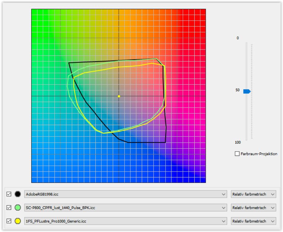
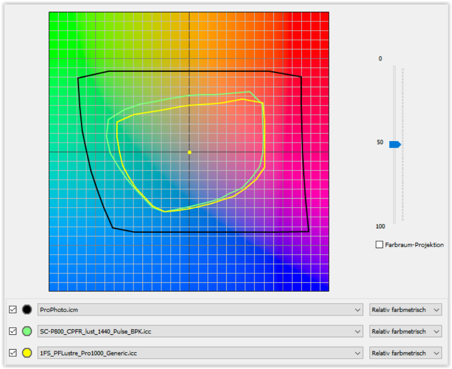
the green line = Canson Platine Fibre Rag w/ custom profile
Agree. Another thing is, that it’ s almost impossible to actually see how much/far a certain colour is out of gamut (and thus, wether it matters much at all). Could be almost in gamut (and hardly noticeable later), or completely off (and very much noticeable later).
The new “out of gamut” buttons on the Histogram (bottom row, RHS) are intended to provide that info;
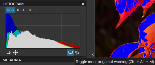
Note: The proffered shortcuts do not work, tho.
John M
Thank you John. In your example it looks like the red and blue are out of gamut. Histogram also indicates that. But…is it possible to see how much these colours are out of gamut? How far is the blue out? How far is the red out? Just slightly, or maybe very far? Lighter or darker reds/blues in that “gamut checker”, possibly indicated by numbers, would be of great help. But maybe that’ s the case with the new “out of gamut” buttons?
The bigger the difference between working color space and output color space, the bigger the corrections that has to be done. Theoretical.
George
No, green and blue.
George
Correct. Theoretical. Big correction / small correction / not so much correction / just a little correction /etc. I guess it all comes down to personal experience with images/software/printer/paper / output.
Ok. But still the question remains…how far out of gamut.
You’re quite right - It shows the areas that are OoG (and, therefore, will be clipped) … but not by how much.
John M
For those of you wanting to read more in depth on color managment, I suggest visiting Andrew Rodney’s web page
He also wrote a very informative book on Color Management “Color Management for Photographers”. It was first published in 2005, but the information inside is very relevant today. If you want to broaden your color management knowledge, it is a great place to start.
There is no direct indication about that quality. The histogram and its colour indicator are bound to the on-screen preview.
If we wanted to know exactly, we’d need a histogram and a colour indicator that are both based on raw data or the latent image.
Geeky stuff: how about a 3D histogram that shows - instead of the x-axis - the CIE 1931 horseshoe?
The histogram will in no way tell you something about the gamut. It’s gamut independent.
George
Yes this guy is “godhimself” in colormanagment and theory.
Some times i read his posts and blogs every time i think geesh i learned a thing.
Mostly my initial assumptinon of something was wrong but that aside. ![]()
I would love him to play with photolab to see if he understands all the bells and wistles in it’s tech. A walkthrough so to speak.
Another reading is Manual of Photograpy. It’s the successor of the Ilford Manual of Photography, first published in 1890. The tenth edition 2011 also covers digital photography.
This side gives a full view of the contents The Manual of Photography, 10th Edition [Book]
George