(geektest or longwinded post for some who like to test themselfs)
Wel playing with colorfull flowers to see if i migrate towards WG as standard.
AdobeRGB is different then Display P3 we could say P3 is tilted to handel more “redisch colors”
So you lose in the green saturation and gain in the orange/red/yellow part of the Horse shoe.
Which is great for flowers and other colorfull images. (Not for plain green forrest i think )
An other part of the thinking process is export. present monitors/display devices are html sRGB driven mostly so most advises are export in sRGB unless your planning to print/hardcopy.
But there is a but, i don’t want to re export all my images every update of a device i buy so would it be better to oversize for my present gear and move on to the new future standard Display P3?
(This means rather uncontrolled by me rendering intent by the device drivers ICC’s from Display P3 twowards smaller sRGB until we updated to the P3 level.)
An other thing wil be then Legacy/AdobeRGB is to small to handle P3 in edit working space which means there will be moved colors between those two colorspaces.
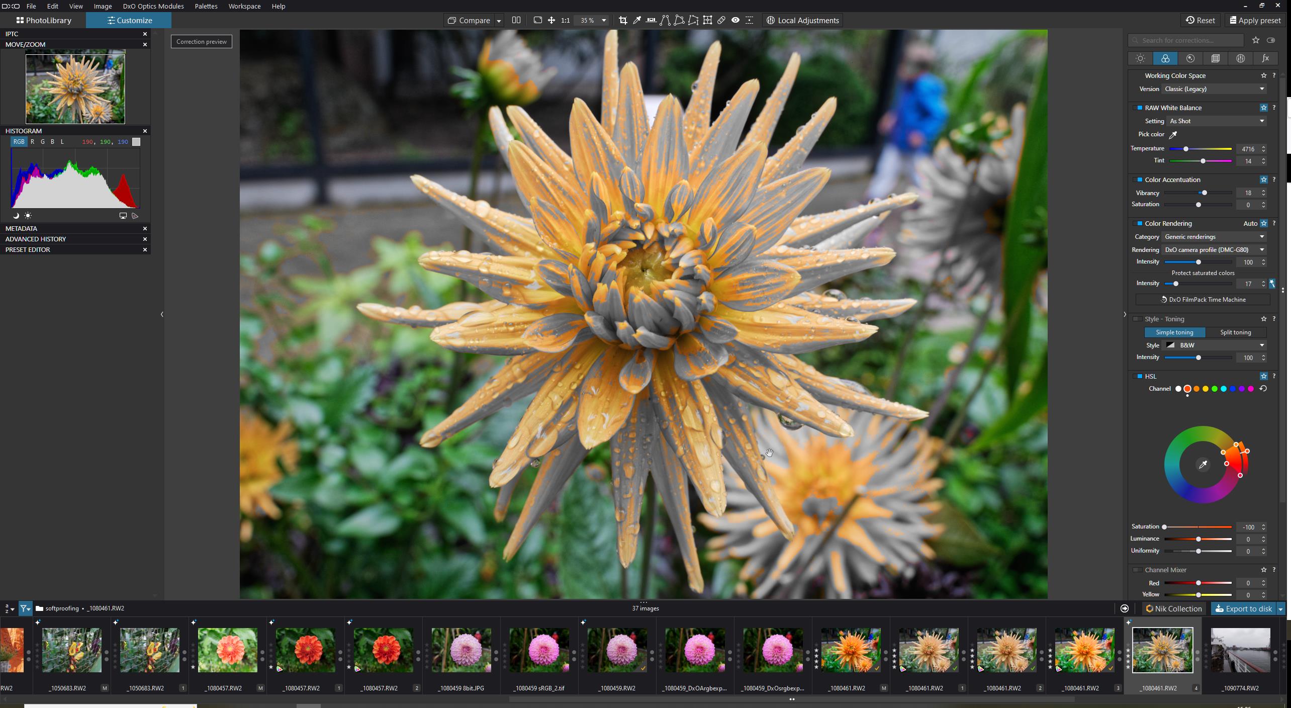
So using P3 inclines to use Wide Gamut of DxO which seems to be REC2020 like. (physical possible produced colors.)
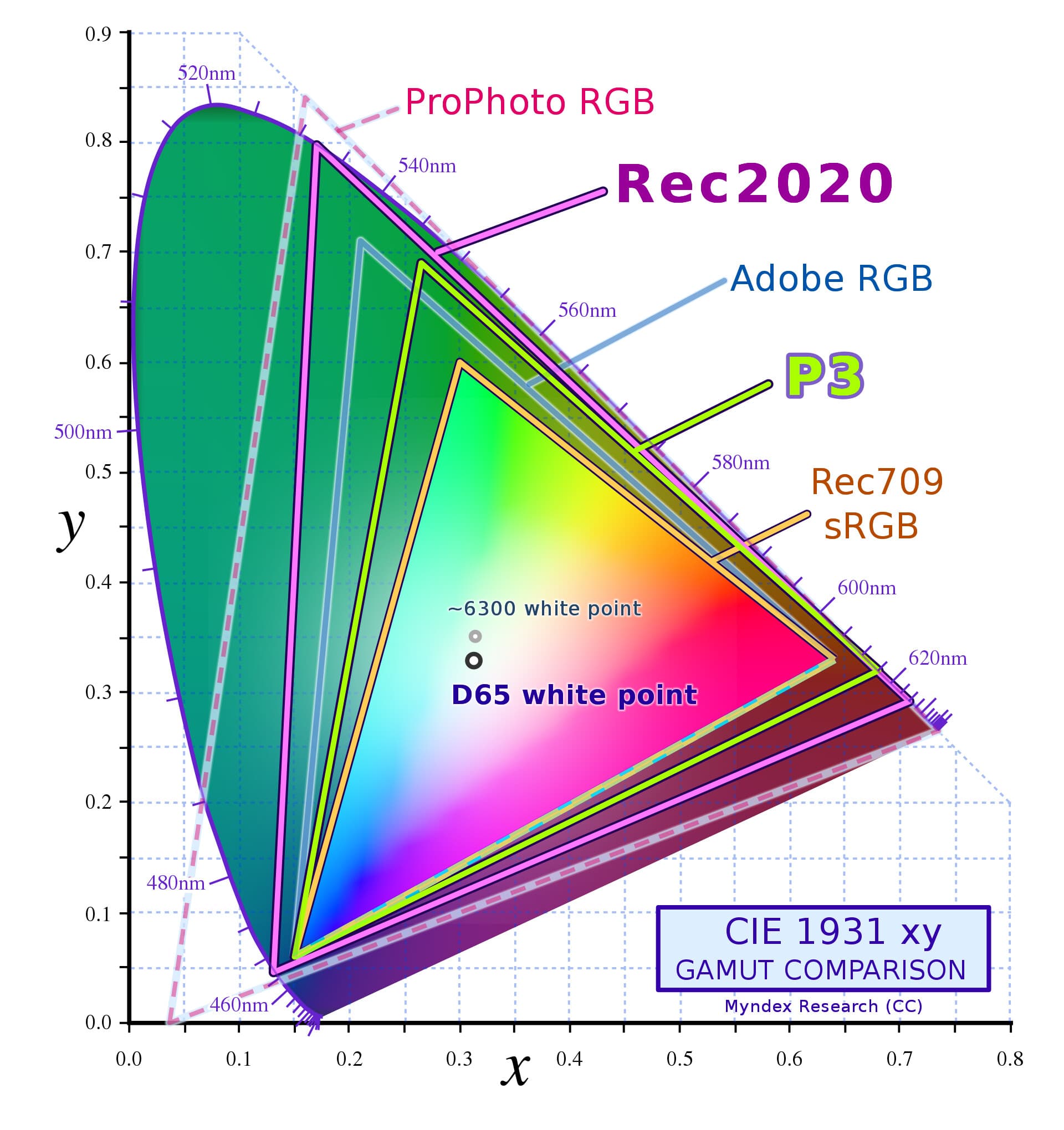
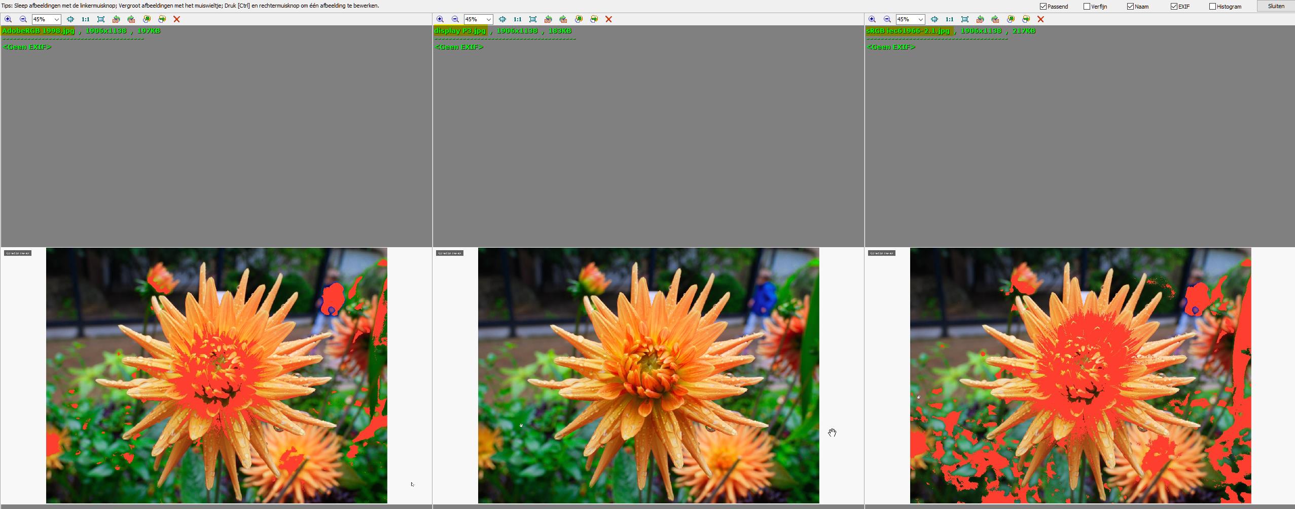
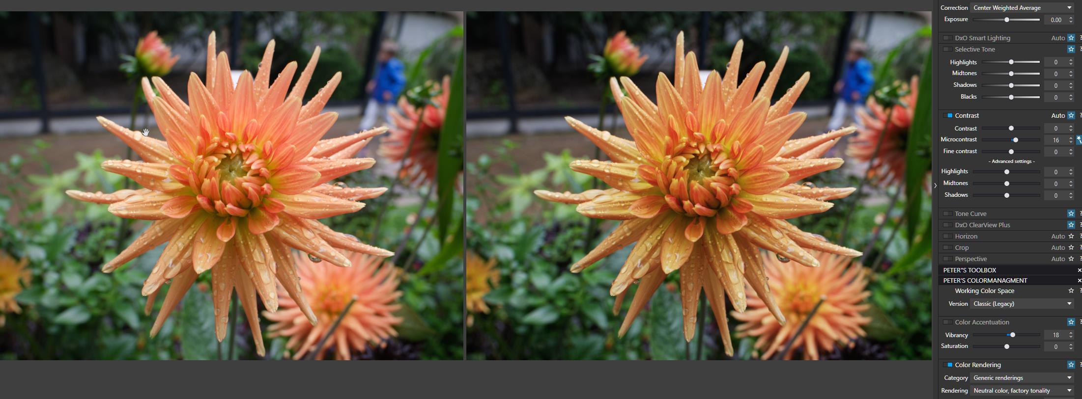
For the sake of argument i set up a flower 100% vivid. Looks great on my BenQ 2k monitor
right monitor softproofing shows:
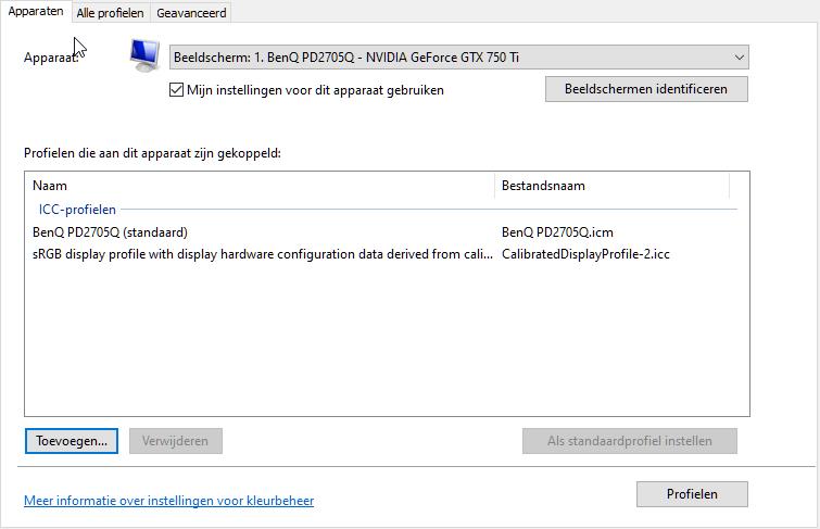
This is my first question: i think monitor driver Benq leaps out sRGB and shows all it can handle in it’s gamut not in its colorspace like sRGB ie61966-2.1.
ok next test:
colorproofing: export as so to speak:
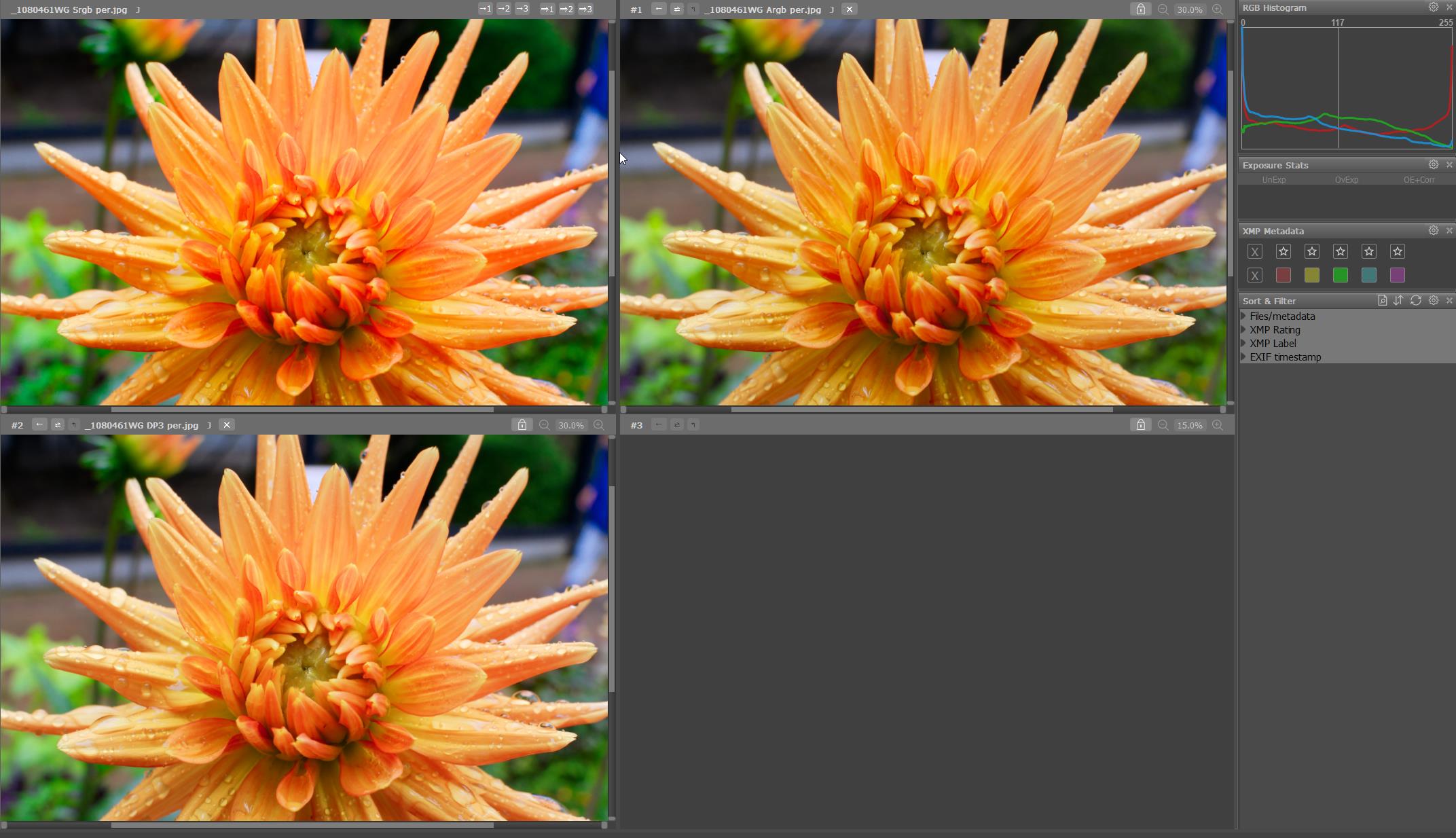
srgb vs adobeRGb vs Display P3
Also nearly the same so we can assume that AdobeRGB working space is enough for this flower only a small bit falls of the cliff.
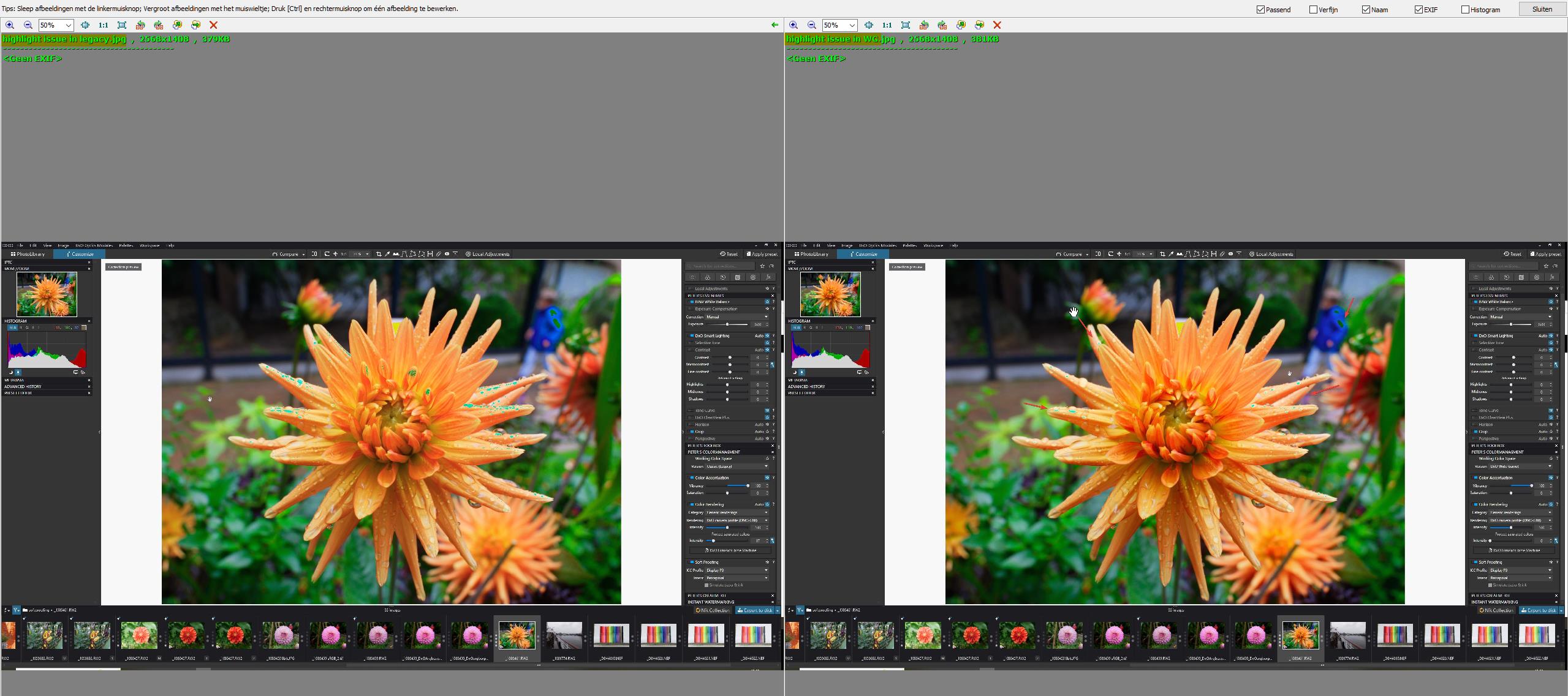
now export in sRGB/WG/Perceptual. (most sensible setting for the present gear.)
and ARGB/WG/Per and DP3/WG/Per.
i didn’t change the out of gamut parts so i let dxo’s export do the job. laziest job.
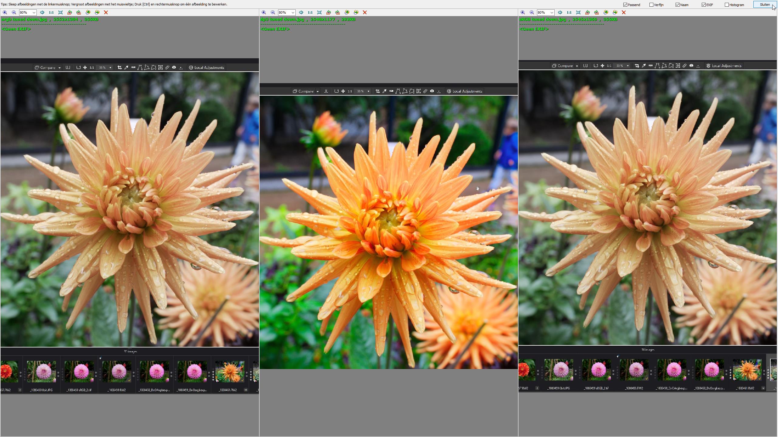
Fast stone viewer has CMS color managment system so i turned that off. and used FRV as count part.
FSV you see difference but not much (think of the red layer is in the middle the most.
What i see is because the jpeg’s color saturation managment is in different colorspaces you see in sRGB a 100% rendering saturation and in the others my screen driver tune them down to fit in?
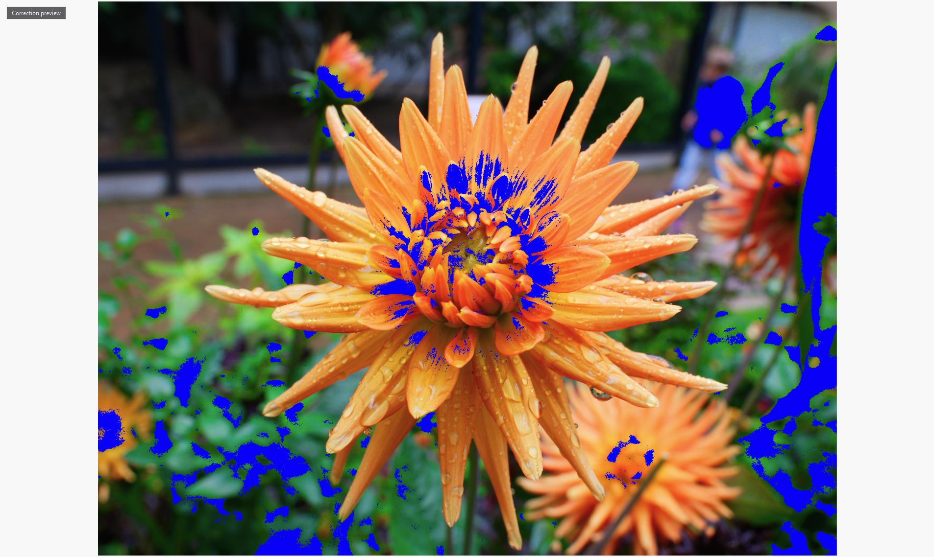
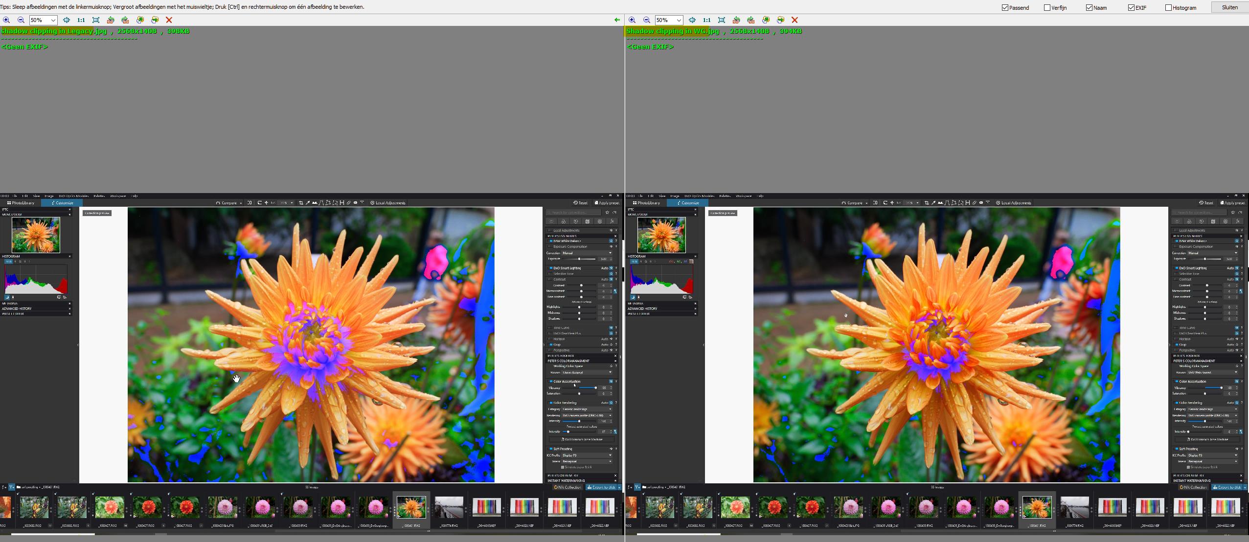
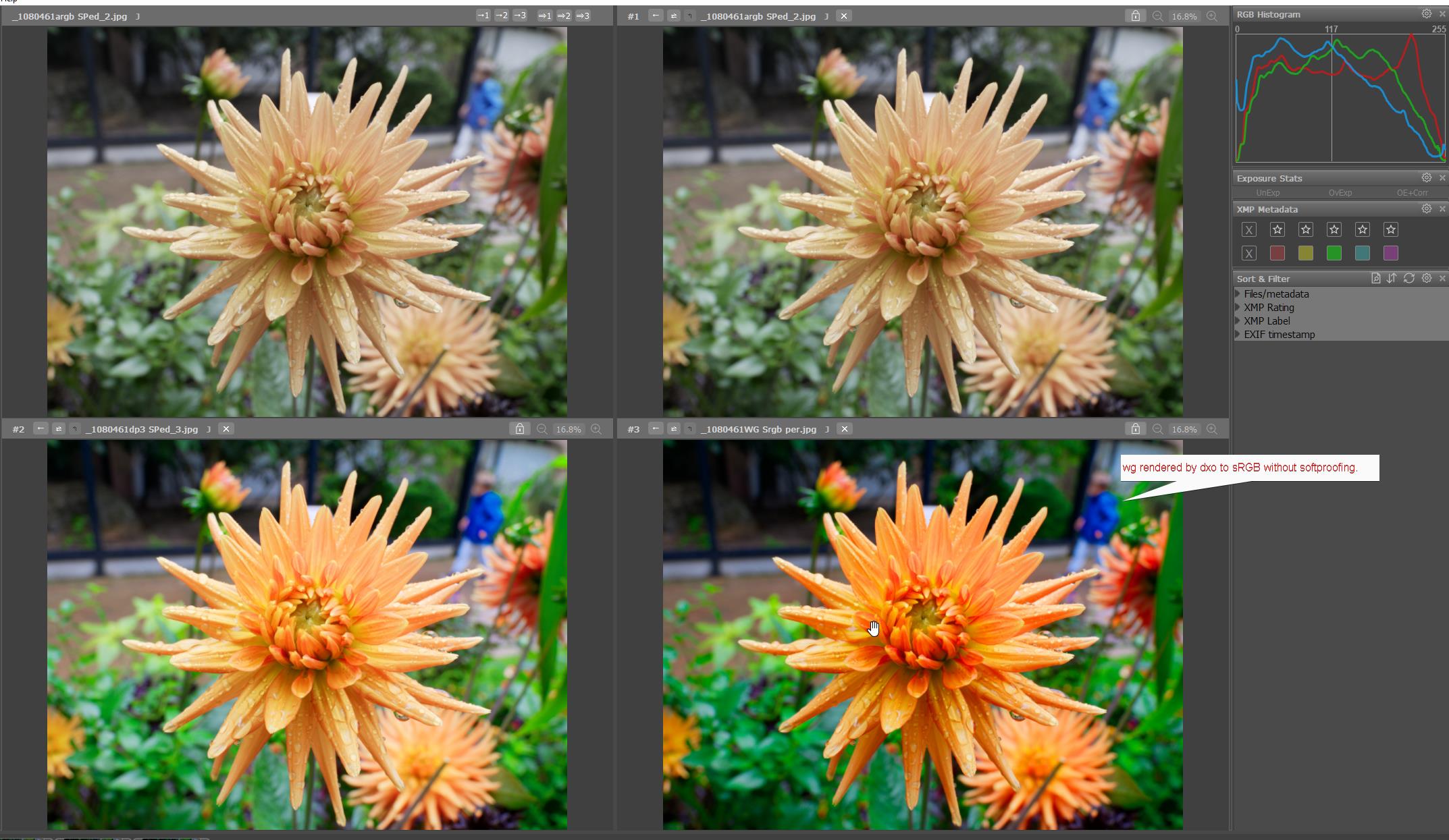
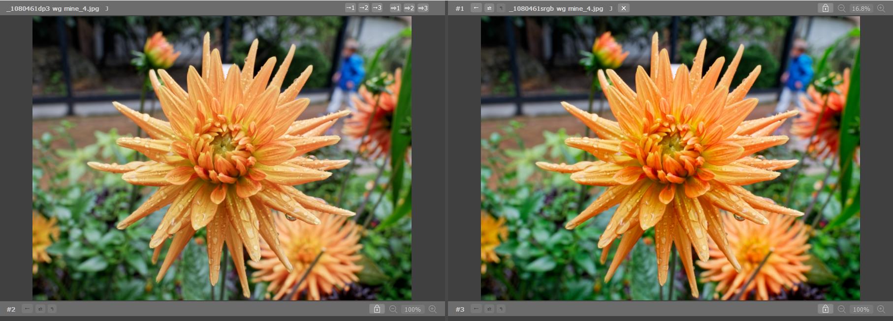
ok next test use soft proofing to fit in side colorspace:
i tuned down vivid until i see no more "out of gamut warning and raise exposure with 0.44.
See the bleeched images which are tuned into the colorspace so no rendering intent relative nor perceptual is needed to be done wile export is hit. (suffix … SPed)
Ugly right!
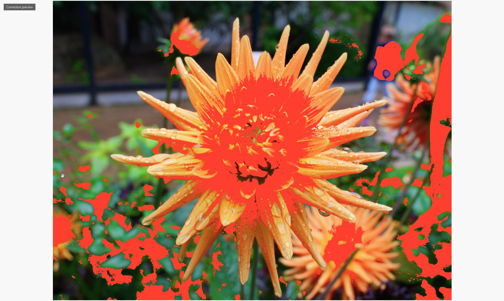
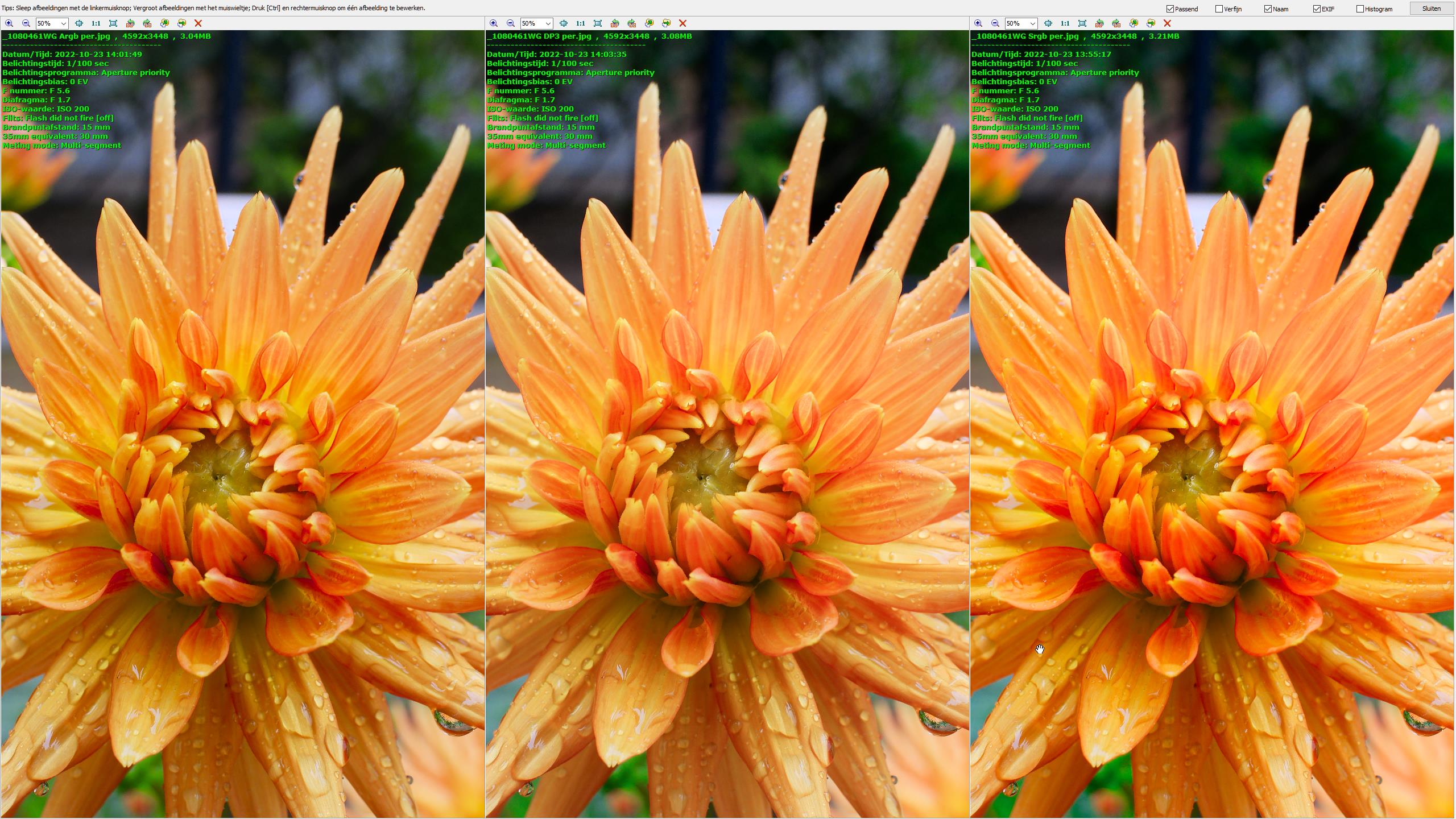
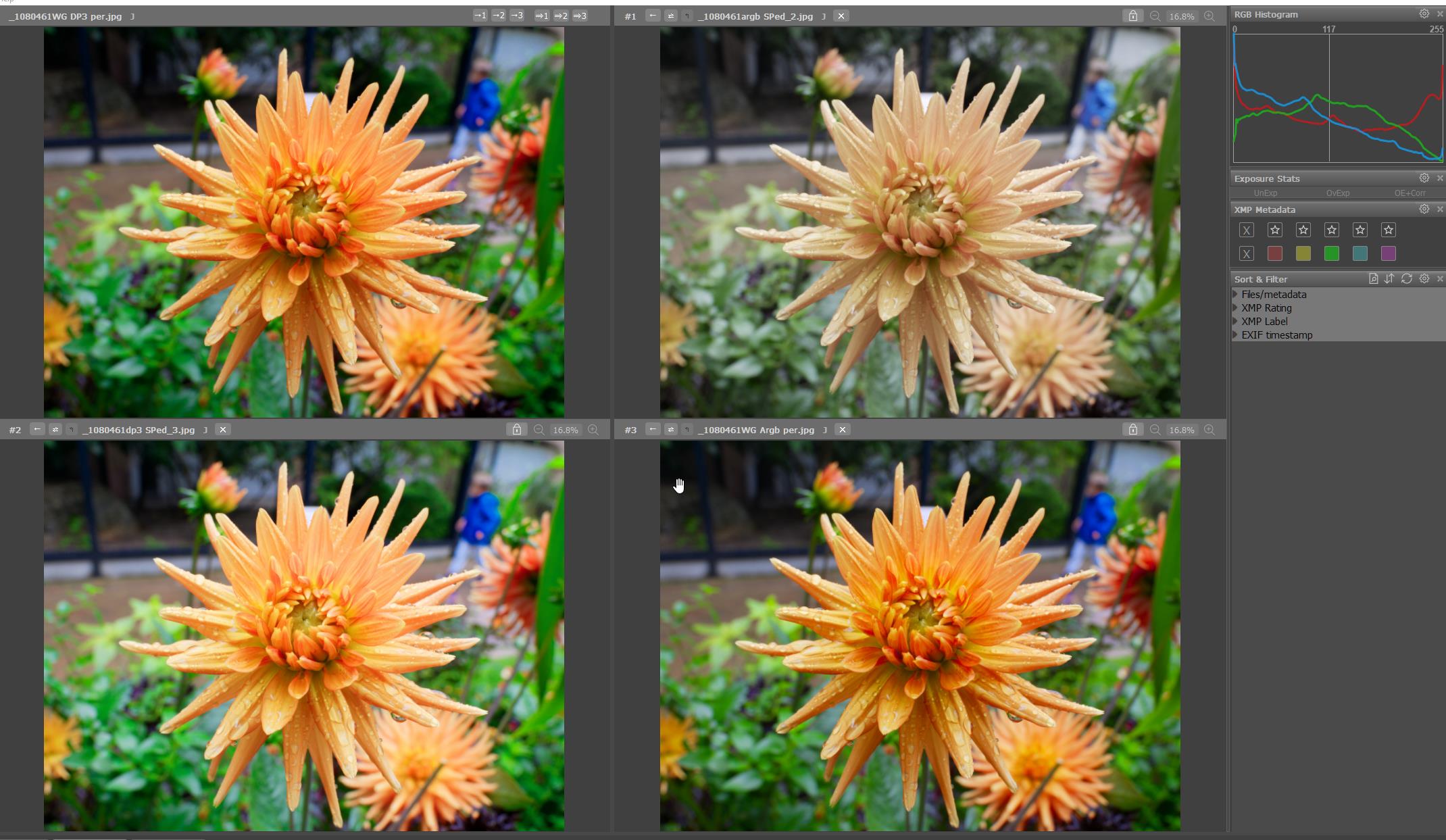
see this one as adobe:
at last a image which i would make from this.
some fine contrast and color enhancement. little global vivid and saturation. (for the sake of comparison no cropping.
first notice there is something funny about this colors:
even neutral color , factory tonality doesn’t show up as the same:
ohwell i preset my own starting point.
fine contrast, some highlight correction , leave the shadow for depth.
then smask the red in the flower for enhancement,
Don’t know yet what to think but exporting on default in Display P3 to be futureproof can be a issue.
The rendering back from DP3 to sRGB in viewing devices showing on my computer at least a desaturation of the image. (which incline that flipping to DP3 isn’t the right way to go for now.)
Same with softproofing your images for screen viewing purposes.
sounds fun and the way to go but as you see in my test there is a nasty backfire for this.
flattend images.
would this be of influence on my tv screen?
So i copied my test folder in to my nass and use a viewing device to see what’s left of it in my tv.
My main viewing habit.
let you know.
I think softproofing is only a good habit if you don’t trust the professional printerguy do a better job then yourself. If you don’t completely understand what your doing or don’t hardtest results of your decisions (printing) then it benefits starts to crumble and can be backfiring on you.
ok sorry for the long winded post but now you can shoot on me.
As I have mentioned before, I have never used soft proofing and have always had perfectly acceptable prints from my own calibrated monitor profile and my own printer/paper/ink profiles.
It will take a lot of convincing to give me a reason to soft proof but, in the meanwhile, I still have to find out if the new WGCS affects any of the FilmPack presets.
I prepare my images in PL and then export them at the required size for printing, with a resolution of 240ppi, to 16 bit TIFF files with the ProPhoto RGB profile.
I then open them in either Apple’s own Preview or ColorSync app or Canon’s own print utility. It is at this point, in the Print dialog, that I select the ICC profile I have created for the printer/paper/ink combination I want to print on.
And that’s the point
They use the appropriate profile and if you/me would take the profile for softproofing at home we will have a better chance to get a closer look for how’s the print will look…and that is what softproofing is developed for.
So all is fine, and I will keep on using a profile my dealer send me for softproofing
I doubt that if you had used PL5 and before, or the legacy colorspace in PL6, that any colors outside of the Adobe RGB colorspace have been exported, even if you selected ProPhoto RGB, as internally all colors have been restricted to Adobe RGB by Photolab. Whether the difference is visible in practice is another story.
Rendering back from AdobeRGB to prophoto does nothing to my knowledge.
Rendering doesn’t stretch everything to the edge of a colorspace if the source is smaller.
What my small test showed is that using WGCS as working space does help but you need to understand that sun and moon(clippingwarning) not quite work for you as good as Legacy is the Histogram setting.
To use those clipping and use them to get close to export’s colorspace it’s best to set it to legacy. (AdobeRGB.)
When your done editing switch to WGCS so the rendering intent( wgcs to jpegs export version) is only once when you export.
(i assume that export is done through working colorspace and not from rawcolorspace straight to export colorspace.)
Stil the advise to alway’s use softproofing before export is a bit of a riddle to me.
Rendering intent is rendering nicely all colors near full saturation bringing the jpeg image to it’s full contrasty view.
Maybe only for flowers suitable i donlt know yet.
Using softproof and tune down inside, no red warning, does flatteb the image alot.
The interesting point about that is; you’re making informed choices about whether or not to go with WG as your standard WCS … with good knowledge and understanding of color gamuts, soft proofing, etc
Whereas, the “Average-Joe” user is very unlikely to have that understanding … and, yet, for all newly encountered images, PLv6 will automatically set his/her WCS to Wide Gamut.
Before that’s fair to “innocent” users, I reckon DxO first needs to deal with issues such as;
RAW development starts with the camera’s internal color gamut (the sensor). PhotoLab has to convert that RAW data to Adobe RGB if the Classic/Legacy WCS is used. Sometimes there’s very little lost in that step. Using DxO Wide Gamut leaves more room for processing saturated colors but that still ultimately has to be rendered correctly in the output. Between the Color Rendering palette and export options, PhotoLab provides some options for doing that more or less for you - and Soft Proofing lets you analyze the resulting transformation a bit. That’s all simple enough for me. Some understanding of color management is needed for RAW development, but as Joanna points out the presets in PL with FilmPack use a recipe that might be dependent on one working color space or the other.
And this is what I find most annoying. I am far from the “average Joe (or Janet)” and have been used to everything “just working” - to the point of producing stunning exhibition prints from the previously “limited” colour space. Why? because screens are not inherently wide gamut and neither is printing paper.
So, the question remains, why bother with wide gamut when the source (RAW file) is only usually AdobeRGB and the paper.
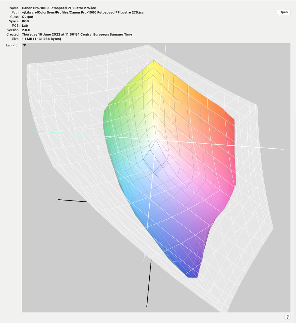
Here is a comparison of AdobeRGB (the larger grey space) and the Canon profile for Fotospeed Lustre paper that I use…
Because, the RAW file (from modern cameras) describes a color-space much wider than AdobeRGB.
The setting that we might assign in-camera applies only to the JPG created by the camera - it has no impact on the “raw” data that’s transferred from the camera’s sensor into the RAW file.
I suppose my point was that the target, whether that be screen or paper is rarely larger than that, so what is the point of processing for larger, only to have to limit stuff for output?
And I can see a little shift in colours on my sRGB Monitor when switch to wide gamut
But I also believe that it doesn’t change so much, for me is more important that the colours/tonality/brighness I see on screen will be nearest as possible to the colours I will get on paper…so I use soft proof
There is an easy fix.
Sun and moon are kind of softproofing tools.
What do we want?
1 a as wide as possible workingcolorspace of the demosiaced rawdata. (no loss of colordata by the first conversion.
2 a control over the colors in saturation and lumination which is
A) converted by monitor driver, icc, to show the virtual image for your eye’s so you can edit. (we want this as close as it should be looking when we export.)
B) the export colorspace and bithdepth and file container. Jpeg, tiff, dng.
So what would be sensible as gauges and viewing this data?
Example.
Multimeter. When i want to measure mA i set the multimeter to mA but then the meter can’t handle big numbers of Ampere. This is physics. In software this isn’t a restriction.
So why not the choice of having Wide Gamut as working space and a choice how the histogram displays the black point and whitepoint(left and right) and how the sun and moon react? (like the monitor out of gamut choice.)
Why?
Wel you are editing for a sRGB or AdobeRGB export mostly.
I assume that when you use Legacy the Rawdata conversion is realtime adjusting from camera colorspace when we work in the Legacy CS. (think we have virtual all colors of the raw file but the gauges are only showing the colors fitting in AdobeRGB.(the rest is out of gamut and activate SCP, sun and moon.
Thus very important question is:
Why do i need WideGamut if i am never use export bigger then AdobeRGB?
Edit: Adding, display P3 is Same size as AdobeRGB , so in the future this still stands.)