@KeithR there was a feature request only 2 years ago or so asking for the filtering behaviour you consider to be a bug. At least 43 users voted for it. Interstingly, StevenL already agreed with what most users in your thread also said:
The only thing I know is that this feature is a huge pain for our users and a major problem for a photographer’s workflow.
I remember how puzzled and surprised I was using the filter menu for the first time. I disliked it definitely and was and am used to “the other way”, what seems to be non-logical for you.
And by adding more buttons, nothing gets clearer, it just needs more explanation and is not needed as nearly everybody is used to the positive pro-active way it is now. As long as filters are not needed, everything PL can display is on display. And if I want to see the rejected items, one click instead of two is better, not to mention 5 clicks instead of 1 for a certain rating.
If you don’t filter, well then you don’t filter and will see everything.
If you filter you’ll see only what you filter. Filtering is adding a filter to your source.
Both filters can be shown or hidden, some of the filters can be customised.
I took some time to get used to Lr’s filters. I find them easier to operate than DPL’s though, mostly because the filter area does not collapse after making a selection, which means that the pointer does not have to travel long distances.
Hint: If the lower three sections of the filter dropdown were aligned on one line (no text, just tool tips) mouse travel could be reduced.
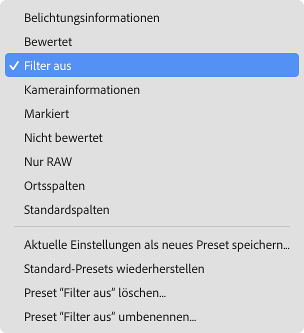

 here is a definition of a filter: