As a calligrapher and letter artist, I find that legibility is acceptable but generally not optimal in DXO, and frustrating in places.
• In this case it is a mistake to put the headings in caps. CAPS ARE LESS LEGIBLE BECAUSE THEY DON’T FORM UNIQUE WORD SHAPES. Caps are used to grab attention or deliberately slow the reader down or to compensate for very small sizes. They are legibility torture when they appear as a block or as a list, like when all the sections are collapsed. There are other ways of making the headings look like headings. Some of that is already being done.
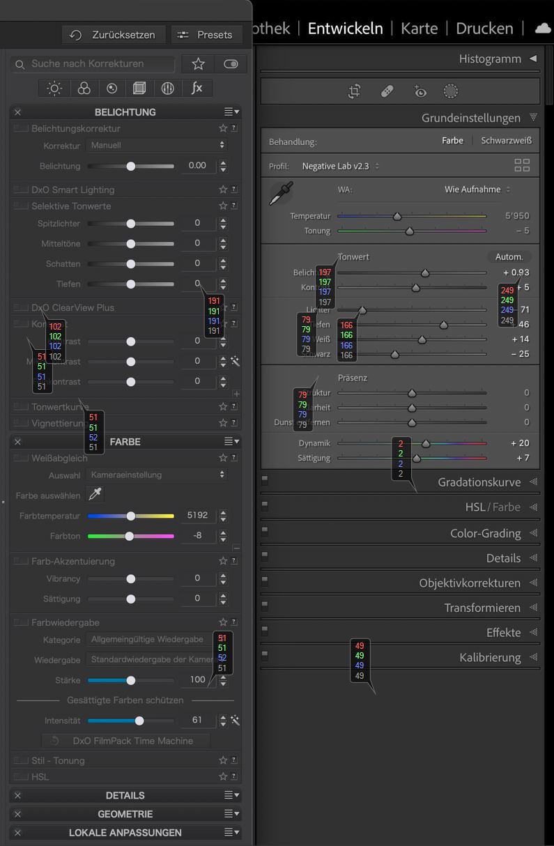
• Grey text on dark grey, blue text on dark grey is really bad. The contrast problem can possibly be solved by giving all the type a 1 pixel black shadow. This will also enhance the word shape and help the eye with finding word units when scanning a list or page. It helps the eye click into place.
• The font choice is good but one that puts a foot on the el would be an improvement, not only for el itself but for I and i because they are all then more easily distinguished from each other. The old g form is better for similar reasons. Comparing DXO with Lightroom, it seems Adobe is wise to subtleties like this.
• Strange that the German has a different font to what I have showing in DXO. The German one is bad - more blockish, less kerning, more counter space than letter space, more anti-aliasing between letters and the open curve forms such as e, c and s are less open. It’s a bad choice. Maybe a popular German aesthetic but bad for legibility at that size.
It is a big mistake to think legibility is a matter of taste. It is not. It is mostly science and engineering with a small margin for taste. If you ask the average person what they think, you just get their bad science - their clueless theories about what works and what doesn’t mixed up with some matters of taste. Legibility is tested by doing reading time trials with large numbers of people just trying to read, not give their opinion, and fonts are engineered to optimise the speed and accuracy of the result. To get the best result, DXO should hire a person schooled in the science.
Agreed. I tend to snag on it even if it’s just mentioned. Looks and personal taste are 99% irrelevant. I get so tired of people who know nothing about legibility making clueless pronouncements and then when you tell them about the science they say it’s personal taste. So, please excuse me responding with my hang-up! Just don’t even mention it … OKAY … or I’ll bite your head off!
I think it’s not only German problem. I think on Windows system it depends on many settings like clear type and so on. But if on one system all the other programs look fine and only the ones by DXO not…what’s the problem?
On my MBA it’s better but if I set the brightness level to 5 bars the inactive tools aren’t so good to read. And as a counterpart Affinity Photo with the same brightness setting and the same old eyes…no problem
When I say a different font, I mean the font - the letter forms - are actually different. I’m not referring to colour, contrast or Clear Type settings. This is unusual. It is possible that DXO does not install it’s own fonts but works with what you have installed, in which case you might be able to solve some some of your legibility problems by installing the right fonts. I don’t know what those would be though. Better font forms will give you better legibility and a slightly heavier weight will give you improved contrast.
I’m not suggesting that a user migh be able to activate this or that font, and I don’t know enough about how it works. I’m just saying that in might be the case that DXO works with whatever fonts you have installed on your computer and that could explain the differences we see in screenshots in this thread, and why mine is different to the German one. If this is the case and if the only font you have installed is Comic sans then that is what DXO will use. You might be able to change what DXO uses by adding one that it defaults to. If the DXO default is a bad choice you might be able to get an improvement by uninstalling that font, then hopefully it will use Trebuchet (the most legible of the web-safe fonts).
But I don’t know if DXO installs its own fonts or not.
Andrew,
I understood you very well , but allowing the program to check for installed fonts on the customers machine is 100% guarantee for trouble – not only with Comic or Script …
There is a big difference, if you design a printout e.g. with block layout, try to resolve spacing, handle ligatures and kerning, use true capitals … OR you have an onscreen layout, that has to be legible, while selfexplaining and guiding the user how and what to do. …
I’m sure, that DxO’s interest is to present things clear and easy to use – and we all can give feedback.
Wolfgang
Dear Andrew,
in my opinion the font a program normally uses depends on the settings of windows. You can customise which font to use for menus and so on. But I have never changed this settings, and it is like it is…every program I use on this system is easy to read except DXO. And is the same on Mac, where I also did not change any settings for menu or any other system font.
The almost total lack of contrast in recent version of PhotoLab and other DxO software is is like a torture test or a joke about modern contrastless design.
It’s not very funny to PhotoLab users who skew much older from what I can see around here and the type of people who are interested in a relatively expensive RAW developer focused on lens corrections and natural image adjustments.
Whoever DxO developers think their public is, they seem to be on the wrong track. At some point most PhotoLab users will just have to give up on PhotoLLab as we can’t see what we are adjusting at all.
Since PhotoLab 5, I’m only able to use PhotoLab by memory. I can’t read most of the text.
I get on OK using my desk PC, two 24inch screens with the menus on one. But on my travel laptop…! I have lost a lot of vision in one eye and am anyway in my late 70’s. Before retirement all web production for my Library had to meet a minimum requirement for readability, DXO programs would fail dismally the tests we had rightly comply with (I can say from my experience now are needed). My wife uses an old PL as the updates she find hopeless to use/see on her laptop.
I’m not a kid either. I’m almost 76 and will likely need cataract surgery at some point in the next year. However I run PhotoLab 5 on a Windows 10 machine with a 28 inch 4k monitor and have absolutely no problem at all seeing and using the interface on my setup.
I can only wonder why so many people are having difficulties with it while I am not. I understand that the interface on the Mac version may have some contrast issues, but I find contrast on the Windows version is not an issue for me. I do realize there may be issues for those editing on small 4K laptop screens but I believe that’s a separate sizing issue.
@mwsilvers, if you look at this post, you’ll find that Windows uses a taller and slightly heavier font than what we get on the Mac. If you look at the screenshots and move away from the screen, the text of DPL4 (and 5) will be the most difficult text to make out. DPL3 and Win texts hold on longer because they are either brighter or taller/bolder.
As we can see here, background brightness has some influence too… While clearly discernible handles help, they also make the surrounding text less obvious.
I can’t speak to how the interface looks on a Mac, only on Windows. Obviously there are some issues with the readability of the Mac version since so many have commented on it. I hope DxO addresses those issues quickly.
I screenshot your LR UI example and if you measure the luminance in a similar way to that for DXO you can see that the LR UI actually has far more contrast.

 /me is already out —> [ ]