I have almost very poor vision in one eye and on the laptop find PL very difficult. On the twin 27inch desk top not such a problem not least as I have every menu open on one of the monitors!
Just out of curiosity, I checked my 10 year old Lenovo W520 and DFine2,
which is a very old piece of software and not adapted to HiRes screens.
1920x1080 / FHD // Win 10 21H2 / 125%
BUT, to work on a 15" laptop is no fun.
3 Likes
Hi,
my wife is working with a Lenovo W520 too, and with 2 x 24" Monitors she is still happy and doesn’t miss anything. And with 24 GB Ram and two SSD’s it’s fast enough after 9 years 
Just to illustrate
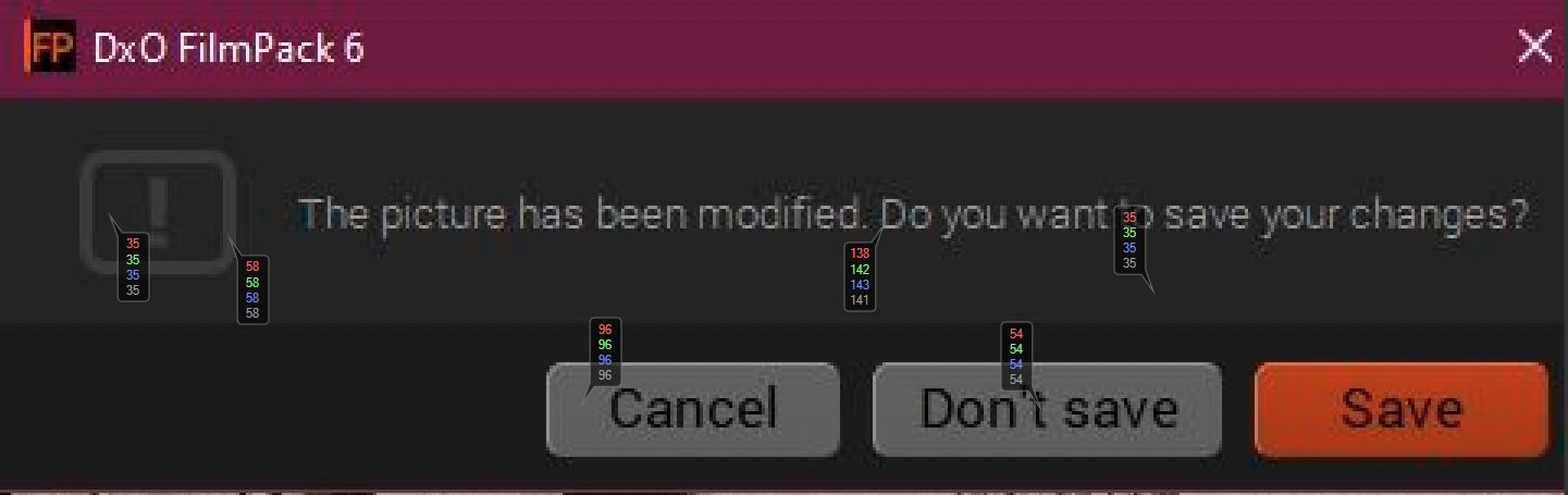
the problem and add some quantitative info I took a screen shot of a warning dialogue box in FilmPack V6. I then added some colour readout markers in Capture One. These markers give the RGB values and Luminance for the indicated pixels.
The warning sign has luminance values of 58 on a background of 35, Black text (54) on a grey (96) - surely a fail in any UI 101 course?
Something is not right with UI design philosophies at DXO and at least needs examining and maybe even an explanation of why the designers have adopted this approach?.
3 Likes
There is more than contrast…
Compared to Lightroom, inactive tools have the same type vs background brightness ratio of about 2:1. Nevertheless, Lightroom’s text is easier to discern and read, because active toolsets are brighter overall.
Moreover, DPL needs more space for a comparable set of settings. Lightroom can automatically collapse toolsets that are not in use, which means that scrolling is unnecessary in most cases. Also, DPL’s GUI looks busy in comparison to Lightroom.
Looks are subject to personal preferences, nevertheless, ergonomics should improve imo.
2 Likes
Hi @platypus,
if you spoke over the Solo Mode in LR we have had discussions a long time ago, for example here Show my settings
and in LR the Text color is lighter and the text itself seems to be more sharp.
Today for me, getting older over the years  , LR has still the more user friendly UI
keep on fighting 
I couldn’t agree more…getting older amplifies the sensitivity to interface ergonomics.
Cranking up screen brightness could help, but going beyond 120 candles is not good for image editing.
1 Like
And virtually impossible for print matching 
4 Likes
yes… maybe you can sneak into DxO’s labs and crank their UI designer’s screens down to 80 candles?
I’ve come across situations, where people got dark prints because their screens were cranked up to maximum brightness.
6 Likes

I print our club photo exhibitions and can guarantee having to rework a fair few due to just that problem.
4 Likes
And I remember some post of you where you explained this theme, and also the setting of 80cd before calibraiting monitors. 
1 Like
I found myself making that mistake when I had my editing window background set very dark. Images appeared brighter than they were.
Hint: Hold a piece of white paper next to your images and check if whites have about the same brightness as the paper…
1 Like
As a calligrapher and letter artist, I find that legibility is acceptable but generally not optimal in DXO, and frustrating in places.
• In this case it is a mistake to put the headings in caps. CAPS ARE LESS LEGIBLE BECAUSE THEY DON’T FORM UNIQUE WORD SHAPES. Caps are used to grab attention or deliberately slow the reader down or to compensate for very small sizes. They are legibility torture when they appear as a block or as a list, like when all the sections are collapsed. There are other ways of making the headings look like headings. Some of that is already being done.
• Grey text on dark grey, blue text on dark grey is really bad. The contrast problem can possibly be solved by giving all the type a 1 pixel black shadow. This will also enhance the word shape and help the eye with finding word units when scanning a list or page. It helps the eye click into place.
• The font choice is good but one that puts a foot on the el would be an improvement, not only for el itself but for I and i because they are all then more easily distinguished from each other. The old g form is better for similar reasons. Comparing DXO with Lightroom, it seems Adobe is wise to subtleties like this.
• Strange that the German has a different font to what I have showing in DXO. The German one is bad - more blockish, less kerning, more counter space than letter space, more anti-aliasing between letters and the open curve forms such as e, c and s are less open. It’s a bad choice. Maybe a popular German aesthetic but bad for legibility at that size.
It is a big mistake to think legibility is a matter of taste. It is not. It is mostly science and engineering with a small margin for taste. If you ask the average person what they think, you just get their bad science - their clueless theories about what works and what doesn’t mixed up with some matters of taste. Legibility is tested by doing reading time trials with large numbers of people just trying to read, not give their opinion, and fonts are engineered to optimise the speed and accuracy of the result. To get the best result, DXO should hire a person schooled in the science.
5 Likes
I think it’s a mistake to call legibility a matter of personal preference or taste. See my comment below for reasons.
Now I understand why this old fashioned UI and strange contrast … they still work with candles 
 /me is already out —> [ ]
Read again:
Looks are subject to personal preferences, nevertheless, ergonomics should improve imo.
“Looks” does not mean legibility. We’d probably agree on the second part in bold type…
1 Like
Agreed. I tend to snag on it even if it’s just mentioned. Looks and personal taste are 99% irrelevant. I get so tired of people who know nothing about legibility making clueless pronouncements and then when you tell them about the science they say it’s personal taste. So, please excuse me responding with my hang-up! Just don’t even mention it … OKAY … or I’ll bite your head off! 

1 Like
Hi Andrew,
I think it’s not only German problem. I think on Windows system it depends on many settings like clear type and so on. But if on one system all the other programs look fine and only the ones by DXO not…what’s the problem?
On my MBA it’s better but if I set the brightness level to 5 bars the inactive tools aren’t so good to read. And as a counterpart Affinity Photo with the same brightness setting and the same old eyes…no problem
When I say a different font, I mean the font - the letter forms - are actually different. I’m not referring to colour, contrast or Clear Type settings. This is unusual. It is possible that DXO does not install it’s own fonts but works with what you have installed, in which case you might be able to solve some some of your legibility problems by installing the right fonts. I don’t know what those would be though. Better font forms will give you better legibility and a slightly heavier weight will give you improved contrast.