All adjustment control labels should be highlighted

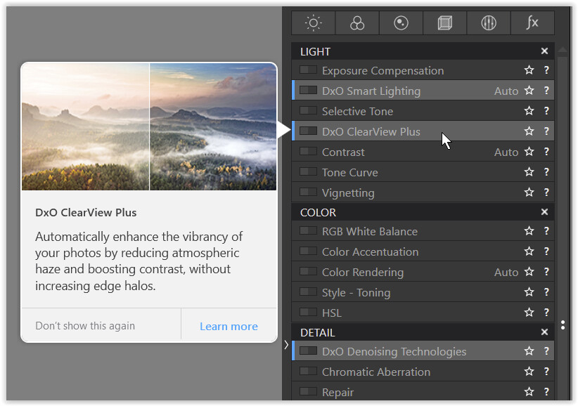
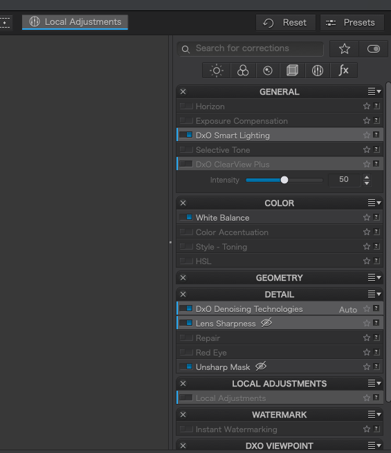
The adjustment labels displayed under the pallets have text that is very small and difficult to read. Highlighting those labels makes them much easier to read, but the ability to highlight those labels is restricted to only the “featured” adjustments. That makes them stand out from the others, but only makes it more difficult to read the labels on the non-highlighted adjustments.

I would like to see a change that would allow all of the adjustment labels to be highlighted so the labels are easier to read. If that can not be done then I would like some way to increase the text size in the adjustment labels so they are easier to read.

Hi @MikeFromMesa

maybe it’s a good idea to place your FR under Better User Interface - #82 by Guenterm so we get more votes.

2 Likes

the windows version

note
The “feature highlight” was introduced to give some guidance to new / unexperienced users,
but not to enhance legibilty (at least not in the windows version).

Hi,
You’re perfectly right: this feature does what it says. It highlights new and/or important features to usher a new user…

Steven.

But it still leaves the unhighlighted items difficult to see and read. Perhaps increasing the text size might help as well.

In which conditions are they difficult to read, Mike ? (I’m not experiencing any such problem - on Win).

  • Could you provide a screenshot …

John M

I am on a Mac. Here is a PL5 screen shot:

This is on a 32" monitor but my setup has me 3 feet from the screen and I can barely see the non-highlighted entries.

3 Likes

Yes, their contrast is very low. – There are already several entries asking for improvements.

2 Likes

Hi Mike,

have seen that you haven’t voted for Better User Interface - DxO PhotoLab / Which feature do you need? - DxO Forums.

Take your chance :sweat_smile:

1 Like

oho, here comes the Spanish Inquisition…

1 Like

The highlights improve the separation between the tools, but inactive tools’ labels are still hard to read. :stuck_out_tongue_closed_eyes:

1 Like

Not spanish, but it comes :rofl: :sunglasses:

I have voted now.

OK - That seems to be the key point.

Text is larger (and clear) on Win:

John

1 Like