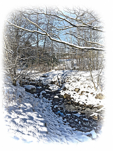
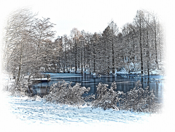
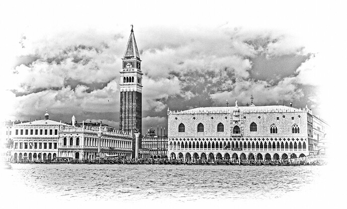
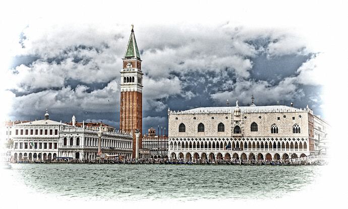
And here’s the PL3 version I used on the photo of Salisbury Cathedral
Engraved Color_stuckOnPL3.preset (7.3 KB)
stuck
PS yes I know the perspective of the cathedral could be better but if I fix it properly, the top of the spire is lost
Thank you for the confirmation.
stuck
Presets like Engraved and Engraved Color should be partial presets, in order to not stomp all over those settings that have already been applied to an image.
Can I just point out something to be very aware of when creating custom partial presets, especially if you are taking an existing preset and editing it as a basis for your preset.
Here’s a preset file that doesn’t contain much but what it does is not a good idea…
Preset = {
	Settings = {
		Base = {
			BlurActive = false,
			ChromaticAberrationActive = false,
			DistortionActive = false,
			VignettingActive = false,
		},
		Version = "15.0",
	},
	Version = "15.0",
}
Applying this preset will disable the four Optical Correction settings - Lens Sharpness, Chromatic Aberration, Distortion and Vignetting.
If the preset you are taking as a basis for your custom one contains any line that ends in ‘…Active = false’ be aware that leaving lines like these in the file might possibly upset a user when they apply it.
Also, to help others who are so inclined to edit these files, please try to indent the lines correctly with tab characters and sort the settings in alphabetical order, like the PL preset editor does. It makes things so much easier when trying to find why something doesn’t work as expected.
That’s an excellent aim, Joanna - Unfortunately, tho, using the “Create preset from current settings” with the Win version creates a completely “flat” file (with no structure at all). In fact, not only are entries not in alpha order, they’re completely mixed-up - with bits and pieces everywhere.
I gather the Mac version is better/tidier ?
John
Suggestion: Try opening the “Advanced settings” section and experiment with “H/V ratio” … You might find you can get it to fit without undue distortion.
John
Ah! That would explain what I saw when I looked at presets from @OXiDant, @rrblint and @Gianpaolo64. Obviously they are using Windows then.
Oh, much better. Here’s an extract from one I just created…
Preset = {
	Settings = {
		Base = {
			AnamorphosisActive = false,
			AnamorphosisHorizontal = 100,
			AnamorphosisRadial = 150,
			AnamorphosisType = "Spherical",
			AnamorphosisVertical = 0,
			ArtisticVignettingActive = false,
			ArtisticVignettingCenterPoint = {
				0.5,
				0.5,
			},
			ArtisticVignettingCornerAttenuation = 0,
			ArtisticVignettingMidFieldAttenuation = 50,
			ArtisticVignettingRoundness = 50,
			ArtisticVignettingTransition = 0,
			BlurActive = false,
			BlurActiveAuto = false,
			BlurDetails = 50,
			BlurIntensity = 0,
			BlurSmoothTransitions = 50,
			ChannelMixerActive = false,
			ChannelMixerBlue = 0,
			ChannelMixerCyan = 0,
			ChannelMixerGreen = 0,
			ChannelMixerMagenta = 0,
			ChannelMixerRed = 0,
			ChannelMixerYellow = 0,
			ChromaticAberrationActive = false,
			ChromaticAberrationIntensity = 100,
			ChromaticAberrationIntensityAuto = true,
			ChromaticAberrationLateralActive = false,
			ChromaticAberrationPurpleActive = false,
			ChromaticAberrationSize = 4,
			ChromaticAberrationSizeAuto = false,
			ColorAccentuationActive = false,
			ColorFilterActive = false,
			ColorIntentAutoActive = true,
			ColorModeContrast = 0,
			ColorModeFilter = "CoolTone",
			ColorModeFilterIntensity = 100,
			ColorModeSaturation = 0,
			ColorModeStyle = "BlackAndWhite",
			ColorModeStyleIntensity = 100,
			…
See how everything is grouped together and ordered, thus making it so easy to edit.
Considering the “factory” presets are neat and tidy, the state the Windows version are created in is appalling.
Maybe we need to signal @StevenL to add this to his ever-growing list of differences between the two versions? Although, not being “visual” or “mass market”, I doubt if it’s likely to make it into production any time soon. Which is a shame because it is not exactly something that would take any significant time to implement.
Yes - probably worthwhile mentioning … tho, as you say, I won’t be holding my breath - it would only be the likes of you and me who would care (ie. speaking for myself; OCD type  )
)
John
I’m a consultant software engineer. Which means I sometimes end up rearranging other programmers’ code just so that I can read it easier. Give me half a day with the code that writes the Windows files and I’d have them looking beautiful 


 .
. 


In words: I see a race comming up, dxo against Betatesters… 
Been there, done that but thanks for suggesting it. The problem is that the top of the spire is just too near the top of the frame but that’s not surprising, at 404 ft the spire is the tallest in the UK 
I’ve been using PL for about 18 months and have come a long way but always chose to create my own presets…until now! Wow, thanks @RexBlock and @Gianpaolo64 for opening my eyes to engraving. I’ve only just started experimenting with one image and the effects are sooo good. Awesome, guys!
That’s it! You’ve got the right idea!
I can’t remember if that preset had grain in it (early versions of it did) but I felt that by removing grain for the base perset, I could add it back in where needed. The intent was to create a deep emphasis on lines (especially as seen in the electric railroad catenary photo). Grain kind of goes against that.
Happy you enjoy them!
Yea. Sorry about the stompage. It’s taken me awhile to isolate only the elements that make it “engraved” and remove all else. Some of that editing has been by hand. I had grain in there for awhile too but finally mustered the motivation to clean it out.
btw I have created a handful of presets that perform only one function –
- crop factor 16x9
- warm-50 filter
- monochrome
- prime noise reduction
- infra-red
These are then programmed to function keys on the Mac in the Keyboard shortcuts under System Preferences. Crop-16x9 is tied to Cmd-Option-9, so that all I have to do to get a 16x9 crop factor on an image is Cmd-Option-9.
This saves a LOT of wear and tear on my poor hands.
System Preferences=>Keyboard=>Shortcuts=>App Shortcuts
I had to install the keyboard shortcut under “All Apps” as PL4 did not come up on its own. That was never solved, but I think the net result is acceptable.
Under App Shortcuts, you create a new shortcut where the Menu Title is
Image->Apply Preset->{folder}->{preset_name}
{folder} is the name of the folder you copied your preset into.
{preset_name} is the name of the preset, minus the file extension.
Then you choose a favorite keystroke sequence. I programmed all of mine under Cmd+Option, because they are together, and as I said earlier, my hand prefers it that way. 
Thank you, I will  I wish I had something as good to share. One day…
Here is 16x9. My reverse-engineering method was to take an image with no preset and do something obvious, like give it three stars. Copy sidecar. Then apply 16x9 crop factor. Copy sidecar, compare with previous copy. The differences should reveal the 16x9 commands.
I would be curious if someone else could look at this and trim it further.
Obviously with a preset like this, the crop will probably not end up where you want it, so adjustment will be required.
16x9.preset (750 Bytes)
I use a Mac, so will definitely look at this, although maybe for some different things, e.g. Instagram dimensions
Instagram dimensions
… which is what, basically mobile device proportions? If the source image is portrait, a 16x9 will become 9x16.
8x10, I believe


