A question about PhotoLab and Workspaces

I think I know the answer to this question, but I’ll ask anyway. When I first got involved in PhotoLab (3, then 4, and now 5) I was completely lost looking at the opening screen. Several people here, especially @Joanna, gradually helped me to simplify my “Workspace”, leaving out things that I wasn’t ready for, and leaving me with Workspaces that appeared much simpler. Over the past two years, I saved these new Workspaces, using the current date for the workspace name.

I now see that my PL5 has “DxO Standard”, “DxO Advanced”, and 14 other workspaces, first the workspaces that others sent me, and then what became “my” workspace, as I added or removed things.

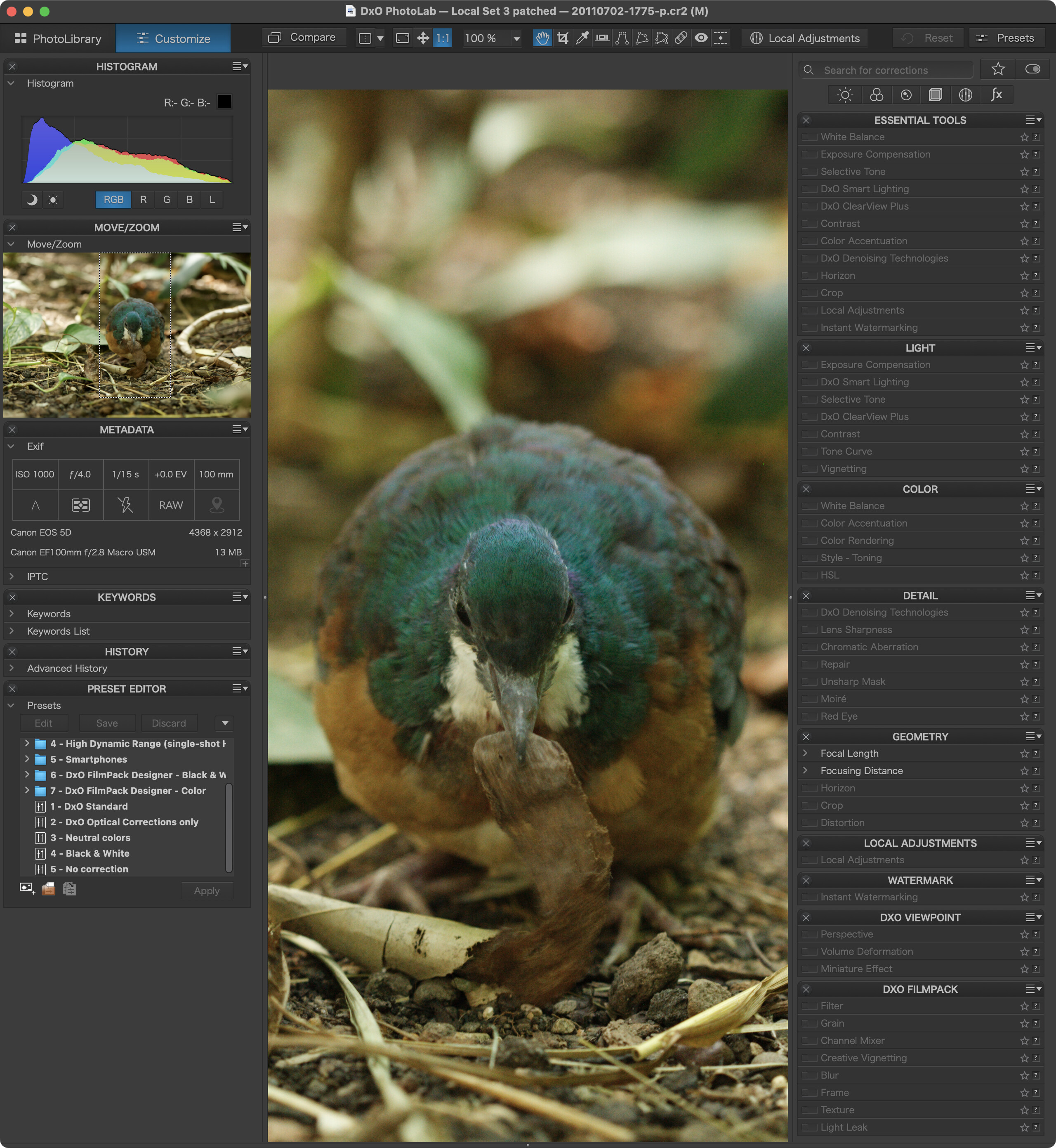
My suggestion for DxO is that in addition to the “Standard” and “Advanced” workspaces, they include a very basic and simple workspace for newcomers, who probably know nothing about what all this stuff is or means, and who (like I did) get lost trying to do something simple, and not knowing how to find things.

Since I now know where to find the tools I use, each time I want to use PL5 I plan to click on the “Advanced Workspace” for my starting point. I don’t expect to have any problems, and eventually I expect to set this as my default.

A question I’d like to ask here is why so many of you create your own workspace at all? I have “All-in-one” workspaces (I forgot who sent them to me), and workspace from Joanna from before and after I changed the language to English, and a lot of workspaces for trying things out, some of which I gave up on. Why don’t all of you just use the “DxO Advanced” Workspace?

Finally, if there are good reasons to use something other than the “Advanced” workspace, maybe someone at DxO could collect these, and make them available for others to try?

My main reason for creating my own workspace, for Customise mode, is to put all of the palettes on my second monitor and only have the image on the man monitor (along with the top and bottom menu / icon bars that you can’t move).

I don’t include all of the palettes as there are a few I don’t use, and I leave one or two infrequently used palettes collapsed most of the time. I tend to leave the individual palettes as they are, just leaving any never / infrequently used controls collapsed.

If I was working on a single monitor I’d probably just used the DxO Advanced workspace.

The Standard workspace is the basic WS.
To see all tools, one has to switch to the Advanced WS.

If one has also entered license keys for ViewPoint and FilmPack, the respective palettes will be shown too.

For ease of use and imo, it makes sense to either stick to the available workspaces or create one that covers one’s own requirements. Customizable palettes require the DPL Elite edition though.

Currently, I’m playing with a single palette workspace. Feel free to try it.
DPL5_1.dopworkspace.zip (1.8 KB)

For various reasons, I’ve recently decided to abandon my custom workspace (which used both the left and right columns on either side of the image viewer) and try getting used to the Advanced Workspace. Overall, I think it’s well organized. And I’m very glad to not be scrolling as much. But there are clear advantages to organizing the palettes/adjustments in a way that makes logical sense to you. And it’s nice that we can do that and still use the Advanced Workspace.

The idea of using fewer palettes is intriguing! That would make customization a lot easier. Still not ideal, but maybe I’ll try two palettes - one on the left and one on the right.

I have two custom workspaces, called “Small screen” and “Large screen”.

I created “Large screen” based on the “Standard” one, adding in a few tools it is missing that I regularly use. When at my desk with my 5K monitor I use this, and occasionally switch to one of the “tool type” views (the buttons at the top) to find tools that are not in my workspace. It has sidebars on both sides with the left side containing histogram, history, and presets — things I don’t generally click on much at all but want to keep visible.

“Small screen” was created based on “Large screen” with the left sidebar removed and the histogram added to the right sidebar. This is for those few times I find myself only with my laptop screen and want as much space as possible for the photo.

If I made the time, I would probably tweak both workspaces given recent learnings and behaviours, but I don’t think I would add or remove any workspaces.

Perhaps I’ve always been a slow learner. I think you, @Joanna, and one or two other people sent me simple work spaces. Yep, I guess the “Standard” workspace is the basic workspace, but I felt overwhelmed. To be honest, if it wasn’t for all the wonderful people I met in this forum, I would have given up, and gone back to Lightroom. It didn’t seem “logical” to me back then.

Nowadays, I know what to do in what order to start editing an image, but I only get so far. Then I stop editing, as I think I’m done. At that point I guess I should pause, and go do other work for a while, and then return to editing, with a clear head.

Ain’t nuthin’ easy!

Before it’s possible to do that, one has to understand the logic of a Workspace. To me it was just a bunch of dis-organized tools, that I never could find again when I worked on a new image.

I never thought of this - would make editing on my 13" MacBook Pro a little easier.

I always find it odd that some people can comfortably and accurately edit an image on a 13-in monitor… I’ve been editing on a 28-inch 4k monitor for the last several years and can’t imagine ever going back to anything much smaller than that.

Mark

2 Likes

I never imagined using either Lightroom or PhotoLab on a 13 in MacBook Air…until I got one and found, that it actually is quite usable - and provides the same quality results I get on the 27in 5k iMac. Admittedly, the workspace is a bit cramped, but once you get used to it, it does not matter that much any more. Having the right workspace settings and presets helps to streamline the work.

1 Like

PhotoLab’s workspace consists of several areas

  • The main preview area
  • The left and right docks or sidebars
  • The toolbar above and the filmstrip below the preview area and the docks

Both docks mentioned above can be populated with

  • Palettes provided by DPL
  • Custom Palettes (only available with the DPL Elite Edition)

Palettes can be populated with

  • Tools (I often call them tool panels)

DxO provides standard palettes. They can feel logically populated or not, depending on how we understand things or like to have them. If we don’t like the standard palettes, we create our own custom palettes and add the tools that we think should be in the respective palettes. Once we’re happy with the resulting structure, we save the setup as a new Workspace and give it a meaningful name.

If we have a workspace that does what we need, all we’ll have to do is check it after a major release update. New tools bring new tool panels and we need to put these in a fitting palette - and save the whole thing as a new workspace.

My first thought, is we need to define what resolution that 13" monitor has. My second thought, is people have to make do with whatever they’ve got. Same thing applies to cameras. Make the most of what you’ve got…

I agree on both points. I wasn’t being critical of the people who work on such a small screen, whether by choice or necessity, but rather whether the same high quality results could be achieved…

Mark,

Could be? Probably, with a lot of effort. I always had a feeling I would be so much more capable editing on my 27" ASUS, or even my 21" iMac. It bothered me, but since I didn’t have any choice, I just did the best I could, which limited my editing. Lots of viewing at 100% size, to check what I was creating.

I’ve got a 2015 MacBook Pro. I think the newer ones have a higher density screen, which would help. I had more important (to me) reasons for not updating. Apple took away all the ports on the sides of the laptop, which killed any desire for me to update. They also replaced the comfortable keyboard with a horrible version I hated typing on. Every year, the price went up. If I could have, I would have been editing on an external monitor connected to my MacBook.

To be honest, I think I usually settled for “good enough”, as I felt so limited.

This depends on screen quality rather than on screen size, the same criteria apply to large screens too :wink:

Of course, screen size is related to viewing distance. I have a 46" television, which I view from just over 2m away but, I also have an iPad which, if I view it from 25cm away, appears bigger than the TV screen.

I use a 27" monitor attached to my 16" MacBook Pro and view it from about 45cm. I would have to be unbearably close (for me) to a 13" screen to get the same level of detail when editing an entire image. I can just about get by with the 16" MacBook Pro but it does mean peering at it from closer and it would be uncomfortable for any long period of time.

I think you mean Elite edition :wink:

1 Like

DPL comes with a bunch of palettes that can be switched on and off.

A Mac’s DPL5 default palettes and respective default contents can be seen in this screenshot:

Bingo! I’m not complaining, but that is what I get to deal with in India, with my 13" MacBook Pro (2015) on my desk, and needing to lean forward quite often. I figure this setup is “good enough”, so I can do what I need to do. It’s nothing like what I’m seeing right now, with two huge displays only 20" away from my eyes. In India, what I have is “good enough” What I have at home is the best I’ve eve had in all the years I’ve been doing this.

I vividly remember my experience with different iPhone sizes. When the iPhone 6 Plus arrived, that’s the one I went for. It was huge and made my hands hurt. For a week until I got used to it. It quickly became “normal” size for me. A couple of years later I switched to the iPhone 8 (not the Plus model) and very quickly began to notice people on the train with enormous phones that turned out to be… the phone I used to have (or at least identical in size).

There are certainly limits that each of us will have, beyond which we cannot reasonably operates, but there is an awful lot of hand wringing made about change without giving it a good go.

Can you get the same results on a 13" screen as a 27" one? Of course you can. It’s the same software.

1 Like

I used to use Nokia phones, with a tiny screen, then got into the more modern phones. I eventually got hooked on an iPhone 3GS (I think) and now use the normal size iPhones. The jumbo phones are too big for my hands, and don’t fit in my pockets. My current phone is an iPhone 11 Pro. I upgraded to that for the camera. I don’t feel any urge to update - maybe next year.

All the photos on my iPhones always look great, but that’s thanks to Apple “trickery”. I prefer using my real cameras.