- 2022 Processing High Dynamic Range Photos in PhotoLab 5 - Part One, Fireworks

No, the opposite of that. The fellow in focus is the subject, but he’s cut off, and too dark to see his face. My eyes are naturally attracted to his hand, which I doubt was your intent. With that lighting, I’m not sure how you could have done it better, but his head should be closer to the center of the photo, and lighter so we could see his eyes.

To me, this IS a solo subject, and it’s great! Everyone and everything else is out of focus. I would have liked a wider angle, but this is plenty good enough. Everything else in this photo becomes “props” for the focus of your photo. Lovely!!!

The other photos have no excitement, nothing going on, just someone playing an instrument somewhere. Beautifully done, if they would like photos of themselves, but “boring”.

To me, the photo of the lady with the (saxophone??) is perfection!

played with your pics and chose "The Big Bang"


VC1 → _1090162.JPG.dop (23,4 KB)

1 Like

What i like in this picture is the vain like red strips like a explosion of a can red paint.
That is what i want to enhance i don’t mind if the images become suralisties i see it as art not a eventrecording. :slightly_smiling_face:
The weather is bad this weekend so i afraid i sit again behind (edut: stupid me, then i don’t see the screen , infront of the pc.) the pc to play with them.
I think you used blur instead of lowering exposure on the fence.
See if this can be done on more.

Hi Peter,
thought the silhouette of the house was too distracting, tried the Miniature Effect and further adjustments.

have fun, Wolfgang

This bit is not self defence but meant to be my reasoning behind the shot…

With things in such close and overlapping proximity, it’s extraordinarily difficult not to cut something off. This was meant to be an image portraying the two musicians, one playing lead, the other backing, not just of the trumpeter. And the face isn’t too dark, it is how it was in the harsh lighting that some idiot lighting “engineer” set up.

Once again, this was not meant to be a solo portrait but an image of the whole sax lineup.

And this is always the problem when any two photographers take a photo - artistic vision. Neither you nor I are right or wrong, we just see things differently :stuck_out_tongue_winking_eye:

Indeed. but they were intended to be portraits of the individual musicians playing their instruments.

On the other hand, the Jacksonville shot that you shared, to my mind, is a posed publicity shot where it is obvious, to me, that they are all playing different chords at the same time. In addition to that, the fiddle player’s face is obscured by a rather large omni-directional mic. I hope this wasn’t one of yours :wink:

… is taken from the press pit – don’t think Mike has access. :slight_smile:

Not knowing any of what you just wrote, I completely mis-understood the purpose of the photos. I was just thinking “band photos”, like the one I linked to (not mine, by the way). And I was looking for “action”, “excitement”, and so on, which had nothing to do with your purpose for the photos. Maybe this is why photos often need “captions”, to express in words what the photographer is trying to show in pictures. Next time I post a photo, I’ll need to post a proper caption under it, in proper English, answering the five W’s… Who, What, Where, When, and Why.

Feel free to verbally abuse me should I not do so. I’m supposed to be able to do that (but I’m way out of practice).

Now that I know what the goals were for your photos, I have very different thoughts. If the photo was intended to show both musicians, shouldn’t they be equally sharp or blurry? What I mean by that, is that most of the photos direct my eye “somewhere”, but I’m not “seeing” what your goal was, unless it’s because one was “lead” and the other “backing”, in which case you did it brilliantly.

Both in the USA, and in India, and when I was covering sporting events, I had wonderful “access”. Now I have none. I’m just an unknown person in a crowd, doing my best. But now I’m relaxed as I take photos. When I had “access” I was expected to perform, which meant a lot of work editing and so on. Now I have to continually tell myself that I’m retired, and to relax and slow down. That doesn’t work though. If I’m taking a photo, I always need to get serious about what I’m doing, and why, even if there’s no need to. The worst thing that would happen, is all of you “dumping” on me for failing to do things well enough. I care more about your reactions then reactions from people I know, who just write “marvelous” or “fantastic” or something similar. :-/

Hey man, this is Jazz, know what I mean? :wink:

Here is one of the three leads of a band who played at the Fest Jazz we have here in Brittany a few years ago. Bluegrass, Country Blues, Old time and Rock’n’Roll…

But the big problem with photographing someone playing or singing is trying to capture dynamism in a 1/1000 second :roll_eyes:

Nonethless, here’s a shot of a great friend of a friend, James Compton, in full flow…


Now, some may be wondering if all this is still on track for discussing high dynamic range in PL5. Well, yes because at 10,000 ISO, my D810 only has 8 stops range and, with stage lighting, which can create deep shadows, I have to shoot carefully, with a view to processing, to try and avoid blown highlights or blocked shadows.

Actually, I have no idea what you mean - I don’t know much about various forms of music, other than people dancing around the stage in the 70’s and 80’s. I never got to photograph one of those big concerts, and would have been lost, had I tried. I’d also probably have lost even more of my hearing. :frowning:

This photo I like, which doesn’t mean much as I know nothing about it. Everything is sharp and clear, nice composition - to me, this is excellent!!

To me, it looks like a static shot. Maybe if his hands were blurry, I’d appreciate the “full flow” better. To me, technically, it’s awesome! I expect he very much loved the photo.

Definitely a high dynamic range photo - was almost difficult to view it with my eyes. It’s taken with my fifteen year old M8.2 Leica, with a $270 Chinese 7Artisans lens, meaning chances are that every person reading this forum has a better camera and lens than what I used. Nobody can say “that’s an expensive camera that they can’t afford”.

I was walking around, looking for a scene that would be difficult to capture, and I decided this was it. It’s not very exciting, probably rather boring, but to my eyes it’s interesting because of the colors and shapes and detail.

I used PL5 because it’s so easy to keep all the vertical lines looking right, even though I had to aim the camera upwards. I thought Joanna’s trick of making the sky look better with a control line would work, and it did. The leaves are real green, not a sickly yellow-green, as I put on an anti-infrared filter to prevent the camera from showing false colors because it’s sensitive to infrared light.

My first question - for experts here, how could I have done this better?
My second question - for anyone just reading, and not contributing, can you please upload a similar scene that YOU have taken, that we can all enjoy working on?

L1000482 | 2022-01-06.dng (10.1 MB)
L1000482 | 2022-01-06.dng.dop (13.3 KB)


Caption: End of the Road - Miami Beach, Florida, January, 2022, where car traffic ends, and pedestrians cross over a canal by using a footbridge that the city recently constructed.

High dynamic range and excitement – simply get it all in,
only limited by sRGB colour space.


Flavia Cohelo, Brasil


Rosario Smoving, Argentina

1 Like

Both are wonderful photos, for different reasons. The “excitement” is overwhelming, perfectly timed, too, especially the B&W photo. Perfection!!! As High Energy photos both excel, the first photo because the background just amplifies the power of the singer, and the second because the background is totally overwhelmed by the singer.

If both of these are yours, that is very awesome! I’m curious - how much “time” did you have to capture the second photo? Did that expression and excitement last for a bit, or was it just the single instant of perfection that you captured? The extreme sharpness of the second photo just amplifies the expression!

Just for the heck of it… Where’s the backing group? :stuck_out_tongue_winking_eye:

They are “just” great portraits of a lead artist, just like mine, except they music must have been louder :hear_no_evil: :joy:

I was wrong about one thing - I thought that new responses and new information here were being posted every day, that it was difficult sometimes to keep up. Then Leica came along with a new Leica M11 camera about to be released, and it seems that every time I get up to date, by the time I finish reading there is a lot more information to read. By comparison, these PL discussions are almost “stagnant”. :slight_smile:
New Leica M11 about to be released

I suppose I ought to add that I didn’t think I had any interest in buying one, only reading about it. Turns out there are so many improvements that if I had the $$, I would be seriously tempted. They’ve added an electronic shutter, huge file sizes, a real (non-reflective) light meter, larger high-res review screen, no bottom plate, and kept the size no larger than my M10. Most of the specs were secret until last night, when a “spy” website posted most of them.

Taken with a 35mm, the B&W version with 170mm.

I was stuck in the crowd and the interpreter on the ‘wrong’ side, but got him without mic stand or trombone in front of a black curtain.

1 Like

Chose those pics for their contrast and the singers’s energy (emotion) put into in a square (static) format.

  • With Flavia Cohelo – I remember trying to get the mic stands and ever changing beams in the pic, ‘concentrating’ on her. Then, later in post I just balanced out some bright spots.

  • When capturing Rosario Smoving’s leadsinger, I was stuck on the ‘wrong’ side of the stage, but could get him all across. Watched him closely and took some selective shots or bursts, when it looked good. Later in post, I decided for B&W, suiting the harsh downlight illumination, etc.


just to add something different


Albert Lee at the keyboard

Just wondering - is there any way to output an image from PL5 in a circular format, the way you did so nicely with square?

Lovely photo!

to crop in circular – never heard of

for square …
grafik

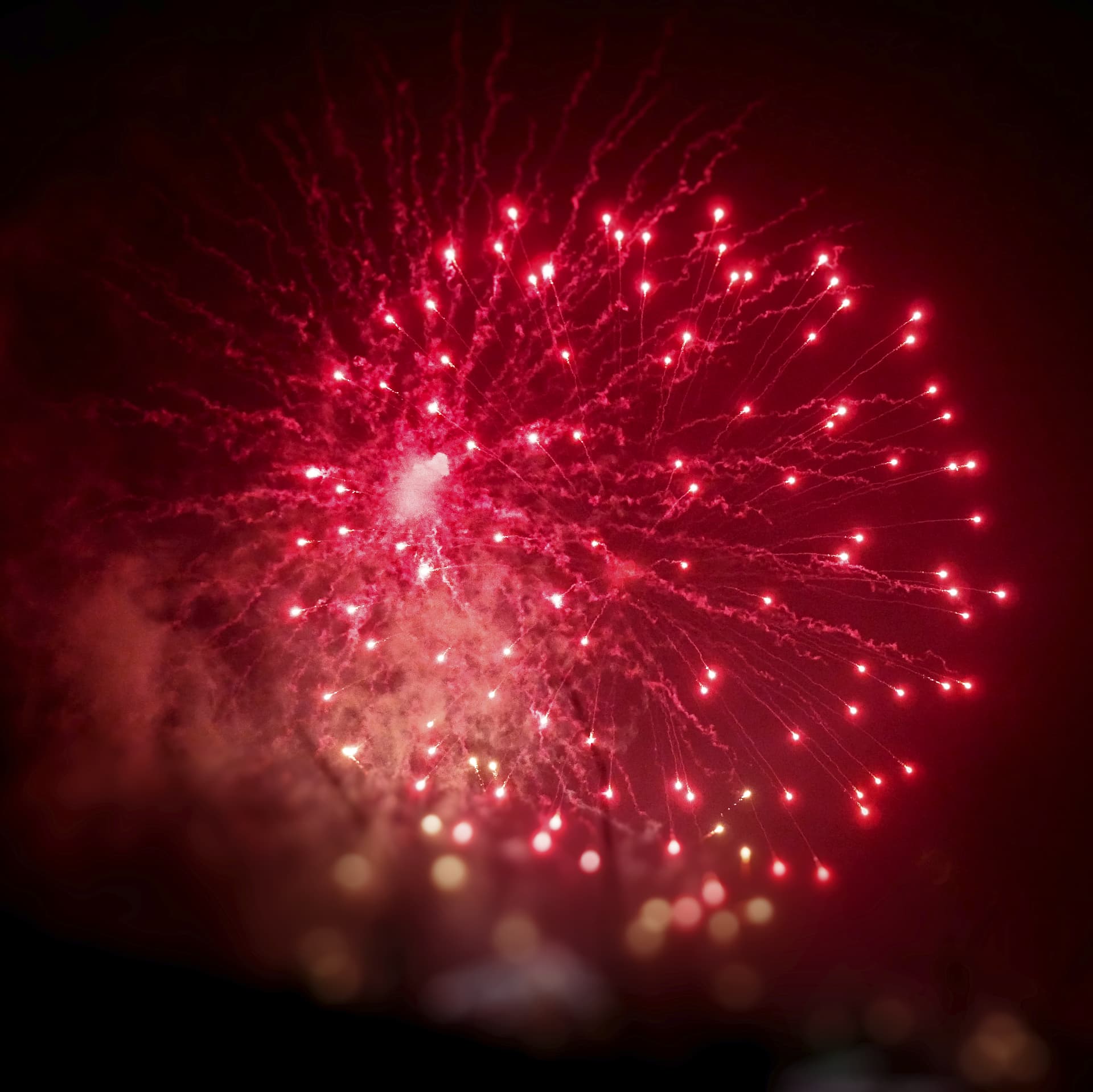
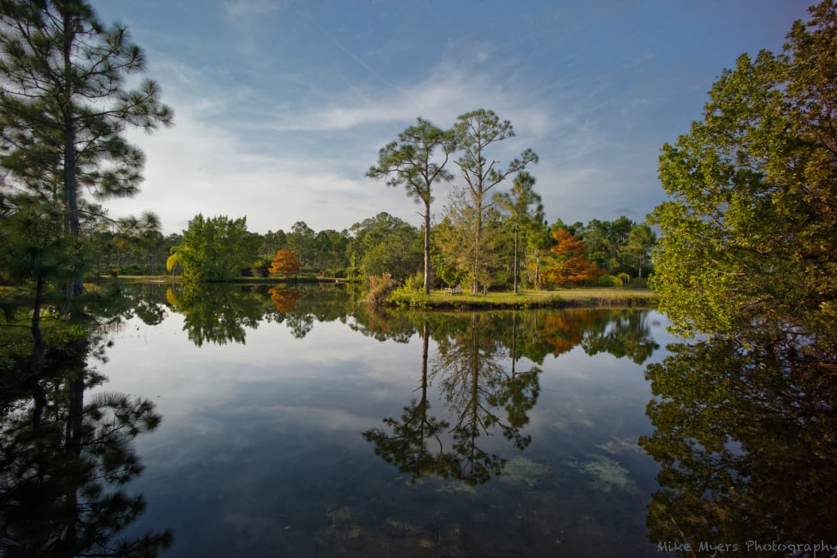
During my visit to my brother’s property in December, I took one day to try out my old 16mm Voigtlander lens on my M10. I originally bought the lens so I could capture wider “street scenes” on my M8, but never got to try it.

I went for a walk around his property, but looking through the viewfinder (Visoflex) I never got to see “wide angle” scenes - instead, I just saw a lot more of his property than I usually could see at once. I could never get everything you see in here into one photo before, and walking further back didn’t help. Walking forwards this time was better, until the tripod was almost over the edge of the pond. I wondered about the dynamic range - from bright sunlight to dark shadows. The exposure was set according to my M10’s meter.

It was such a peaceful day - no breeze, no birds, no nothing. I took almost a dozen photos, but this is the only one I liked, for many reasons - the reflections in the water being near the top of the list. There are two trees in the photo that are an orange color - the leaves were just starting to fall off, (and four days later those trees were naked). To me, this photo is almost “eye candy”, as I think of the different parts of his land as I scroll my eye over and through the image.

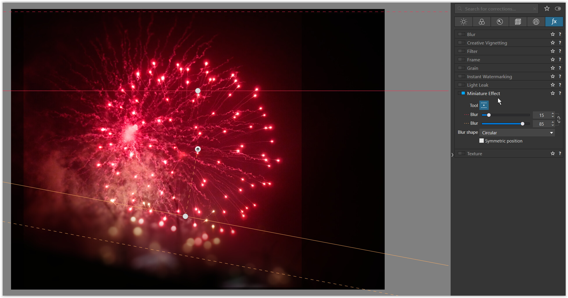
I didn’t spend a lot of time editing, or at least that’s what I thought. I just made some basic adjustments like what I’m now used to doing in PL5. However, when I click on “Compare”, I’m shocked at the difference! My new hero “Moose” may not like to do edits beyond what he captured in his camera, but all the things I now see were hiding in plain sight - until PL5 unlocked them. Moose says to get it right in the camera, but I wouldn’t know where to even start!

If a photo is supposed to “tell a story”, this one doesn’t. It’s just… there! It would probably make a great desktop photo, but I like to zoom in more to see detail. I don’t think it is as sharp at 100% as my Voigtlander 50mm lens, but maybe that’s not a fair comparison as this lens is 16mm, meaning extreme wide angle.

I can’t achieve this much quality with my M8.2 Leica, but the old sensor in the M8 achieves a different kind of color. For me, no comparison - I prefer the M10 in so many ways…

Anyway, you’re all welcome to have at it, and then tell me all the things I could have done better.

(As always, it was fun and enjoyable to edit. DarkTable feels more “mechanical”, while PL5 is almost done “by feel”. For @Joanna - no, I don’t think I could have gotten a similar result in DarkTable - I don’t know it nearly as well as I know PL.)

L1003823 | 2021-12-09.dng (29.8 MB)
L1003823 | 2021-12-09.dng.dop (14.4 KB)

well, there is not much you can do


VC2 new → L1003823 2021-12-09.dng.dop (212,3 KB) // M=master file, VC1= Mike

EDIT
Revisiting the pic I realized, I had not taken special care for chromatic abberations
and the lack of sharpness you have been talking about.

  • changed the CA’s intensity
  • reduced the edges’ standard sharpening
  • carefully added some local sharpening at the background
  • minor adjustments

Tried to figure out about that old lens but couldn’t find.
Unfortunaltely, your copy is not good enough for serious pics.